National Geographic drops its borders to highlight migration crisis
Magazine tells refugees' stories with borderless design.

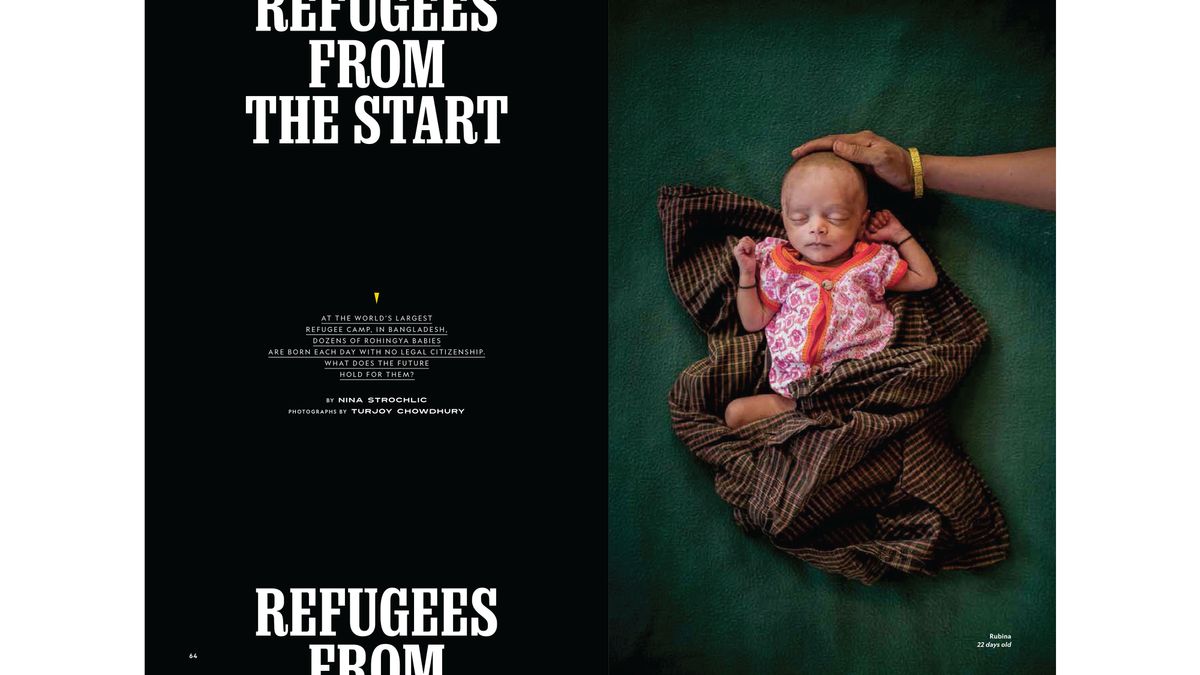
The August issue of National Geographic is packed with features that shine a light on global migration patterns. And to help get its message across, the magazine has created a batch of powerful editorial designs that roam beyond borders themselves.
For readers, the use of full-bleed photography and headlines that drift off the top of the page represent an impactful change of pace. And considering that the issue highlights the plight of refugees, it's a clever design choice that will make people pay attention to these pressing concerns.
If you want to push your own lettering further, check out our typography tutorials.
"The headlines on each of the main stories will run off the page, reflecting the issue's theme that there are no borders, that everything is fluid and that people migrate," the magazine revealed in a press release.


With mainstream media outlets in the US choosing to focus on stories about domestic migration, National Geographic has broadened its scope to highlight that they're just part of a global trend. The August issue of the magazine includes features on the history of human migration, a report from the world's largest refugee camp in Bangladesh, and an insight into the world's busiest land border crossing.
As a commentary on these migration issues, National Graphic's creative director, Emmet Smith, decided to push the limits of magazine design.
"We are living in a time where borders fail us," says Smith. "We wanted to reflect that notion in the headlining of our special issue on human migration, having the type move through the pages, rather than obeying traditional rules as to where it can-and can't-be. It is a signal to our readers that something is changing here."
Get the Creative Bloq Newsletter
Daily design news, reviews, how-tos and more, as picked by the editors.
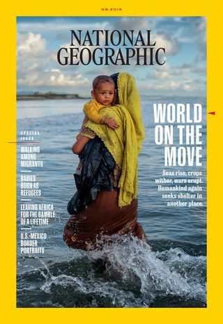
One thing that hasn't changed though is that National Geographic's familiar yellow border can still be seen on the cover of the August issue (below).
This element is the magazine's most recognisable design asset, so we can't help but wonder if the editorial team considered removing the border for one issue only to help underline its migration message.

Either way, this is one of the most striking and worthy uses of typography and print design we've come across in a while. National Geographic has form when it comes to pushing boundaries in its reports and design choices – who could forget that distinctive iceberg cover – and we look forward to seeing what it will come up with next.
See the complete set of features in the August 2019 issue of National Geographic by clicking here.
Related articles:

Thank you for reading 5 articles this month* Join now for unlimited access
Enjoy your first month for just £1 / $1 / €1
*Read 5 free articles per month without a subscription

Join now for unlimited access
Try first month for just £1 / $1 / €1
Dom Carter is a freelance writer who specialises in art and design. Formerly a staff writer for Creative Bloq, his work has also appeared on Creative Boom and in the pages of ImagineFX, Computer Arts, 3D World, and .net. He has been a D&AD New Blood judge, and has a particular interest in picture books.