We can't stop laughing at this unfortunate logo design
Who approved this?
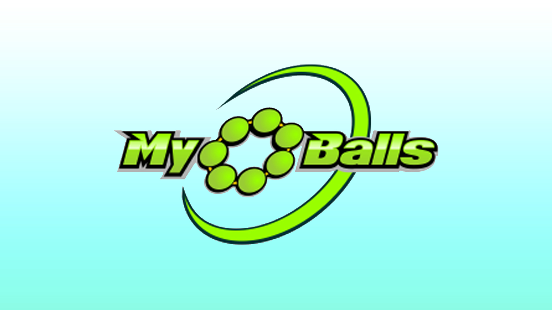
Sometimes it's hard to see the bigger picture when you're designing a logo, which is when unfortunate mistakes slip through. We've seen some pretty hilarious design fails over the years, and this logo for the brand MyoBalls is no exception.
This logo has gone viral on the CrappyDesign Reddit page as it looks like it says "My Balls" (as if that wasn't obvious). The brand specialises in massage equipment that looks like the O shape in the logo design (see below), but without the context of the product, the logo looks pretty, let's say, rude. We think MyoBalls should follow our 15 golden rules of logo design when designing its next logo to avoid confusion.
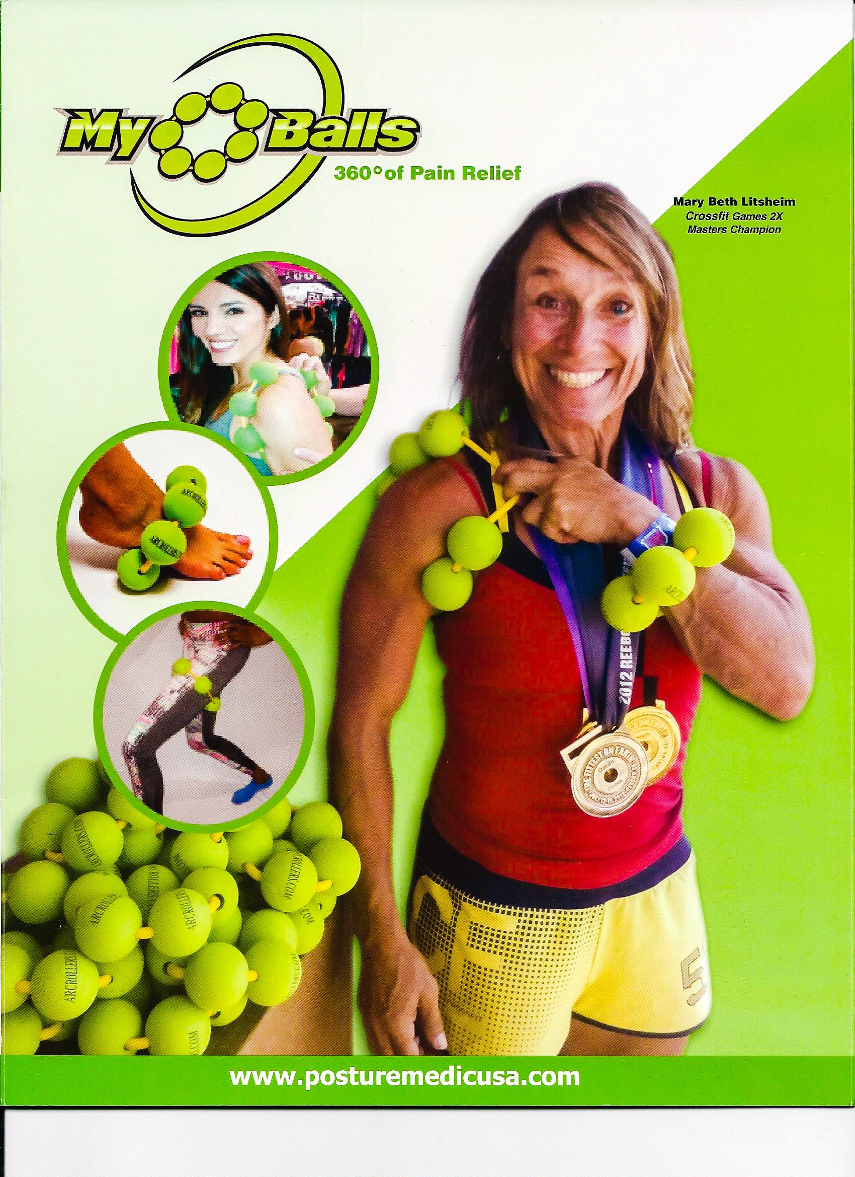
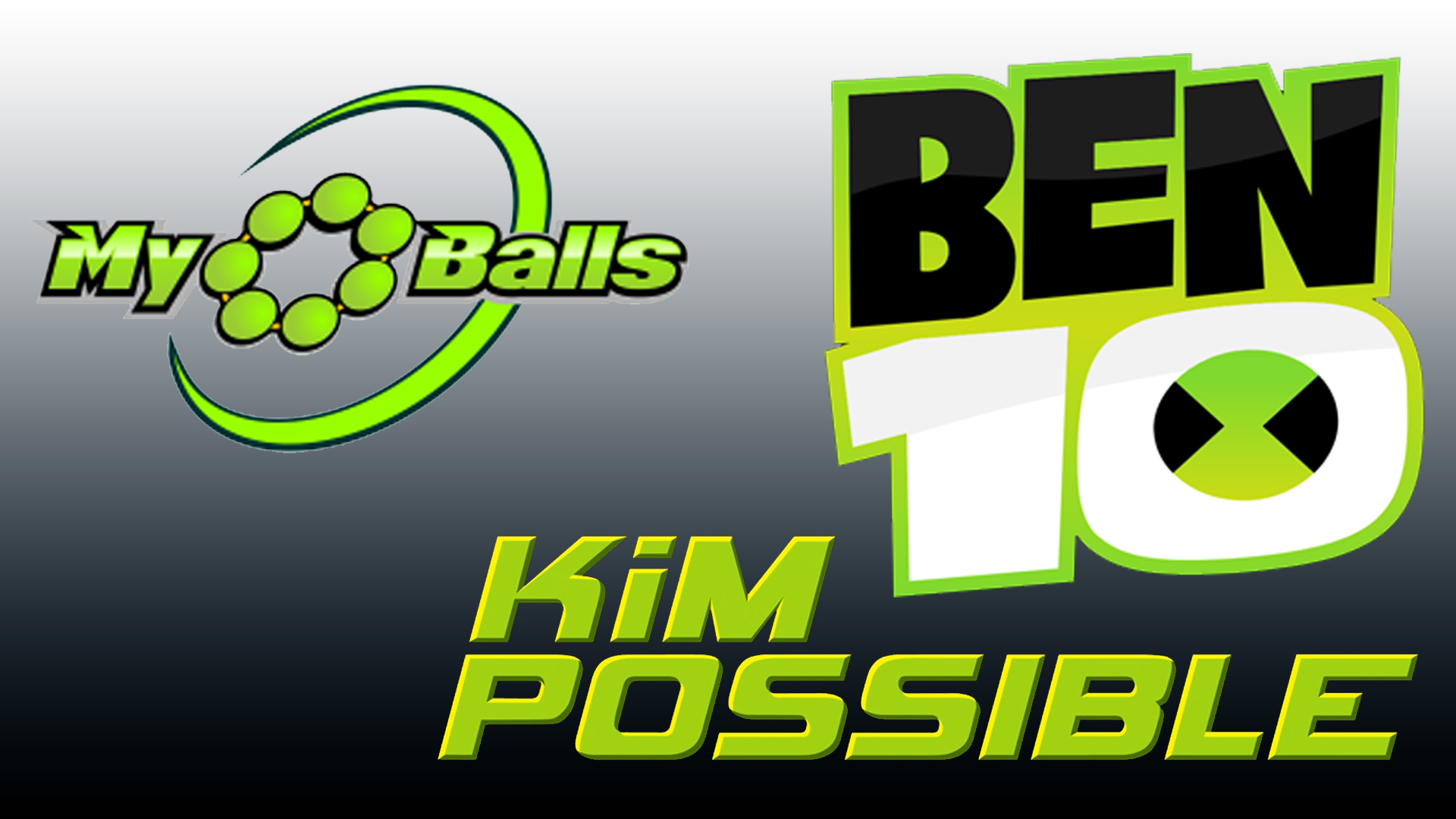
Aside from the X-rated design fail, there are quite a few things in the logo that we aren't keen on. The blinding neon green is quite an overload, especially on the MyoBalls poster (see above). We also think the combination of the oblique font and the gradient lime green is similar to the Kim Possible and Ben 10 logos, which would be fine if you were trying to sell a children's cartoon instead of sports massage balls.
The logo has got plenty of attention on Reddit and many users have left hilarious comments on the design. One Redditor said, "This should've been an underwear brand". Someone responded to a YouTube video about the MyoBalls, "This made me laugh my ass off," because the lady in the video sounds like she is saying my old balls instead of MyoBalls – could they have chosen a worse name and logo combo?
dont_use_your_product_as_the_letter_o_in_your from r/CrappyDesign
dont_use_your_product_as_the_letter_o_in_your from r/CrappyDesign
dont_use_your_product_as_the_letter_o_in_your from r/CrappyDesign
If you're in the middle of making a logo, we hope this unfortunate design inspires you to triple-check your work before it's published (just in case). If you're designing a logo at the minute, then we recommend checking out our roundup of our best free logo makers.
Read More:
- This 'magic' iPhone hack will brighten your day – literally
- There’s a cat hiding in this optical illusion
- Super Bowl NFTs: The good, the bad, and the ugly
Get the Creative Bloq Newsletter
Daily design news, reviews, how-tos and more, as picked by the editors.

Thank you for reading 5 articles this month* Join now for unlimited access
Enjoy your first month for just £1 / $1 / €1
*Read 5 free articles per month without a subscription

Join now for unlimited access
Try first month for just £1 / $1 / €1
Amelia previously worked as Creative Bloq’s Staff Writer. After completing a degree in Popular Music and a Master’s in Song Writing, Amelia began designing posters, logos, album covers and websites for musicians. She covered a range of topics on Creative Bloq, including posters, optical illusions, logos (she's a particular fan of logo Easter eggs), gaming and illustration. In her free time, she relishes in the likes of art (especially the Pre-Raphaelites), photography and literature. Amelia prides herself on her unorthodox creative methods, her Animal Crossing island and her extensive music library.
