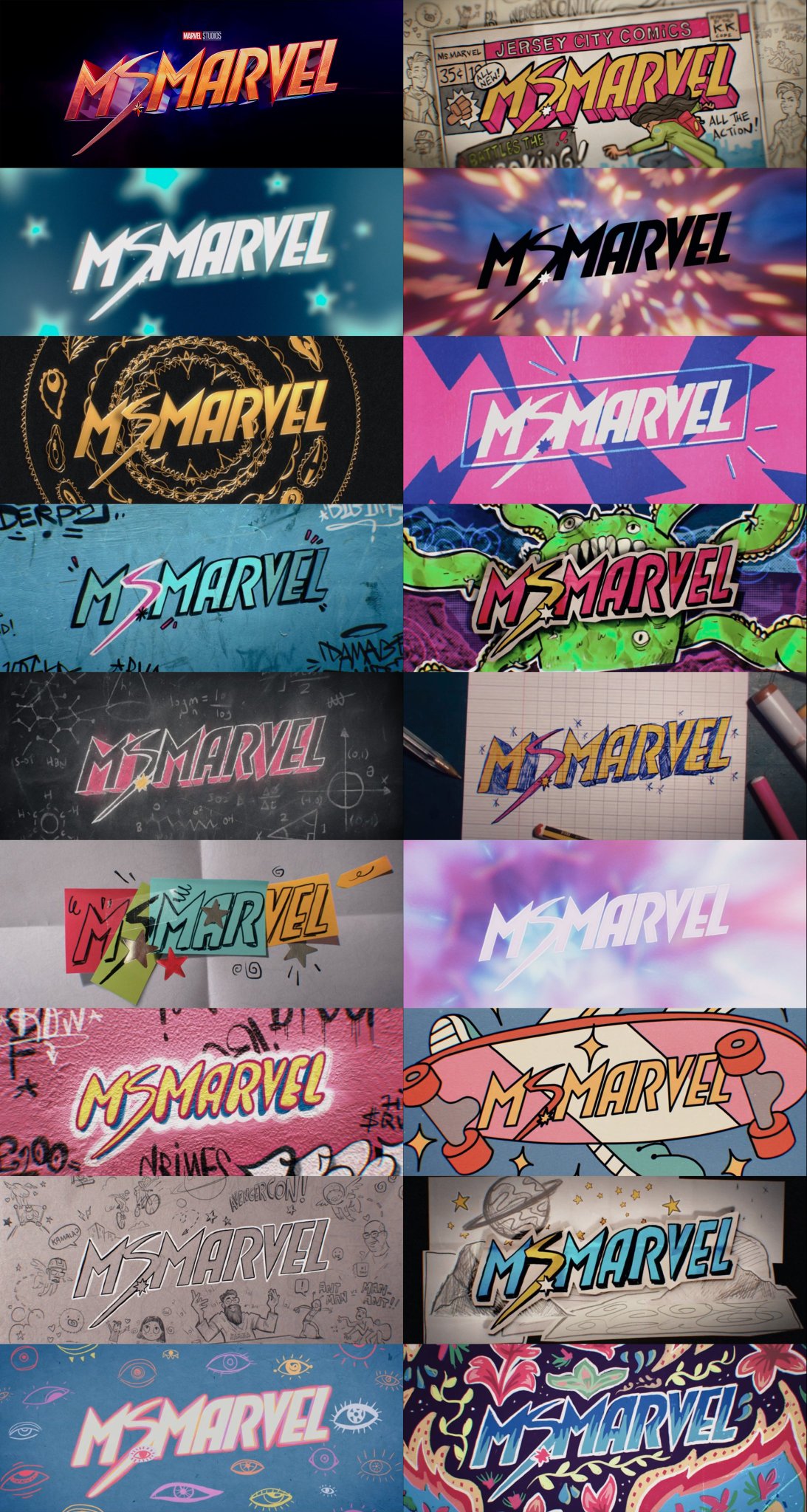
New Disney Plus show Ms Marvel has already been declared a hit, but it's the graphic design behind Marvel's new show, the brand's first Muslim superhero, that really caught the eye. The first episode is a masterclass of design, and its 18 hidden Ms Marvel logos are genius.
The Ms Marvel live action show embraces the comic's that it draws inspiration from, with a beautiful teen-scrapbook approach to its design and logos. Every frame of Ms Marvel is filled with subtle references; you can see it for yourself by checking out our Disney Plus sign-up deals and watching the show.
The mix of Ms Marvel logos are incredible. The mind boggles how many logos have been left on the cutting room floor. The 18 are below, scroll down to see them all. Which do you love?

The scrapbook, pop art approach of these and the main Ms Marvel logo isn't the first time Marvel has done this, the recent Spider-Man movies all embrace the school book scribble approach. It also took a year for Marvel to decide on the She Hulk logo, which is another triumph for Ms Marvel – she gets 18 in one episode.
But none of Marvel's properties have embraced the Gen Z branding aesthetic quite like Ms Marvel. It's a blend of nostalgia, pop art, 1970s overlaps, eighties 'synthwave', and the 1990's Memphis style – it's all in here, and a skateboard.

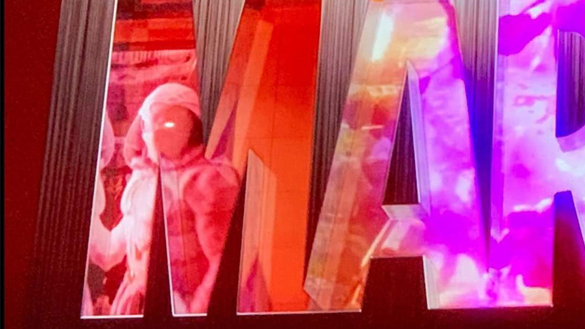
Eagle-eyed fans also spotted some new changes to the famous Marvel Cinematic Universe logo that appeared ahead of the Ms Marvel credits. It's rare for Marvel to alter this logo but new characters Moon Knight and The Eternals made it into the MCU logo. This suggests both franchises are here to stay.
This isn't the first time we've loved the work of Marvel's graphic design team. The recent Thor logo proved a nostalgia overload for many, while the Loki logo design was met with a more muted response.
Get the Creative Bloq Newsletter
Daily design news, reviews, how-tos and more, as picked by the editors.
The signs were always good ever since Amelia glimpsed the Ms Marvel poster and shared her love of the approach Disney was targeting with this show. If you're inspired by that poster, then take a look at our guide to the four rules visual hierarchy poster design. If these 18 Ms Marvel logos have given you ideas, then take a look at our pro guide logo design feature for more.
Read more:

Thank you for reading 5 articles this month* Join now for unlimited access
Enjoy your first month for just £1 / $1 / €1
*Read 5 free articles per month without a subscription

Join now for unlimited access
Try first month for just £1 / $1 / €1

Ian Dean is Editor, Digital Arts & 3D at Creative Bloq, and the former editor of many leading magazines. These titles included ImagineFX, 3D World and video game titles Play and Official PlayStation Magazine. Ian launched Xbox magazine X360 and edited PlayStation World. For Creative Bloq, Ian combines his experiences to bring the latest news on digital art, VFX and video games and tech, and in his spare time he doodles in Procreate, ArtRage, and Rebelle while finding time to play Xbox and PS5.
