Firefox logo controversy finally addressed by Mozilla
"Remain calm," the company tells users.

It's not often that a company is compelled to respond to mocking memes, but Mozilla has decided to set the record straight about the logo for its web browser, Firefox. Despite suggestions to the contrary, Mozilla insists the software's titular fox has not been felled.
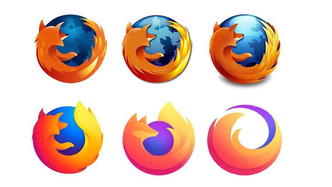
While Firefox's is hardly one of the best logos of all time, it certainly has character – courtesy of that furry, fiery fox. But after a tweet (below) went viral last month, internet users have been up in arms about the fox's apparent death-by-minimalism. But all is not quite as the tweet suggests.
THEY KILLEDTHE FUCKING FOX pic.twitter.com/mr3Ys4zNWbFebruary 20, 2021
Much to Mozilla's despair, the tweet caught on, with meme after meme appearing on Twitter, Reddit and more – all bemoaning the fox's apparent disappearance in the name of simple design.
Firefox logo minimalism has gone too far from r/memes
pic.twitter.com/YJjpWUbkctFebruary 24, 2021
Firefox logo in 10 years. pic.twitter.com/GT9bIW9F3HFebruary 20, 2021
Firefox logo, 2022 pic.twitter.com/dggLm3guilNovember 17, 2020
Smh firefox from r/dankmemes
Indeed, there's something of a backlash against flat design taking place online right now – and for some, it seems the death of the fox represents the ultimate example of minimalism sapping the life from a logo.
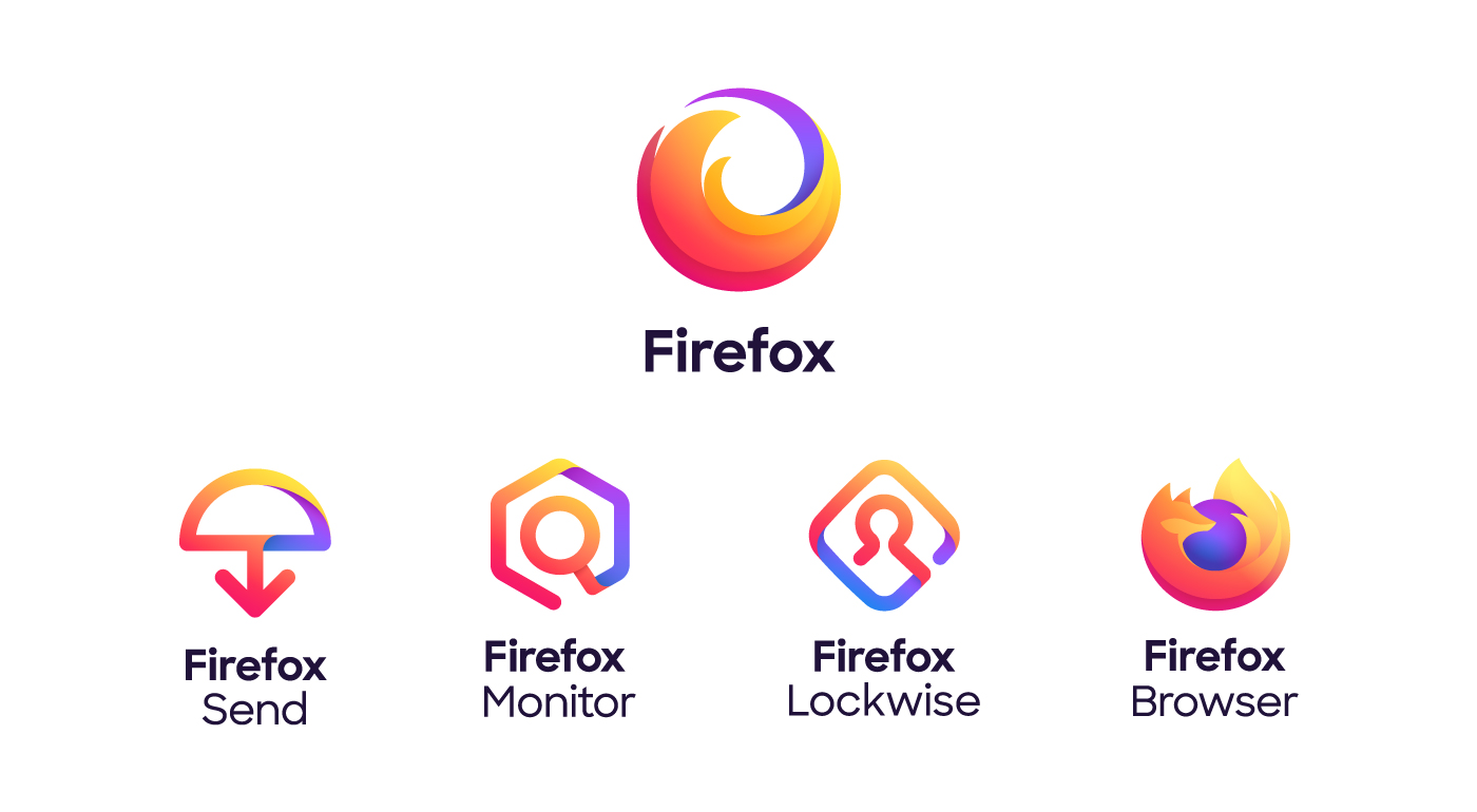
But now, in a blog post on its website, Mozilla has (literally) told everyone to calm down. "Remain Calm, the fox is still in the Firefox logo," the company insists. Calling the furore a case of "misinformation spreading online," Mozilla explains that the design without the fox's head is actually the logo for Firefox's parent brand, which "represents the family of Firefox products".

If we're honest, the fact that Mozilla has been forced to explain its logo system suggests that maybe said system it isn't quite right? For one thing, why are the logos for Firefox and Firefox Browser so similar? Surely the Browser logo ought to match the flat style of the other three members of the Firefox 'family' (above) instead of that of the parent company? So many questions.
And given that most people know Firefox Browser simply as Firefox, we'd have thought Mozilla would want to help users to differentiate Firefox the browser from Firefox the, er just Firefox (blimey, this is confusing).
Get the Creative Bloq Newsletter
Daily design news, reviews, how-tos and more, as picked by the editors.
Much like the unpopular new Google Workspace logos, it seems the Firefox and Firefox Browser logos are just too similar – and in this case, the confusion has led to some seriously savage meme treatment. If Mozilla's design team does decide to go back to the drawing board, our logo design guide is on hand to keep it from chasing its tail.
Read more:

Thank you for reading 5 articles this month* Join now for unlimited access
Enjoy your first month for just £1 / $1 / €1
*Read 5 free articles per month without a subscription

Join now for unlimited access
Try first month for just £1 / $1 / €1

Daniel John is Design Editor at Creative Bloq. He reports on the worlds of design, branding and lifestyle tech, and has covered several industry events including Milan Design Week, OFFF Barcelona and Adobe Max in Los Angeles.
