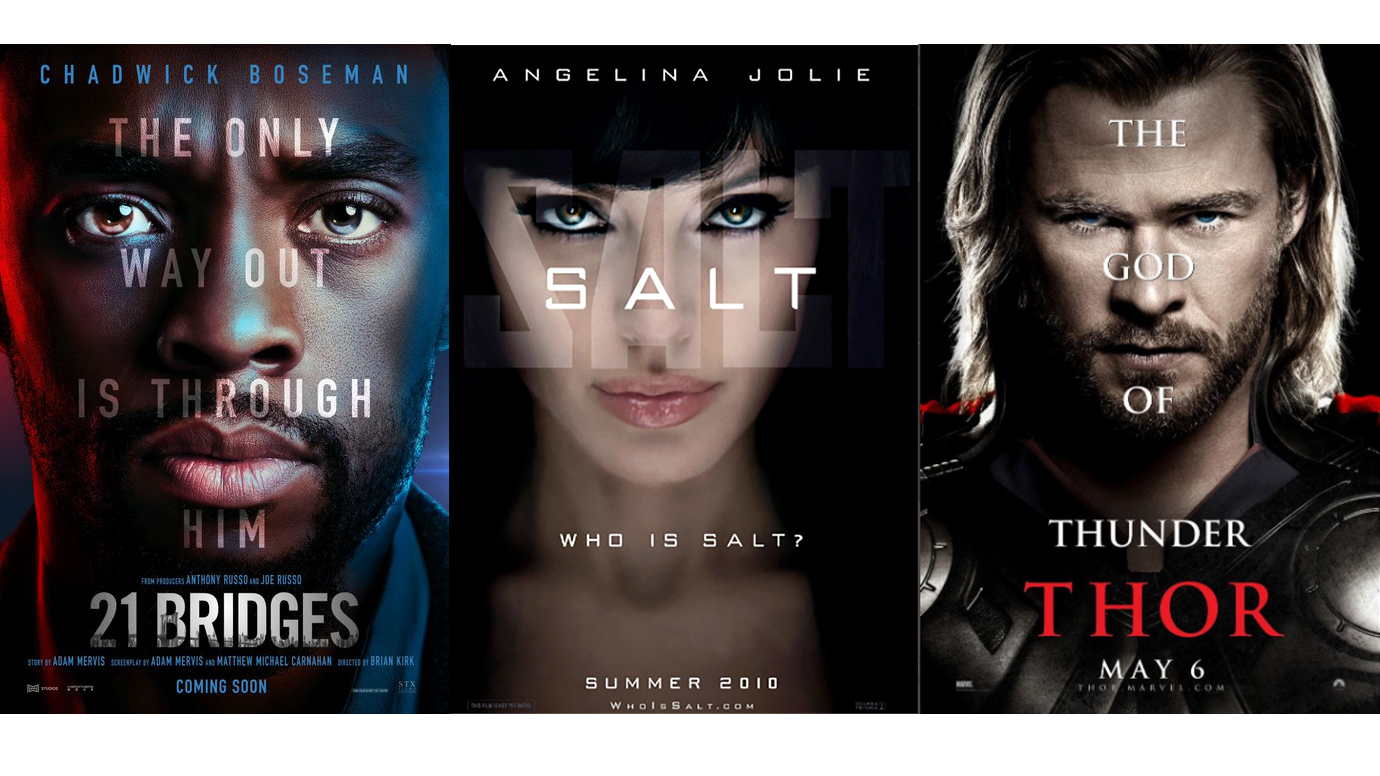
Is this the defining movie poster trend of the decade?
We spell it out.

A movie poster is the first look into the world of a new film. Summing up the cinematic vibe with a piece of epic artwork and a catchy slogan is sure to draw a popcorn-munching crowd. And there have been some splendid examples – The Birds springs to mind, and Ready Player One is so good that it made it into our best poster designs roundup.
But one movie poster trend stands out above them all. Not for being the most groundbreaking piece of design, you understand, but for being the most persistent. Yes film fans, it's the 'words over an intense face' movie poster. We have to thank Radio 1's film critic Ali Plumb for bringing this to our attention, as we are now kind of obsessed with it.
With 21 Bridges, I'm starting to think the "words over faces" movie poster trend is never going to end I think it's time Matt Damon gets another pic.twitter.com/17QPiJTqo2November 19, 2019
Of the posters shared by Plumb, kicking things off at the beginning of the decade was Angelina Jolie's Salt poster. Jolie started strong with a particularly focused glare straight into the camera. And the trend continued from there, encompassing Chris Hemsworth as Thor and ending this year with Chadwick Boseman in 21 Bridges.
We found a few other examples to add to the haul. The contagious words-on-face affliction has affected big names like Johnny Depp and Benedict Cumberbatch, too.

But the star of the show is none other than Matt Damon. When you look into it, it becomes clear that Damon's best intense looks are rarely allowed to shine without a bunch of words interrupting the emotion.

And Damon has been battling through the typographic overlay for even more than a decade, as user TMT pointed out:
Here is another Matt Damon one you forgot. pic.twitter.com/hi9I8oTKfiNovember 19, 2019
It's something that's been noticed before. Twitter user Litmus Configuration may have won this one with the mockup he shared on Twitter in 2017:
Get the Creative Bloq Newsletter
Daily design news, reviews, how-tos and more, as picked by the editors.
#MattDamon face thunder again stolen by taglines.#movie #poster #parody pic.twitter.com/rcNdIQvV2KJanuary 17, 2017
There was even a through the looking glass inversion of the trend that saw Robert De Niro, Edward Norton and Milla Jovovich peering out (still intensely) from underneath the typography of the film Stone.

Where would this trend fit into our roundup of the good, the bad and the ugly of movie posters, we wonder? Though the frequency of use leaves us uninspired, it must be a design that reaps rewards, otherwise surely Hollywood wouldn't bother with it? Maybe we should ask Mr Damon how he feels...
Read more:

Thank you for reading 5 articles this month* Join now for unlimited access
Enjoy your first month for just £1 / $1 / €1
*Read 5 free articles per month without a subscription

Join now for unlimited access
Try first month for just £1 / $1 / €1

Georgia is lucky enough to be Creative Bloq's Editor. She has been working for Creative Bloq since 2018, starting out as a freelancer writing about all things branding, design, art, tech and creativity – as well as sniffing out genuinely good deals on creative technology. Since becoming Editor, she has been managing the site and its long term strategy, helping to shape the diverse content streams CB is known for and leading the team in their own creativity.
