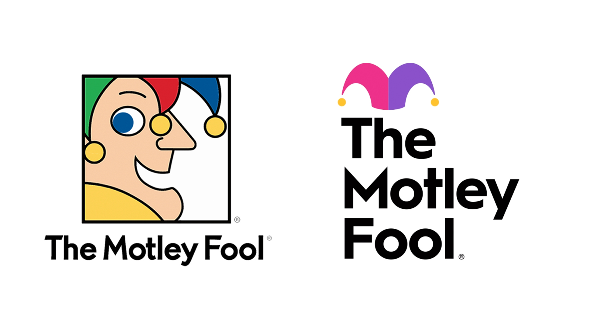
The Motley Fool's new logo is a fun-free zone
Why so serious?
Financial advice might not sound like the most fun industry in the world, but one investing platform is known for its tongue-in-cheek approach. The Motley Fool has revealed a new identity, though – and it does away with probably the one thing we all need right now: a smile.
Gone is the original logo, featuring a cheeky court jester in profile. Instead, the brand name has been made much larger, with a small jester's hat sitting atop it. The original was certainly unmistakable (one of the main rules of our logo design guide) – particularly in the financial sector, but this new design seems to have lost its sense of fun.

Established in 1993, The Motley Fool is "dedicated to making the world smarter, happier, and richer" through its website articles, investment newsletters and reports. The company is known for its anti-establishment approach, which makes it even more surprising that the new look seems so safe.
In a blog post on its website, The Motley Fool explains the decision to retire its jester. "Elvis was created to represent the jester of yore," the company explains. "But when many people looked at our old logo, they failed to see something very important: themselves. The jester can be found in many diverse cultures around the world, and it isn't exclusively the domain of blue-eyed men."
"By focusing on the cap with the new logo," says Pentagram, who designed the new identity, "the platform hopes more people can imagine donning the hat and seeing themselves as Fools, too."
Best way to celebrate 27 years of Foolishness.We hope you like our new logo, and if not, give it a chance.We promise it'll grow on you as it did us.June 30, 2020
While it's great to see the new logo increase inclusivity, we can't help but wish it had done so with a little more panache. The Motley Fool's sense of disruption and anti-establishment is what sets it apart from other financial services – yet the new logo, with its emphasis on the large, serif font, now feels rather humourless. We'd have preferred to see the jester's hat featured a little more prominently in the new design.
Fans of graphic design website Brand New have also weighed in on the rebrand. "Honestly I always thought the old logo was dorky, but memorable," one user comments, "the new one is neither." "I'm kind of enjoying the O's of "Fool" being used as eyes," another adds. "Besides that, I'm kind of not enjoying anything else."
Get the Creative Bloq Newsletter
Daily design news, reviews, how-tos and more, as picked by the editors.
Pentagram's animated version of the logo (above) does, however, contain a little more character, with the blinking 'oo' highlighting the fact that the hat is sitting above a pair of eyes. It adds a human touch that we'd love to have seen in the static version – perhaps a pair of pupils could have anthropomorphised the eyes a touch more?
While it isn't much fun, the new logo is at least inoffensive – we'd say it's safe from our list of the most hated redesigns of all time. Pentagram has had a few hits on its hands this year, including a fun-filled rebrand for toy company Fisher-Price. We just wish this one had made us smile a little more.
Read more:

Thank you for reading 5 articles this month* Join now for unlimited access
Enjoy your first month for just £1 / $1 / €1
*Read 5 free articles per month without a subscription

Join now for unlimited access
Try first month for just £1 / $1 / €1

Daniel John is Design Editor at Creative Bloq. He reports on the worlds of design, branding and lifestyle tech, and has covered several industry events including Milan Design Week, OFFF Barcelona and Adobe Max in Los Angeles.
