What the world’s most popular websites are getting wrong
While pretty much every website out there is intended to be viewed by as many people as possible, issues with accessibility mean millions of websites are unusable for billions of people. And now, a series of images has revealed how websites really look to those with visual impairments.
From legible text to subtitled videos, there are plenty of steps web designers can take to ensure their sites are as accessible as possible. But far too many websites are difficult or even impossible to navigate for those with impairments, as demonstrated by these shocking images. (Check out the best web hosting services if you're starting a project of your own.)

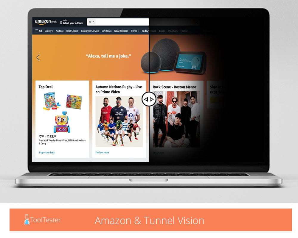
Web builder comparison site ToolTester has revealed the most (and least) accessible websites in the world, after analysing over 150 of the most popular sites to assess their accessibility for those with disabilities. Along with the results, ToolTester has created images to help readers visualise how the internet can appear to those with specific visual impairments.
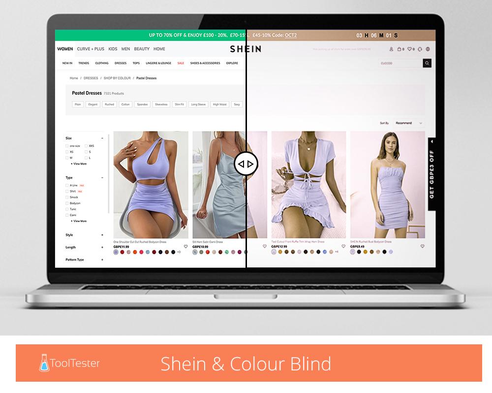
For example, to those who are colour blind, websites can appear vastly different to how they were intended to look, such as in the example above. "While on some sites it might just make things look a little different, if you ever use colour to convey meaning, it would take all that meaning away. We might be able to see that a green button means sign-up and a red button means cancel, but that wouldn’t be as clear to everyone," ToolTester says.
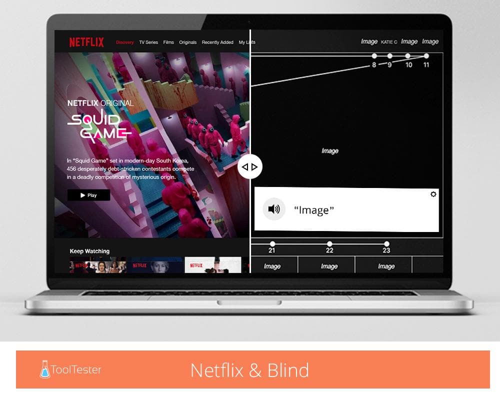
Meanwhile, a lack of descriptive alt text can make a website inaccessible. As the mocked-up Netflix image below shows, without detailed descriptions to be read aloud by screen readers, sites can become a blank mass of non-information.


The study reveals that the most accessible websites in the world include Linkedin, H&M, Paypal and Amazon. Among the least are ASOS, Instagram and Facebook. Accessibility was measured in three levels – for the highest score (AAA), "colour contrast needs to be almost black on white, videos need sign language, you won’t ever get timed out of an order, and tooltips are present whenever the content’s purpose needs explaining." Only 0.18 per cent of the highest-scoring website (Nih.Gov) is inaccessible, whereas the lowest-scoring site (ASOS) has a whopping 23 per cent of inaccessible content.
Head to ToolTester to view the full report. And if you're inspired to embark on your own web-building project (and are fully clued up on how to make it accessible), check out the best web-builder services available in 2021.
Daily design news, reviews, how-tos and more, as picked by the editors.
Read more:

Daniel John is Design Editor at Creative Bloq. He reports on the worlds of design, branding and lifestyle tech, and has covered several industry events including Milan Design Week, OFFF Barcelona and Adobe Max in Los Angeles. He has interviewed leaders and designers at brands including Apple, Microsoft and Adobe. Daniel's debut book of short stories and poems was published in 2018, and his comedy newsletter is a Substack Bestseller.
