Mock Cleveland Indians logos highlight racial double standards
These logo ideas are intentionally problematic.

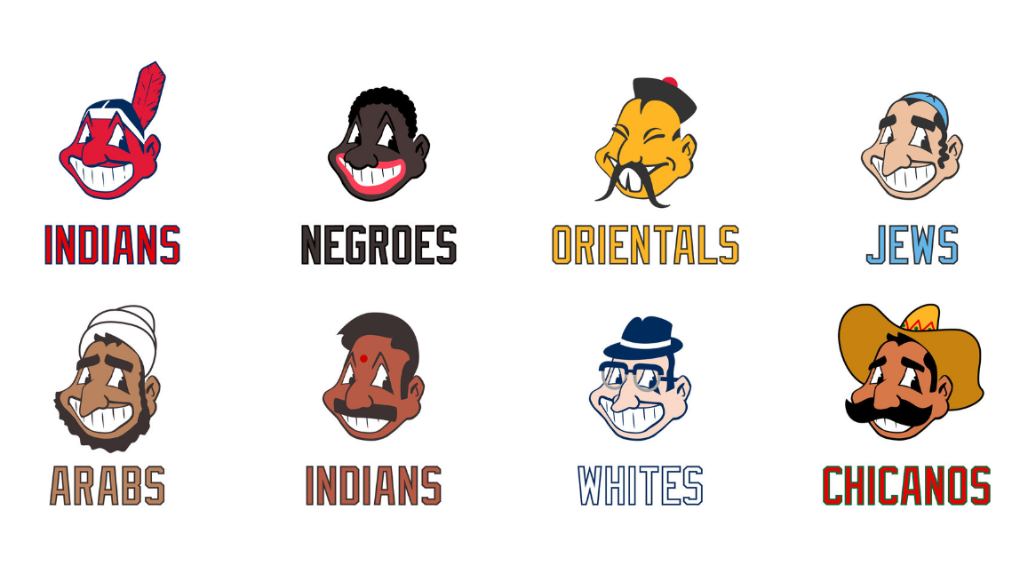
An illustrator has created intentionally offensive versions of an American baseball team's problematic logo in an effort to highlight racial double standards. The designs point out the harmful impact of the Cleveland Indians' former logo, Chief Wahoo, by imagining racially-charged alternatives.
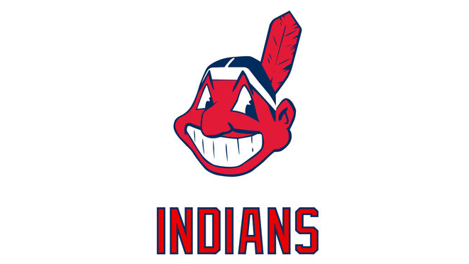
If you're unaware of the controversy surrounding the Cleveland Indians, the professional baseball team had been using the Chief Wahoo logo (above) up until this year. The design made its last appearance on uniforms in 2018, and has since been replaced by a letter 'C' monogram.
Chief Wahoo drew criticism for presenting a harmful racial stereotype of Native Americans. The problem was compounded when the Cleveland Indians were gifted the MLB All Star Game in exchange for retiring the logo design. For illustrator Jesse Alkire, this was an embarrassing move that prompted him to ask "why are we still okay with the Cleveland Indians brand?"
To highlight the damaging impact of the team's brand, which includes what Alkire describes as a "problematic moniker", he decided to create alternative logos that relied on similar racial stereotypes. They're a powerful set of inappropriate logos that make Alkire's point very effectively.

"The aim of this project is of course to shock, but perhaps the most shocking thing is that many would look at these other logos and be more shocked," says Alkire in a blog post explaining the project.
"How are these logos any different from what Cleveland did for so long? The truth is they’re not."
"We’re rightly outraged at racist depictions of Blacks, Asians, Jews, and others," he adds, "but why are we somehow alright with bigotry towards Native Americans?"
Get the Creative Bloq Newsletter
Daily design news, reviews, how-tos and more, as picked by the editors.
"Looking at them all side-by-side, these should all be viewed with the same amount of scorn. One or a few of these are not worse than the others. You're either outraged at all of them or none of them."

Alkire went one step further and created mockups of uniforms and merchandise emblazoned with the racist logos. It's all part of his argument that the Cleveland Indian's move away from Chief Wahoo is half-hearted.
He claims that the team has "put the brand in limbo" by removing the design from uniforms, and that much more could be done to set things straight.

"A better move would have been a full-on re-brand preceded by a heartfelt apology, encouraging education on the issue and spurring fans to rid the city of the terrible logo," he says. "A chance for everyone to move on and start something new that the entire city and country can be proud of."
The Cleveland Indians isn't the only brand to be criticised for its problematic design choices recently. Earlier this week Nike pulled its Independence Day-themed sneaker line after former NFL quarterback Colin Kaepernick privately complained about its use of the Betsy Ross flag.
Related articles:

Thank you for reading 5 articles this month* Join now for unlimited access
Enjoy your first month for just £1 / $1 / €1
*Read 5 free articles per month without a subscription

Join now for unlimited access
Try first month for just £1 / $1 / €1

The Creative Bloq team is made up of a group of design fans, and has changed and evolved since Creative Bloq began back in 2012. The current website team consists of eight full-time members of staff: Editor Georgia Coggan, Deputy Editor Rosie Hilder, Ecommerce Editor Beren Neale, Senior News Editor Daniel Piper, Editor, Digital Art and 3D Ian Dean, Tech Reviews Editor Erlingur Einarsson, Ecommerce Writer Beth Nicholls and Staff Writer Natalie Fear, as well as a roster of freelancers from around the world. The ImagineFX magazine team also pitch in, ensuring that content from leading digital art publication ImagineFX is represented on Creative Bloq.
