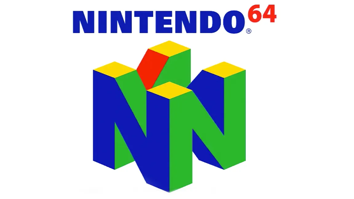
The N64 logo is a great piece of graphic design, and it continues to inspire. In a single logo Nintendo sold the idea of how its '90s games console was transitioning from 2D to 3D gaming. But, many developers failed to take notice of a significant detail. Can you spot the mistake in the N64 logo above?
Before revealing all, let's take a moment to reflect on just how superb the N64 logo design is and why it remains so loved. The design features a large three-dimensional letter N for Nintendo, four of them are placed together so they form a cube. The '64' in Nintendo wordmark signals to gamers this new console is a 64-bit machine. If you're interested in logo design, read our features on how to design a logo and the best logos ever. We also have a guide to the best graphic design software.
Back in the '90s, 3D was still a very new and uncommon thing. So when Nintendo rolled out its bold new 3D logo many game developers had to imagine how it would look when rotating. The N64 logo makes use of Nintendo's famous green, red, yellow and blue colour scheme, and this is where many developers came unstuck.
Below is the N64 logo as it should look side by side with the one at the top of this page. Can you spot the difference?
The N64 logo on the left is wrong, the one on the right is the correct N64 logo (Image credit: Nintendo)
Above, the correct N64 logo is on the right, but the one on the right appeared in many games. Why? Well, every game released for N64 would have a uniquely animated N64 logo that introduced the game. Many logos had the wrong colour scheme because the designers had to imagine what the colour of the hidden 'N' would be. This stretched beyond third-party games such as Earthworm Jim 3D and included first-party Nintendo titles like Banjo-Kazooie.
All the same, the N64 logo is so good that it could withstand this and other mistaken takes on the design. No matter then slight colour changes the logo is clearly identifiable. Oh, and there's a nice secret lurking in the N64 logo design too; it's made from 64 faces and 64 vertices when rendered as a solid 3D model. If in doubt, you'll need to imagine the faces and vertices you can't actually see.
If looking at the N64 logo again has inspired your nostalgia, then see our guides to the best retro consoles and the best retro controllers, both featuring classic Nintendo games machines and gamepads from the N64 era and before.
Get the Creative Bloq Newsletter
Daily design news, reviews, how-tos and more, as picked by the editors.
Thank you for reading 5 articles this month* Join now for unlimited access
Ian Dean is Editor, Digital Arts & 3D at Creative Bloq, and the former editor of many leading magazines. These titles included ImagineFX, 3D World and video game titles Play and Official PlayStation Magazine. Ian launched Xbox magazine X360 and edited PlayStation World. For Creative Bloq, Ian combines his experiences to bring the latest news on digital art, VFX and video games and tech, and in his spare time he doodles in Procreate, ArtRage, and Rebelle while finding time to play Xbox and PS5.