A well-designed movie poster can do wonders to create excitement about a new film. There are a range of strategies that film posters can adopt, from depicting every member of an all-star cast to a more enigmatic approach that stirs up intrigue. But what a movie really shouldn't do is completely mislead the audience about what to expect.
Sometimes, though, it seems poster designers take desperate measures to reel cinemagoers in. At least, that's the opinion of those contributing to a discussion dedicated to the topic on Reddit. From gritty dramas portrayed as light-hearted comedies to the use of actors that are killed off in the first five minutes or situations that simply don't happen in the film in any way, people might be asking for their money back if they chose a film based on the poster designs below. For more poster inspiration, see our pick of the best print adverts.
The Day the Earth Stood Still
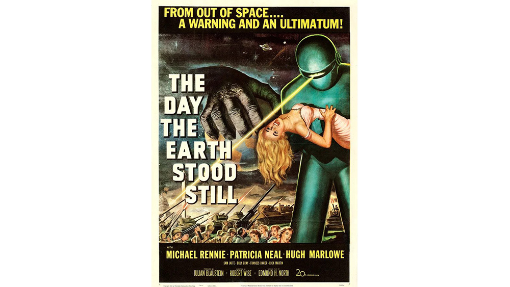
Nine years ago someone on Reddit asked the question, 'which movie poster is the most misleading?' Now there's a subreddit dedicated entirely to that topic, and it's full of hilarious examples of designers taking very liberal interpretations of films' themes, atmosphere and plots.
Many of the examples are from monster movies and sci-fi flicks from the 50s and 60s, a time where there were limited channels available for promotion, and movie posters were often impressionistic interpretations of a film's themes rather than real representations of anything that could be expected on screen. As u/Ok-Scale1423 points out, The Day the Earth Stood Still is about a benevolent alien trying save humanity from its own destruction, not an invasion. There's no blond heroine, and we have no idea what the big monkey paw is all about. Great poster though.
Escape From New York
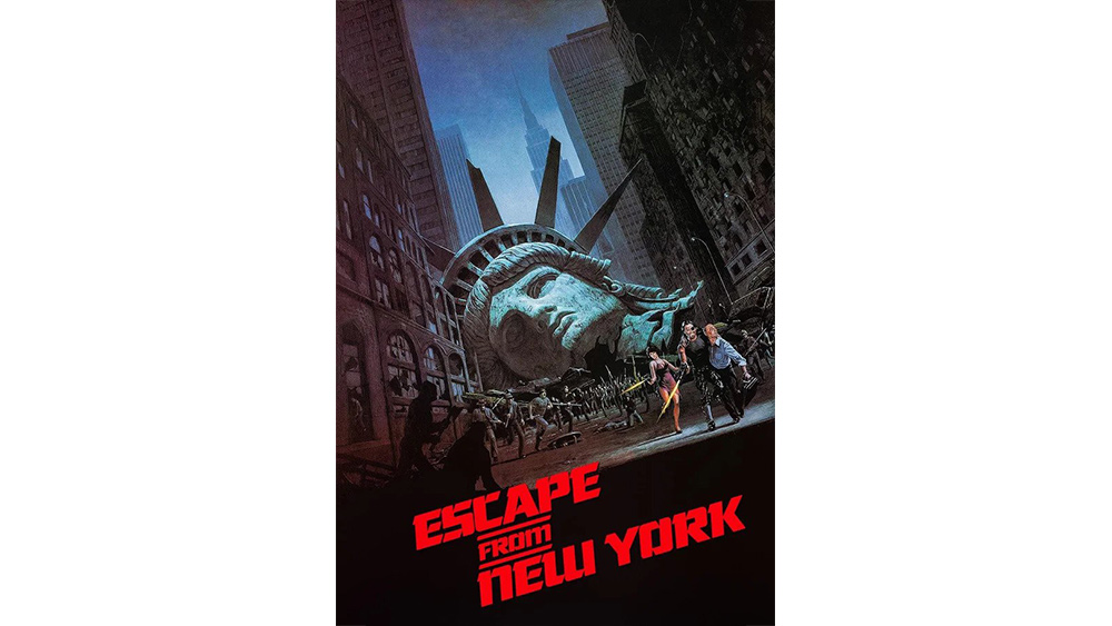
But a tendency to take a liberal interpretation of what happens in a film continued far beyond the 1950s. This poster for the cinema release of Escape From New York in 1981 makes it look like a disaster movie in which the Statue of Liberty is destroyed. Spoiler: that doesn't happen.
Friday the 13th VIII
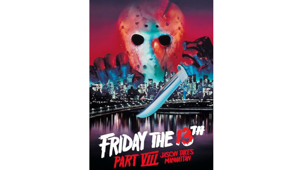
Sticking with New York, the poster and tagline for the awful Friday the 13th VIII gives the impression that a good deal of the film must surely take place in Manhattan. But as RiemsMUFC points out, "he's only in NY for a few minutes." Most of the film takes place on a boat.
Muriel's Wedding
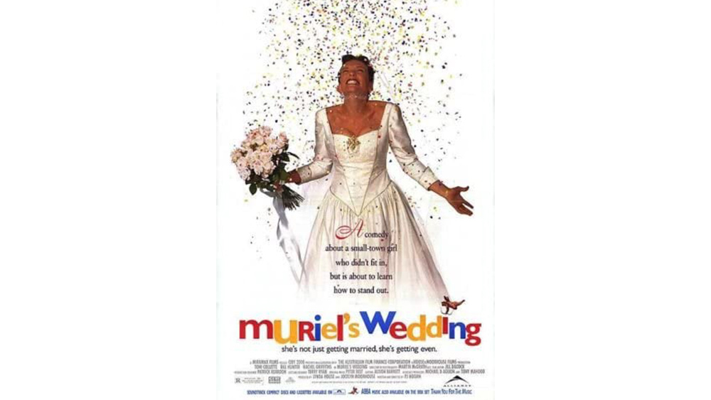
Sometimes the complaint about a misleading movie poster is how it portrays the feel of a film. Anyone going to Muriel's Wedding hoping for a light-hearted rom-com along the lines of Four Wedding and a Funeral based on this poster is going to be disappointed. "The poster shows Muriel in her wedding dress, laughing," RudyThree writes. "In reality, absolutely depressing movie which focuses on familial abuse."
Get the Creative Bloq Newsletter
Daily design news, reviews, how-tos and more, as picked by the editors.
Def by Temptation
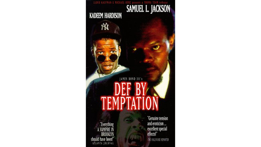
Understandably, when producers get hold of a major star, they can be tempted to overplay the actor's role in the film or series, even if they're killed off early on. This poster suggests that Samuel L. Jackson is a prominent character, but his appearance is mostly limited to a couple of flashbacks, after which he's promptly killed off.
Follow that bird
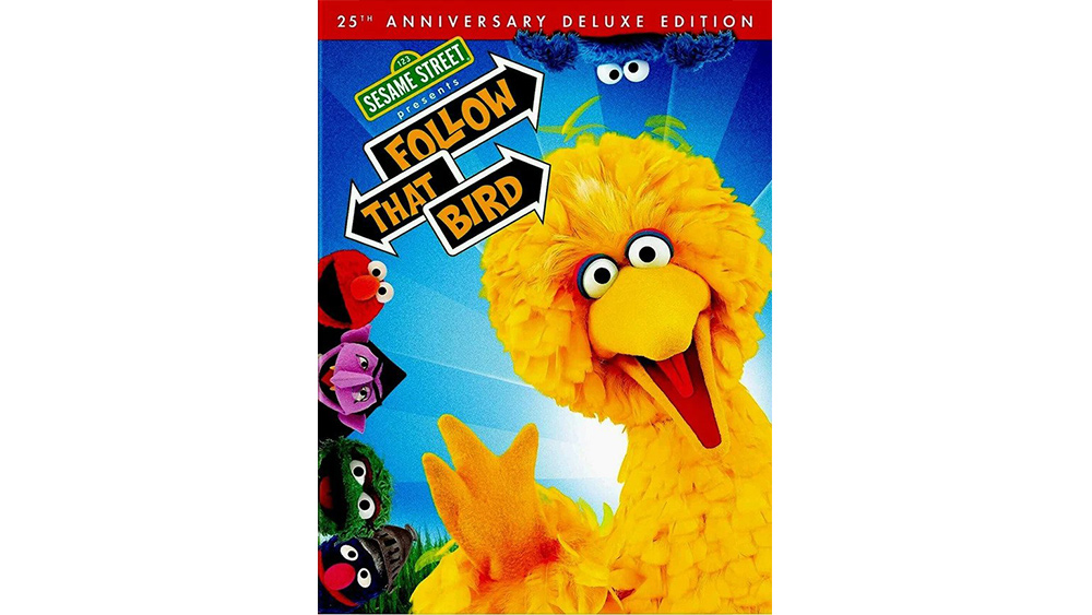
This technique doesn't apply only to human actors, either. One Reddit user took issue with the Sesame Street Follow That Bird movie for "prominently featuring Elmo, despite not appearing in the film, or even having been created yet."
Jaws 2
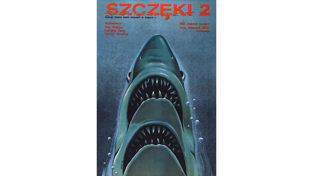
At other times, it's designers' creativity that people have an issue with. This Polish poster for Jaws 2 might be a nice idea graphically but, alas, the shark in the film does not have two sets of jaws. "Misleading because (unsurprisingly!) there is no 2-mouthed shark," the OP complains. People are quite liking the creative poster art all the same.
Captain America
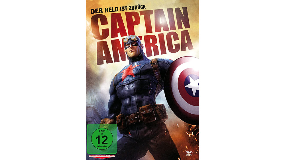
Another fairly common trick in poster art is an attempt to associate an old release with a newer blockbuster. Video and DVD re-releases are particularly unscrupulous here. The cover art for this German DVD could make you think you're getting a modern CGI-heavy movie. It's actually a 1944 TV series in which the OP complains that Captain America "is not called Steve Rogers, not a solder, has no powers, doesn't use a shield, doesn't even fight the Nazis." "I'm also certain that this art was "borrowed" from the portfolio of a digital artist," Ok-Scale1423 adds.
Jabberwocky
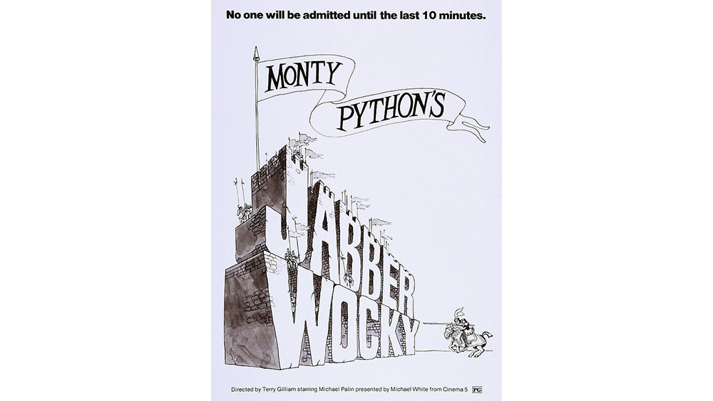
Sometimes the crime is to use the style or layout of a poster design to connect a film with another, better known release, no matter how tenuous the connection. This US poster for Jabberwocky intentionally copies the style of Monty Python's film posters to give the impression the film is part of the series. It even calls the film 'Monty Python's Jabberwocky'. OK, so it was directed by Terry Gilliam and stars Michael Palin, but anyone expecting Monty Python humour is going to be a little confused.
One Flew Over the Cuckoo's Nest
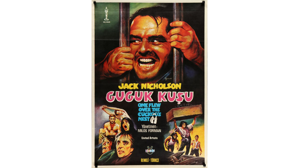
Reddit's wondering if the designers of this Turkish poster for One Flew Over the Cuckoo's Nest even saw the film. "It features Jack Nicolson from The Shining, Shelly Duvall also from The Shinning, what appears to be Christopher Lee as Count Dracula and what appear to be zombies," the OP notes.
Return to Oz
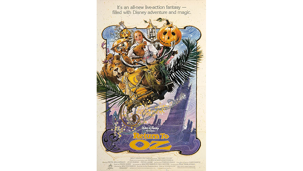
Disney's Return to Oz was a controversial release, criticised by parents for being too dark. The lavish magical feel of poster didn't prepare people for a twisted story that veers from electrotherapy to a devastated Emerald Kingdom and a head-collecting princess. Highway_robbery82 notes: "I still like how misleading the Return to Oz poster was considering how much childhood nightmare fuel that film contained."
The Sneak Over
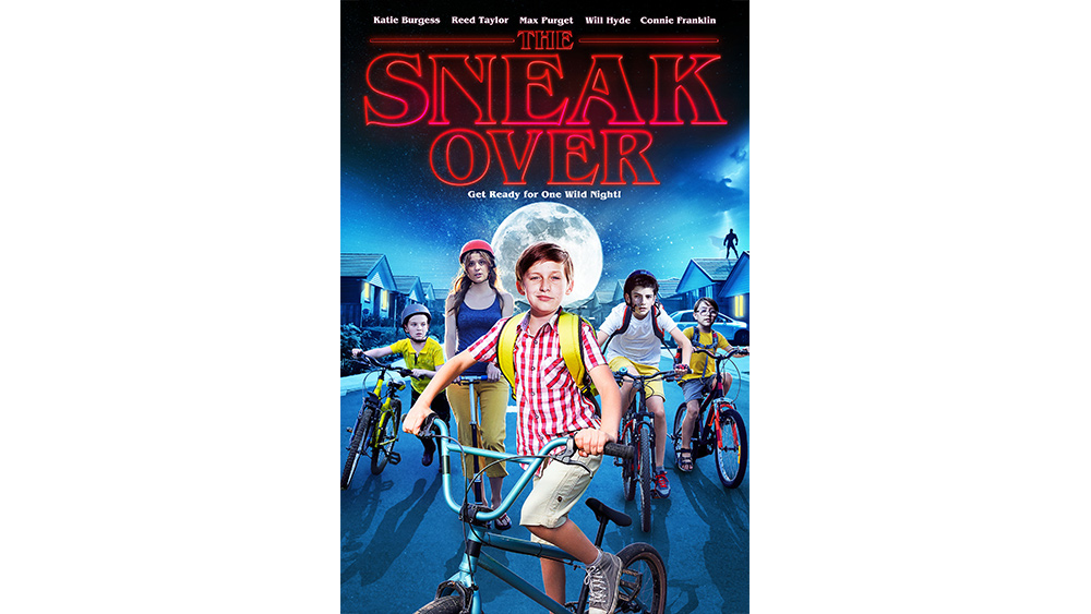
Sometimes it can be something as specific as the use of a particular font that gives designers an opportunity to cash in on another title that's in vogue. This film has nothing to do with the Upside Down despite the use of what looks suspiciously like the Stranger Things font. As the OP says, it's "more of a Diary of a Wimpy Kid knock-off".
Read more:

Thank you for reading 5 articles this month* Join now for unlimited access
Enjoy your first month for just £1 / $1 / €1
*Read 5 free articles per month without a subscription

Join now for unlimited access
Try first month for just £1 / $1 / €1

Joe is a regular freelance journalist and editor at Creative Bloq. He writes news, features and buying guides and keeps track of the best equipment and software for creatives, from video editing programs to monitors and accessories. A veteran news writer and photographer, he now works as a project manager at the London and Buenos Aires-based design, production and branding agency Hermana Creatives. There he manages a team of designers, photographers and video editors who specialise in producing visual content and design assets for the hospitality sector. He also dances Argentine tango.
