Does the Mini feature the ultimate car design fail?
It's lightning up Reddit.

It's one of the most iconic cars around, but it seems fans are still discovering design details about the humble Mini. Despite being owned by the German BMW since 2000, the Mini continues to celebrate its British heritage, not least when it comes to the taillights.
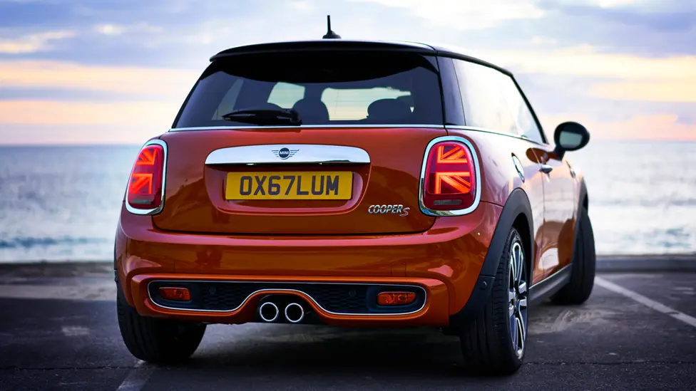
Redditors are only just noticing that the rear lights are designed to resemble a Union Jack. But while some are appreciating this nationalistic design touch, others are arguing that it is, quite literally, a glaring design fail. (But is it up there with the disastrous Kia logo?)
If you've ever driven behind a Mini at night, you may have wondered where the hell the driver is trying to go. That's because although the left indicator might be illuminated, that half Union Jack creates the impression of a right arrow, resulting in a tad of cognitive dissonance – just what you want on a busy road.
"We drove by one the other day and it looks both ridiculous and is counter intuitive when blinking," one Redditor complains, while another adds, "Precisely what goes through my head when I’m behind one of these. It’s pointing the wrong way and it looks dumb. The Union Jack works for a lot of design implementations, just not this one." And it seems there's no shortage of complaints on Twitter, too.
One of the dumbest design decisions I've seen in a long time: The Union Jack turn signals on Mini Coopers that look like arrows pointing in the wrong direction. pic.twitter.com/BBkrFxCdMWMarch 21, 2022
I know it’s supposed to be a half Union Jack, but these Mini Cooper tail lights look to me like two arrows pointing RIGHT. Which is NOT the message you want your LEFT turn signal to send. pic.twitter.com/uSqGodQSZFAugust 30, 2021
Indeed, it hasn't been a great few months for car branding and advertising. From Audi's poorly received new rings to Volkswagen's hilarious unfortunate Instagram handle, it's fair to say a few creative decisions have gone, er, off-road lately. Still, for every illegible Kia logo, there's a brilliantly sleek new BMW design.
Read more:
- How to design a logo: 15 pro tips
- Is this really the most offensive logo?
- TikTok still can't get over that terrible Hershey's logo redesign
Get the Creative Bloq Newsletter
Daily design news, reviews, how-tos and more, as picked by the editors.

Thank you for reading 5 articles this month* Join now for unlimited access
Enjoy your first month for just £1 / $1 / €1
*Read 5 free articles per month without a subscription

Join now for unlimited access
Try first month for just £1 / $1 / €1

Daniel John is Design Editor at Creative Bloq. He reports on the worlds of design, branding and lifestyle tech, and has covered several industry events including Milan Design Week, OFFF Barcelona and Adobe Max in Los Angeles. He has interviewed leaders and designers at brands including Apple, Microsoft and Adobe. Daniel's debut book of short stories and poems was published in 2018, and his comedy newsletter is a Substack Bestseller.
