The internet is still going wild for this adorable milk packaging design
It's the cat's pyjamas.
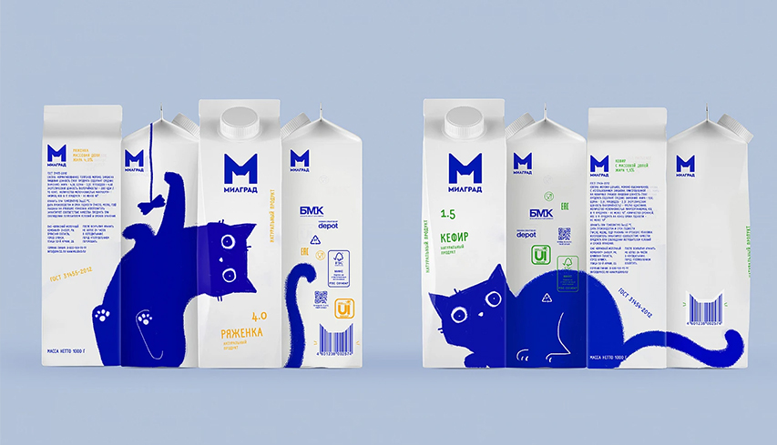
Great designs come and go, but the best often have a habit of resurfacing every now and again. And if you're a follower of Reddit's DesignPorn page, you've no doubt seen some adorable (and downright ingenious) packaging design for a Russian milk brand.
Featuring a blue cat (we're not sure why), the design stands out brilliantly on the shelves. And depending on how the cartons are stacked, it offers several delightfully playful images. And it appears online pretty much every other week. (Looking for inspiration? Check out our guide to the best print ads of all time.)

Created by Russian agency Depot, the packaging for Milgrad’s Bryansk dairy brand is as playful and interactive as it gets. The blue cat can roll on its back, peek its head around corners, duck down and stand tall – all depending on how the cartons are arranged. And of course, the real ingenuity of the design is how it encourages shoppers to buy multiple cartons of the stuff in order to enjoy the full effect at home.
milk_box_desing_of_vera_zvereva from r/DesignPorn
Got to appreciate good packaging design pic.twitter.com/UJnBFHi8bMSeptember 22, 2022
Indeed, there's clever design, and there's cute design. And then there's clever and cute design. And then there's clever and cute cat design. We'll always have time for the latter, which is why we also went wild for this brilliant vet logo last year. If you're looking for more ingenious examples, take a look at the best packaging design of all time.
Read more:
- Disney was right to ditch its original Belle design for Beauty and the Beast
- "Embarrassing" new NFL logo gets panned on Twitter
- The YouTube logo: a history
Get the Creative Bloq Newsletter
Daily design news, reviews, how-tos and more, as picked by the editors.

Thank you for reading 5 articles this month* Join now for unlimited access
Enjoy your first month for just £1 / $1 / €1
*Read 5 free articles per month without a subscription

Join now for unlimited access
Try first month for just £1 / $1 / €1

Daniel John is Design Editor at Creative Bloq. He reports on the worlds of design, branding and lifestyle tech, and has covered several industry events including Milan Design Week, OFFF Barcelona and Adobe Max in Los Angeles. He has interviewed leaders and designers at brands including Apple, Microsoft and Adobe. Daniel's debut book of short stories and poems was published in 2018, and his comedy newsletter is a Substack Bestseller.
