Redesign is lumped in with over 100 new app icons.
(Image credit: Microsoft)
Microsoft has revealed a new Windows logo and a total redesign across a huge 100 of its app icons. But the main thing that stands out about the entire project is how little the new Windows logo stands out. You'd think a brand new Windows logo would be big news in the tech/branding world (and might even be a contender for our best logos post), but the new design is just quietly slotted in there amongst the other icons.
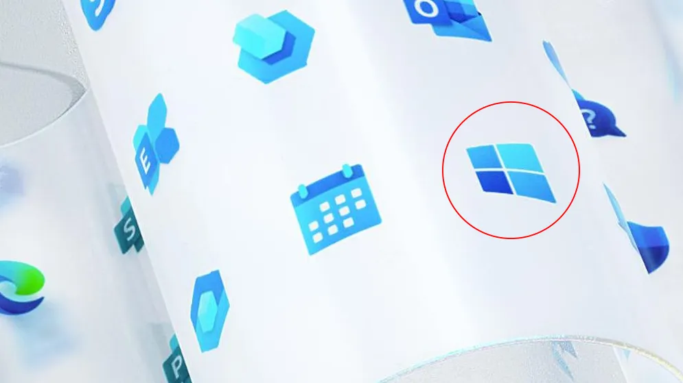
The new Windows logo actually typifies the overall design strategy – so could have been made into the poster child for the redesign. Colour gradients have replaced the flat blue/white, and softer, rounded edges have taken over the traditional squares that previously made up the window.
The new logo (on the left) has been made over with colour gradients and rounded edges (Image credit: Microsoft)
The redesign strategy is about the unification and connectedness of all of those icons across the visual library. This may be why the Windows icon is simply popped in the midst of the rest of the icons that share its colour gradients.
Latest Videos From Creative Bloq
Has Microsoft not gone big on the Windows logo because it didn't want to hold up just one logo above the rest? Maybe this was a deliberate choice, so as not to confuse the overall visual branding strategy (or enrage the whole of Twitter, who do love to criticise a logo in isolation). The concept does seem to rely heavily on the icons being visually in sync with each other.
A full colour palette unifies and organises the app icon library (Image credit: Microsoft)
The new icons use a range of colours and are unified under a sleek new aesthetic. This results in a striking overall visual as you can see in the above sample of the 365 range. Before, the app icon library was a bit of a hodge-podge. Some apps have icons dating back decades, whereas some have been updated pretty recently. So the unification of the library was much-needed.
Jon Friedman, corporate vice president of design and research at Microsoft explains that, "we introduced rich gradients, broadened our spectrum of colours, and implemented a dynamic motion with ribbon-like qualities".
According to Friedman, the Fluent Design System, "promotes building off the familiar," and the finished icon range shows this off, containing mostly tweaks of original designs rather than total overhauls. Those tweaks include gradient colours and rounded edges, as well as a scaling back on detail.
Get the Creative Bloq Newsletter
Daily design news, reviews, how-tos and more, as picked by the editors.
The team had to consider innovation and change whilst retaining familiarity (Image credit: Microsoft)
Friedman explains that the finished result needed to signal innovation and change while retaining familiarity for users. “We also had to develop a flexible and open design system to span a range of contexts while still being true to Microsoft", he says.
As usual, reactions are mixed, although to be fair, there haven't been that many of them. No one seemed to really care too much, particularly about the Windows logo. What little reaction there was seemed to focus on the icons themselves.
Some Twitter users think the scaling back may have gone too far:
[Microsoft design team headquarters]#1: Okay, so the two apps that office workers use constantly are Word and Outlook#2: Right#1: So their icons should be completely indistinguishable.#2: I mean yeahDecember 15, 2019
See more
Others preferred the icons before...
I don't like them, they look like icons from a child game. What happened with the flat design? I really loved that.December 13, 2019
Combining customer familiarity with a forward thinking design seems to be a winning strategy as we head into the new decade. Reebok recently utilised this approach, tweaking and streamlining an original vector logo. But the scale of Microsoft's overhaul is in a different league. Although the reaction to it has been in a league that Microsoft may not have anticipated.
Georgia is lucky enough to be Creative Bloq's Editor. She has been working for Creative Bloq since 2018, starting out as a freelancer writing about all things branding, design, art, tech and creativity – as well as sniffing out genuinely good deals on creative technology. Since becoming Editor, she has been managing the site and its long term strategy, helping to shape the diverse content streams CB is known for and leading the team in their own creativity.