Microsoft’s old logos remind us why we love graphic design
Take a wild trip down memory lane.
Tech giants don't tend to play around with their logos too much. Apple's, for example, has been the same shape since 1977 (albeit in various different colours). But one brand that has chopped and changed its design lots over the years is Microsoft – and the company has been celebrating its old logos this month.
Founded on 4 April 1975, Microsoft entered the world with a rather funky, seemingly disco-inspired logo. And this month, the company has shared an updated version of it, incorporating Windows' famous four-colour scheme. (Looking for logo inspiration? Check out our best logos of all time.)
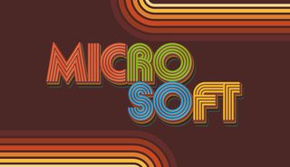
"Microsoft was founded on April 4, 1975. #NewProfilePic and banner to help us celebrate our 46 years in style," the company announced on Twitter. The name has been separated into two words, in a nod to the company's original name: Micro-Soft.
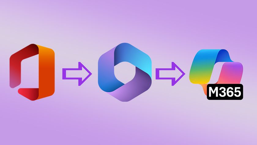
And this week, Microsoft has shared more classic logos (below), showcasing the variety of design styles it has adopted over the last 45 years. From the funky, discotheque (disco tech?) style of the original, to the classic, sans-serif look of the 90s. If you're looking for more typographical inspiration, check out our best free fonts.
What would make these logos even more rad? You. Upload one as your next #MicrosoftTeams background. pic.twitter.com/R9t3TGtVuUApril 28, 2021
But our favourite simply has to be that Metallica-inspired design from the 1980s. Sadly, it only lasted a couple of years – but there's something charming (and faintly ridiculous) about a computer company deciding to go full heavy metal. It's fascinating to see how the wordmark has changed styles over the decades – and a reminder of why we love graphic design.
If Microsoft's logo throwbacks have inspired you to start a logo design project of your own, check out today's best Adobe Creative Cloud deals below. And if you need more nostalgia in your life, these early Mac-inspired iOS 14 icons are a delight.
Read more:
Get the Creative Bloq Newsletter
Daily design news, reviews, how-tos and more, as picked by the editors.
- Apple tweaks its famous logo (and people are unhappy)
- Adobe Creative Cloud discount: All your favourite creative apps for less
- Apple's 2021 iPad Pro release date just leaked (and we're confused)

Thank you for reading 5 articles this month* Join now for unlimited access
Enjoy your first month for just £1 / $1 / €1
*Read 5 free articles per month without a subscription

Join now for unlimited access
Try first month for just £1 / $1 / €1

Daniel John is Design Editor at Creative Bloq. He reports on the worlds of design, branding and lifestyle tech, and has covered several industry events including Milan Design Week, OFFF Barcelona and Adobe Max in Los Angeles.
