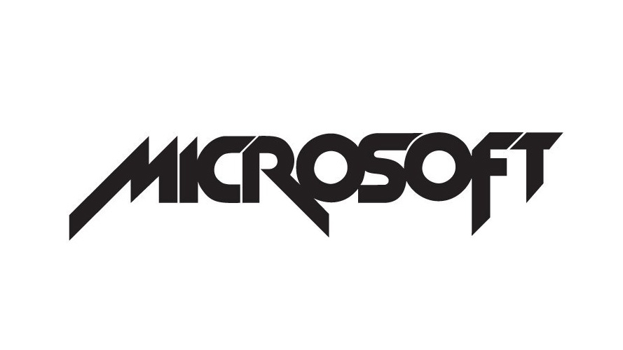
We can't believe how Microsoft's logo looked in 1980
It's a lot less 'software company', and more 'metal band'.
A brand's logo is one of the most important things to get right. How do you distill the entire identity of an organisation into one simple symbol? And then, when things go stale, how do you find a new look that your loyal fans will recognise and embrace?
The whole process is a tricky balancing act. Get it wrong and it's a catastrophe. Which is why we were surprised to discover that Microsoft took such a wild misstep in its branding history.
It's now one of the world's most popular brands (fans: take a look at our roundup of the best early Microsoft Black Friday deals), with a brand mark that wouldn't be out of place in our ranking of the best logos ever. As a reminder, here's what it looks like now:

However, in 1980, Microsoft took a bold step with a logo redesign that left it looking much more like a wild metal band than a reliable, respectable tech company. Sadly, this look only lasted two years.

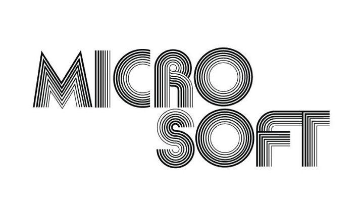
It has more than a whiff of the Metallica logo about it, doesn't it? In fact, during that whole period, Microsoft seems to have been embracing a band logo design aesthetic – the 1975 logo is an impressively 'disco' effort too.

Thanks to Ian Bogost for first bringing this to our attention on Twitter.
Not many people know this, but Microsoft was a metal band from 1980–1982. pic.twitter.com/8sP3dv2lU8November 19, 2019
We will say this for Microsoft though: back in the day, it clearly wasn't afraid of embracing a confident new look. No blink-and-you'll-miss-it redesigns for this software company. For advice on creating a great brand mark, see our logo design tips, or for more recent efforts, explore our roundup of the biggest logo redesigns of 2019.
Get the Creative Bloq Newsletter
Daily design news, reviews, how-tos and more, as picked by the editors.
Read more:

Thank you for reading 5 articles this month* Join now for unlimited access
Enjoy your first month for just £1 / $1 / €1
*Read 5 free articles per month without a subscription

Join now for unlimited access
Try first month for just £1 / $1 / €1

Ruth spent a couple of years as Deputy Editor of Creative Bloq, and has also either worked on or written for almost all of the site's former and current design print titles, from Computer Arts to ImagineFX. She now spends her days reviewing small appliances as the Homes Editor at TechRadar, but still occasionally writes about design on a freelance basis in her spare time.
