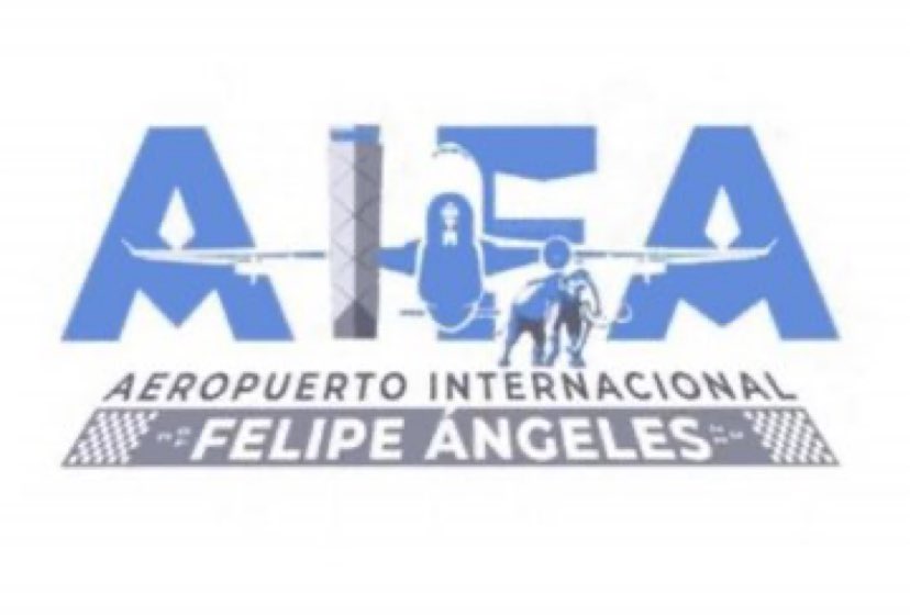
Extraordinary Mexican airport logo throws out the rulebook
(And it doesn't land well.)
While we love a quality logo design, we'll always have time to chuckle at a clanger – and the latest has just landed courtesy of a brand new airport in Mexico City. The design is currently going viral on social media (and not in a good way).
Scheduled to open next March, Felipe Ángeles International Airport (AIFA)'s logo is really, erm, something. It's hard to know exactly where to start with it. We'll begin by saying it probably won't be winging its way into our best logos roundup any time soon.

The logo features the initials AIFA, somewhat obscured by a large plane and, of course, a woolly mammoth. The letter 'I' appears to depict an airport control tower – one which is apparently about to be hit by the wing of said plane. Meanwhile, the full title of the airport sits on a horizontal runway below. Yep – there's a lot going on.
Perhaps the strangest aspect of the logo is that mammoth. But don't worry – there's a perfectly reasonable explanation for its presence. According to Mexico News Daily, during the process of building the new airport, hundreds of mammoth skeletons were discovered. So, you see – one simply had to be on the logo.
While the design hasn't yet been officially announced by the airport, it was spotted in a trademark registration filing. And Twitter has, as Twitter does, made its feelings known about it:
When you ask your nephew to do your logo on Microsoft Paint. (this is the actual logo that the Mexican Army bought for the new Mexico City Airport) pic.twitter.com/KjjgUcFAVwApril 11, 2021
Seriously tho, this can’t really be the logo that presumably some team of professionals agreed on. If it is, it’s safe to say the Mexico City airport is in the hands of a group of 4th graders. Or the mental equivalent thereof. https://t.co/cy97WDu9m1April 11, 2021
"This is an all too common 'throw everything at it' style of design, with little thought to the overall impression it creates," comments one Redditor – which we think just about sums it up. Perhaps the designer ought to have checked out our logo design guide before the project took off. If you fancy having a crack at the design yourself, check out today's best Adobe Creative Cloud deals below.
Read more:
Get the Creative Bloq Newsletter
Daily design news, reviews, how-tos and more, as picked by the editors.

Thank you for reading 5 articles this month* Join now for unlimited access
Enjoy your first month for just £1 / $1 / €1
*Read 5 free articles per month without a subscription

Join now for unlimited access
Try first month for just £1 / $1 / €1

Daniel John is Design Editor at Creative Bloq. He reports on the worlds of design, branding and lifestyle tech, and has covered several industry events including Milan Design Week, OFFF Barcelona and Adobe Max in Los Angeles. He has interviewed leaders and designers at brands including Apple, Microsoft and Adobe. Daniel's debut book of short stories and poems was published in 2018, and his comedy newsletter is a Substack Bestseller.
