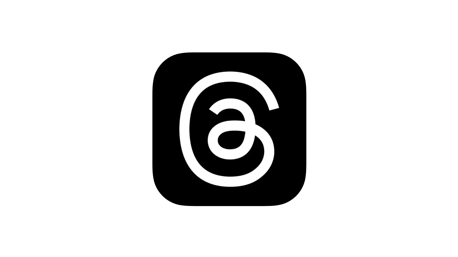
What's the Instagram Threads logo supposed to be, anyway?
It's an ear, right?

Another day, another Twitter clone. Rival companies have been swooping in to take advantage of the chaos wrought on the blue bird site by a certain E. Musk, with alternative platforms arriving left, right and centre. But here's one that might just stand a chance of taking Twitter's crown – once we get past the app icon, that is.
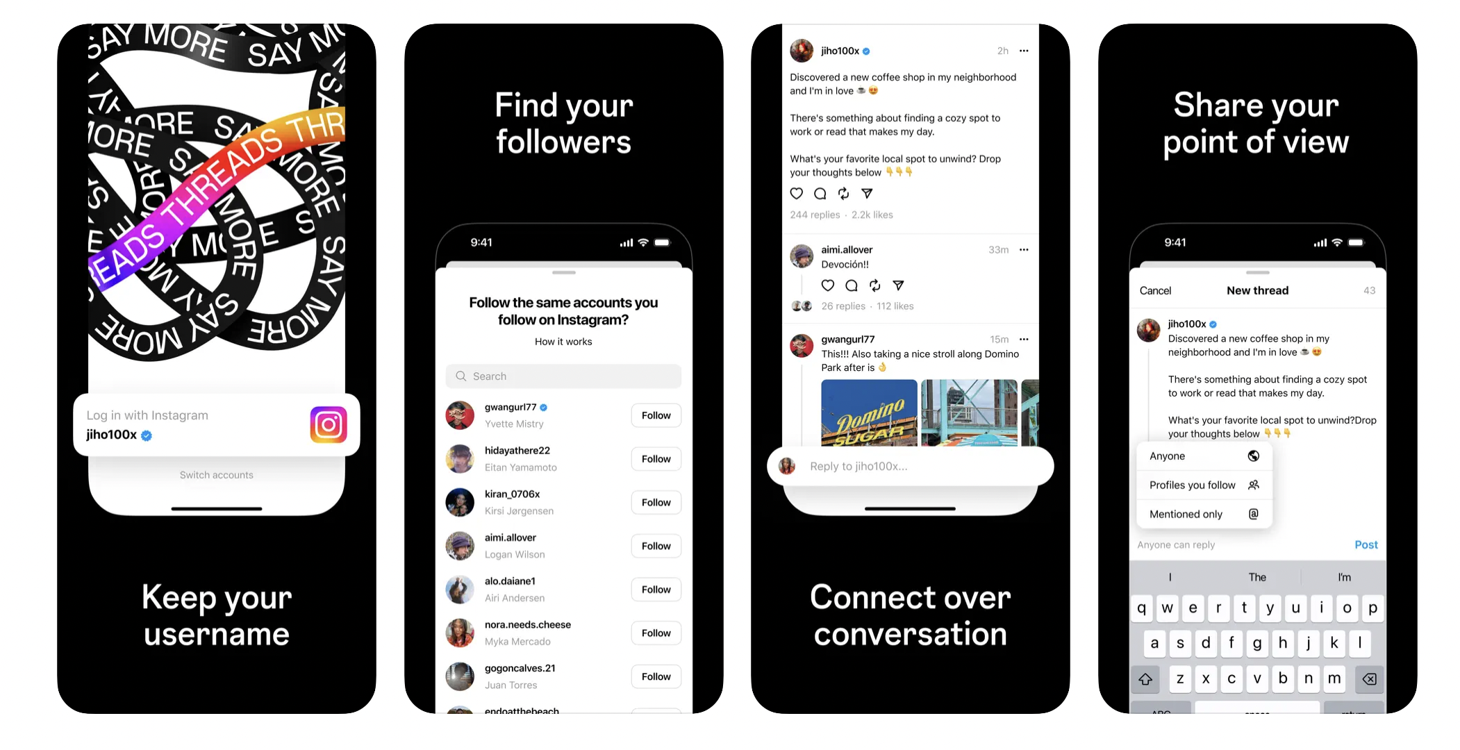
After months of rumours, Meta's rival text-based platform, Threads, finally lands on Thursday, promising deep integration with Instagram. In theory, this could mean millions of users are already on – or at least adjacent to – Threads before it has even launched. But, yeah, what's the logo supposed to be, exactly? Certainly not one of the best logos of all time.
At first glance, the Threads app icon looks like, er, a squiggle. But look into the centre and it soon becomes apparent that it's an '@' symbol (so far, so Twitter). And for my money, it also appears to be somewhat based on the Instagram logo itself – am I seeing a camera in that slightly square shape with the circular centre? No? Just me?

But the design has Twitter users divided – both on what it looks like, and whether or not its any good. From an ear (I can see it) to a Tamil character to the letter 'G', there are a few theories out there.
The logo of threads by @instagram looks like the Tamil letter 'கு' pic.twitter.com/2F7noLGs7DJuly 4, 2023
Just us or does the Threads logo looks like an ear?... pic.twitter.com/5RYnJdUCF8July 4, 2023
Meta's new twitter clone, Threads, launches soon, and liketheir logo a weird @ that looks like a fetus? pic.twitter.com/hihhsmVjZmJuly 4, 2023
Can someone explain the Threads logo to me? It looks to me like @, or a G, or an ear... https://t.co/clSxMqHWxqJuly 4, 2023
Still, like 2014's much-maligned (at the time) Airbnb logo, if the app is successful enough, and the design hangs around long enough, we wouldn't be surprised to see the dissent die down. That said, Instagram hasn't exactly got form when it comes to winning users round to new features – 2022 was something of an 'appus horribilis' for the platform. (Not gonna lie, pretty proud of that one.)
Get the Creative Bloq Newsletter
Daily design news, reviews, how-tos and more, as picked by the editors.

Thank you for reading 5 articles this month* Join now for unlimited access
Enjoy your first month for just £1 / $1 / €1
*Read 5 free articles per month without a subscription

Join now for unlimited access
Try first month for just £1 / $1 / €1

Daniel John is Design Editor at Creative Bloq. He reports on the worlds of design, branding and lifestyle tech, and has covered several industry events including Milan Design Week, OFFF Barcelona and Adobe Max in Los Angeles.
