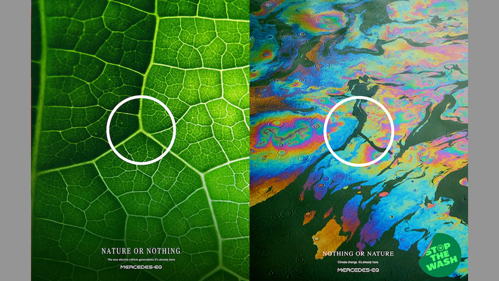
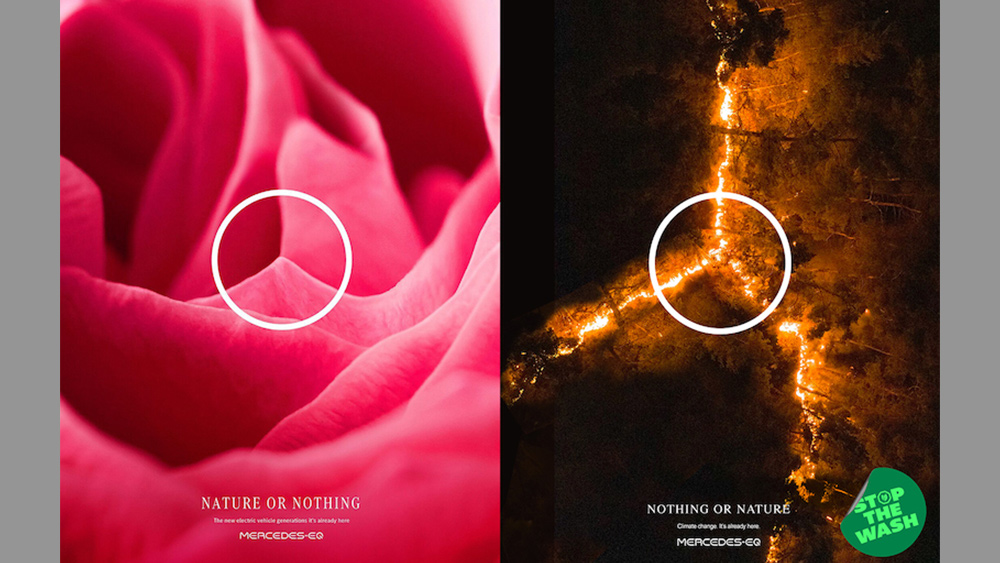
Sometimes a brand campaign can backfire more severely than a car with faulty spark plugs, as Mercedes has just learned. A recent campaign for its electric cars used patterns in nature resembling the brand's famous three-pointed star logo, including a lion's mouth, veins on a leaf and honeycombs. It was a great example of how recognisable a successful logo design can become, but some people felt the choice of subject was more than a little inappropriate.
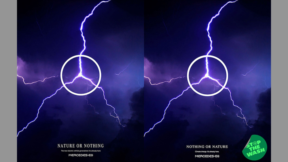
The sustainability scoring platform WhereFrom was quick to see the irony of the campaign and hijacked it with a sharp parody that replaces the scenes of natural beauty with ones that show the impact of climate change, with parched earth, a toxic spill and wildfires. One of the images actually remains the same – a lightning bolt, which must be what this campaign hijacking feels like for Mercedes (by the way, if you're wondering what the Mercedes marque is all about, see our post on the secret behind the Mercedes logo).


The original designs were developed by Leo Burnett Mexico for a campaign to mark Earth Day. They ran on social media with the Spanish text ’Nuestro futuro siempre ha estado aquí’ (’Our future has always been here’), but somehow, somewhere, they got transformed into an English-language version with the text 'Nature or nothing. The new electric vehicle generation. It's already here.'
The campaign received some praise on social media, but WhereFrom, a review platform on which consumers can score products according to their environmental impact, wasn't impressed. With the London-based agency 10 Days, it set out to produce what it says is a more realistic representation of Mercedes’ contribution to nature. As well as changing the images, it changed the text to read 'Nothing or Nature. Climate change. It’s already here,” and added a badge for its 'Stop the Wash' anti-greenwashing campaign.
10 days strategy director and co-founder George White said: “This is Greenwashing 101 – equating Mercedes to the beauty of nature and leading consumers to believe Mercedes is a green company when it's a huge contributor to climate change.” He added that he believed creative agencies should take responsibility for turning out greenwashing campaigns.
A post shared by wherefrom (@wherefrom_uk)
A photo posted by on
Mercedes has now sought to distance itself from the work. It says the pieces were only intended to run in Mexico and that the English text wasn't approved, although that doesn't really weaken WhereFrom's argument. Even the juxtaposition of the Mercedes logo with scenes from nature should surely have been questioned coming just as an environmental group is suing parent company Daimler along with BMW in Germany for refusing to reduce its targets for carbon emissions.
The debacle shows that it always pays to think twice about the wider context of a campaign, no matter how clever the visual design might seem. For some tips on getting the right tone, see our pick of the best print adverts of all time or take a look at our pick of the best graphic design books.
Get the Creative Bloq Newsletter
Daily design news, reviews, how-tos and more, as picked by the editors.

Thank you for reading 5 articles this month* Join now for unlimited access
Enjoy your first month for just £1 / $1 / €1
*Read 5 free articles per month without a subscription

Join now for unlimited access
Try first month for just £1 / $1 / €1

Joe is a regular freelance journalist and editor at Creative Bloq. He writes news, features and buying guides and keeps track of the best equipment and software for creatives, from video editing programs to monitors and accessories. A veteran news writer and photographer, he now works as a project manager at the London and Buenos Aires-based design, production and branding agency Hermana Creatives. There he manages a team of designers, photographers and video editors who specialise in producing visual content and design assets for the hospitality sector. He also dances Argentine tango.
