Bold new mental health website is not what you might expect
And that's exactly the point.
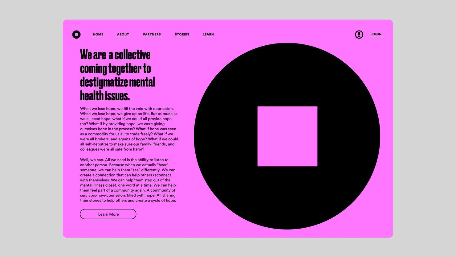
A brand new collaborative platform dedicated to destigmatising mental illness has launched to coincide with Mental Health Awareness Week, featuring a striking identity designed by Pentagram partner Paula Scher and fashion designer Kenneth Cole.
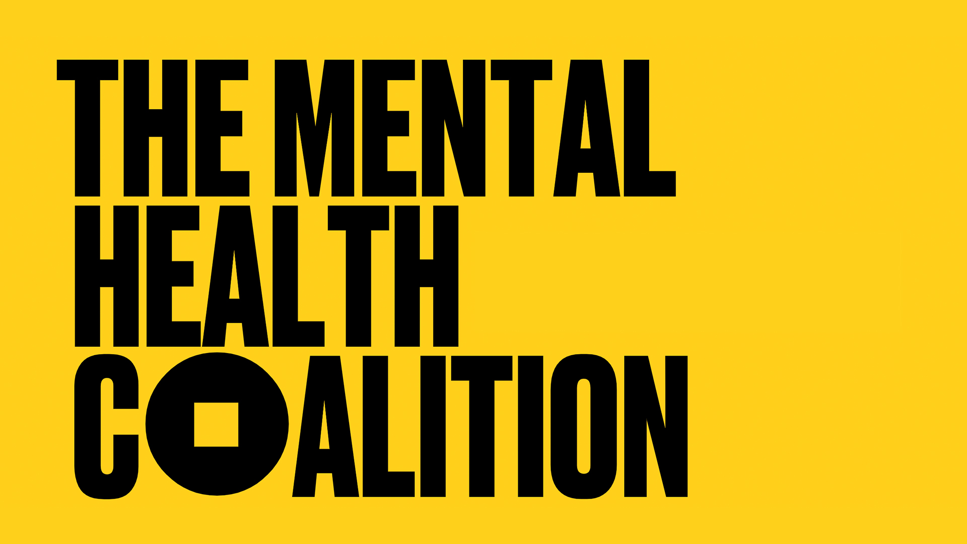
The Mental Health Coalition unites the leading US mental health organisations, along with advocates and celebrities (such as Whoopi Goldberg and Kendall Jenner), all dedicated to changing the way people talk about mental health. The new identity's logo (below) centres around the phrase "square peg in a round hole", representing the fact that there is "no normal" when it comes to mental health. It's a strikingly bold look – check out our logo design guide for more inspiring designs.

With its bright colours and tall, bold typography, Scher describes the identity as "exactly what you wouldn't expect from a mental health site", and we're loving the empowering design. According to Pentagram, the Mental Health Coalition is hoping that the 'square peg' icon "will become the global symbol for mental health" – an ambitious aim, but perhaps it could one day become a universally recognisable design.
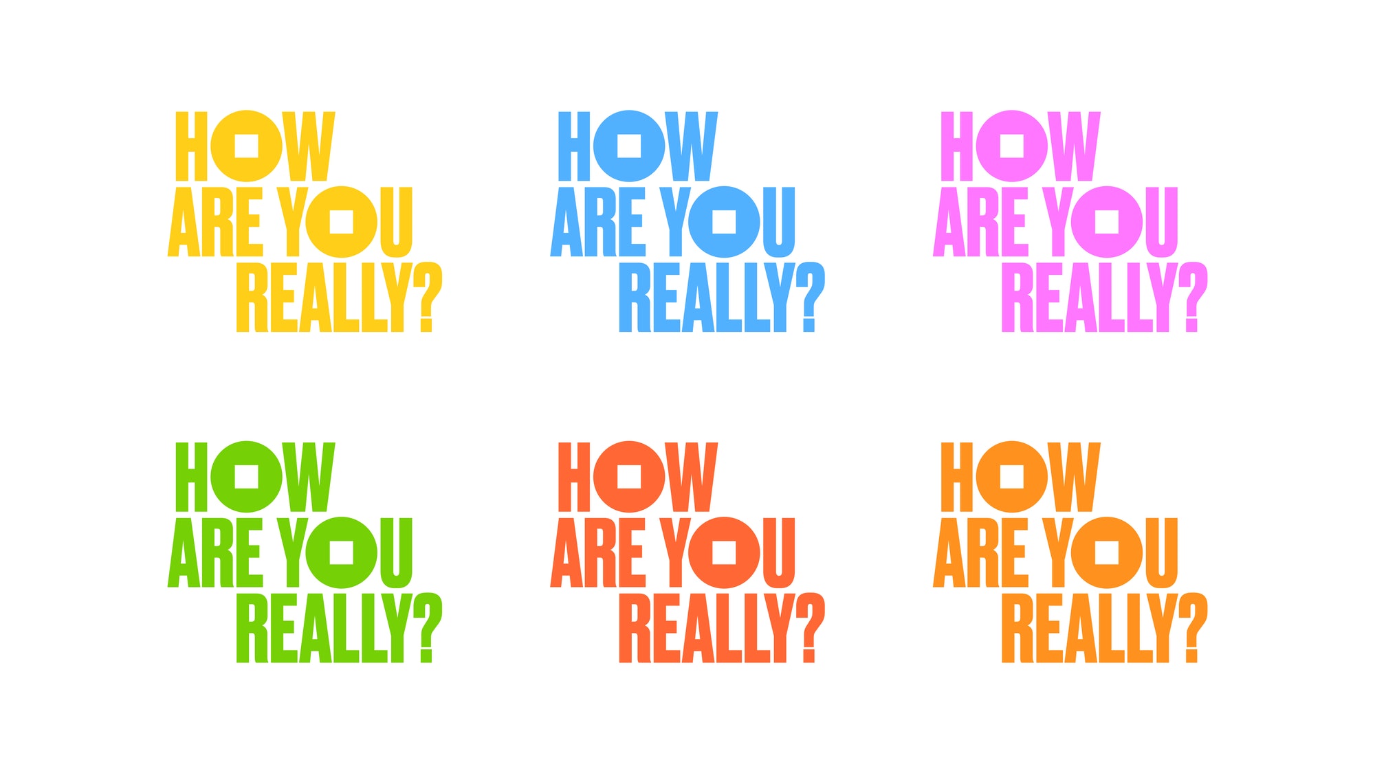
The circular icon is also skilfully integrated into the coalition's wider campaign. It takes the place of the 'o' in the logo for the coalition's new digital storytelling platform called How Are You Really? – which encourages those with mental health challenges to share their own stories.

“I like the way that Pentagram captured the ‘How Are You, Really?’ identity, as distinct from but still cohesive with the Mental Health Coalition,” says Cole. "It will be a hub for oftentimes serious discussion, but it is also interwoven with pops of colour and fun to lighten the mood and increase engagement.” Check out our best web design tools if you're inspired to create your own masterpiece.

For us, this empowering new identity is another winner from Pentagram. We loved its recent simple rebrand for Blood Cancer UK last month, as well as its nautical new look for publisher Thames & Hudson. But while its track record is generally top-notch, even Pentagram can make the odd misstep – this year's TrueCar rebrand failed to reinvent the wheel.
Read more:
Get the Creative Bloq Newsletter
Daily design news, reviews, how-tos and more, as picked by the editors.

Thank you for reading 5 articles this month* Join now for unlimited access
Enjoy your first month for just £1 / $1 / €1
*Read 5 free articles per month without a subscription

Join now for unlimited access
Try first month for just £1 / $1 / €1

Daniel John is Design Editor at Creative Bloq. He reports on the worlds of design, branding and lifestyle tech, and has covered several industry events including Milan Design Week, OFFF Barcelona and Adobe Max in Los Angeles. He has interviewed leaders and designers at brands including Apple, Microsoft and Adobe. Daniel's debut book of short stories and poems was published in 2018, and his comedy newsletter is a Substack Bestseller.
