Ingenious vet logo design drives the internet wild
Now that's how you use negative space.

From FedEx to Amazon, plenty of the most iconic logo designs in the world feature brilliant hidden images or meanings. And now we can add another to the list, courtesy of, er, a UK-based veterinary service.
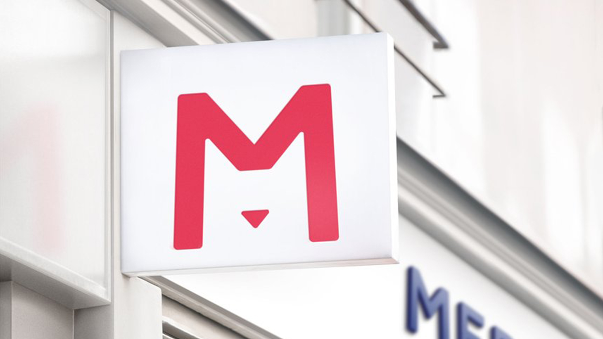
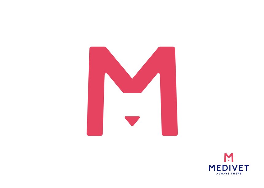
Medivet's logo has gone viral after a Twitter user spotted the design's ingenious use of negative space, which transforms the inside of an 'M' into a cat's face. Like many of the best logos of all time, the design is pretty much guaranteed to raise a smile.

"Imagine how the designer must’ve felt when they came up with this logo," creative director Stu Royall Tweeted alongside an image of the logo. "I’d ruin my life chasing that high again." Indeed, it's certainly a smart design, with the addition of a mere triangle beneath the M creating a 'nose' – and giving enough context to transform that white space into a cat's head (although, are we the only ones getting Batman vibes too?).
Imagine how the designer must’ve felt when they came up with this logo. I’d ruin my life chasing that high again. pic.twitter.com/WWeVU7KYc0November 24, 2021

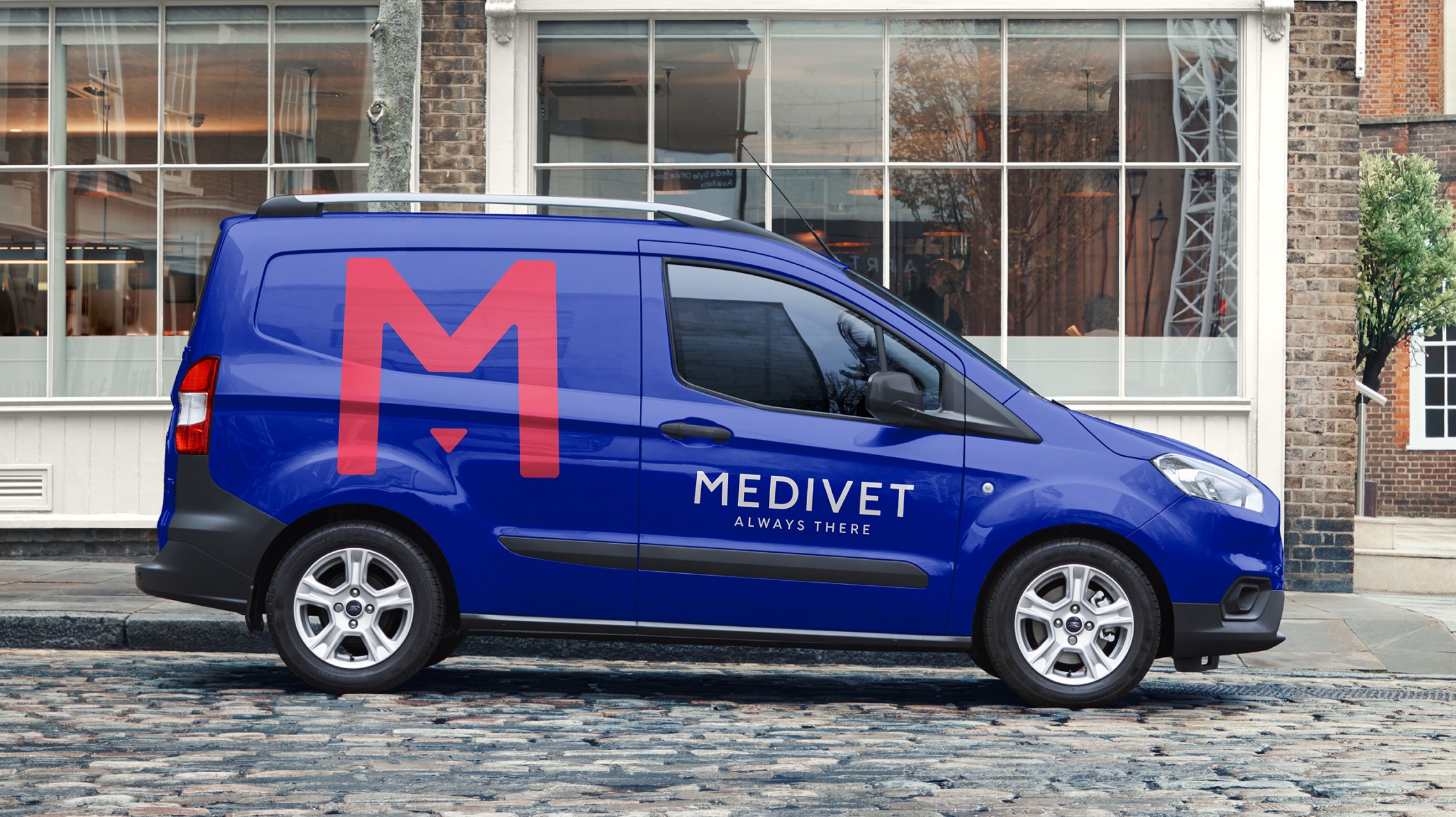
The design by TurnerDuckworth was part of a rebrand for the company last year, and won a Wood Pencil award at the 2020 D&AD awards. And it's certainly proving a hit online, with over 25K upvotes on Reddit. "Excellent concept/idea," one user tweets, while another adds, "I'd give the designer a year off if I was their boss." Check out our roundup of the best uses of negative space for more awesome examples.
This is good.Don’t let the simplicity fool you: This likely didn’t come easy. But you don’t have to be a brand builder to know this is good branding. And that’s the beauty of it. https://t.co/S7DlpC4mCCNovember 25, 2021
We love a good old logo with a hidden message, and Medivet's design is the cat's pyjamas. For more brilliant examples, check out this infographic revealing over 50 logo secrets. And if you're inspired to create a design of your own, take a look at our guide to logo design.
Read more:
- This wooden Lego decor is an interior design dream
- The best infographic maker
- BMW revives 1970s logo – and it's delightfully extra
Get the Creative Bloq Newsletter
Daily design news, reviews, how-tos and more, as picked by the editors.

Thank you for reading 5 articles this month* Join now for unlimited access
Enjoy your first month for just £1 / $1 / €1
*Read 5 free articles per month without a subscription

Join now for unlimited access
Try first month for just £1 / $1 / €1

Daniel John is Design Editor at Creative Bloq. He reports on the worlds of design, branding and lifestyle tech, and has covered several industry events including Milan Design Week, OFFF Barcelona and Adobe Max in Los Angeles.
