Medium reveals (another) new logo – and it's a head-scratcher
Site's third rebrand in five years is... confusing.
Just three years after its last rebrand (and five years after the one before that), online publishing platform Medium has revealed yet another new look. The refresh includes a new colour scheme, illustration style and, most notably, yet another new logo. Is it strong enough to warrant a third rebrand in five years? Rather than yes or no, the response online seems to be a resounding "Eh?"
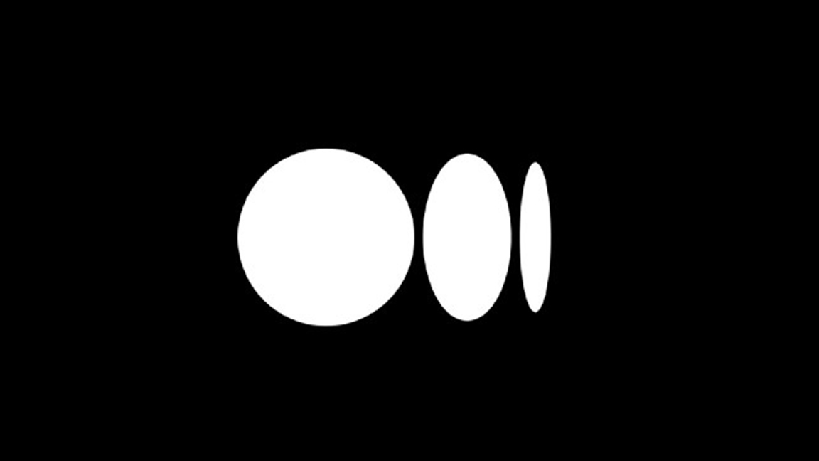
The logo (below) involves three elliptical shapes of varying widths. It's certainly a simple (and perhaps even striking) design, but users are having a hard time understanding exactly what it's supposed to represent. Unlike our best logos of all time, the message here is a little baffling.

In a blog post on its website (by which we mean a Medium post on Medium), the company explains that the design was inspired by language and typography. "It is born from the ellipses: a punctuation mark that represents an unfinished or impending thought, an idea to come, what’s next," says Medium's Karen Tropen. "This is, again, what happens on Medium — there’s always a new idea, always more to the story." (For more typographical inspiration, check out our best free fonts.)
Users have taken to Twitter to express their confusion at the design, with some even presenting their own theories on what the three shapes might represent. One user even manages to recreate the design pretty successfully on Microsoft Paint (because why not?)
Someone help me understand @Medium 's new logo?October 14, 2020
In Medium’s new logo, “the distorted ellipsis,” each circle represents a writer being squeezed by an ever-changing business model pic.twitter.com/uDzipz5rSvOctober 14, 2020
Tutorial of how to recreate @Medium’s new logo pic.twitter.com/82por0S9nNOctober 14, 2020
The new @Medium logo represents my rapidly diminishing sanity from the beginning of 2020 to now. pic.twitter.com/e1lHJQd1EJOctober 14, 2020
How many more times will Medium rebrand...?October 14, 2020
It probably doesn't help that Medium has changed its look quite so often in the last few years. 2015 saw the introduction of a geometric 'M' logo, which was replaced two years later by a flatter, more traditional version of the letter. Three years after that, the 'M' has been usurped by these three, er, things. If Medium itself is confused about its identity, we're not surprised its users are.

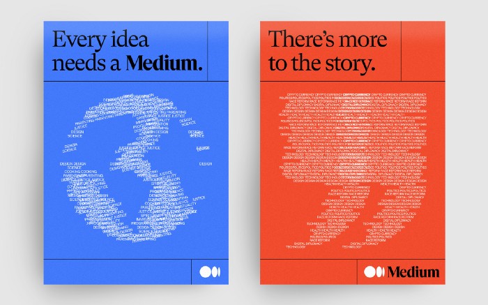
Confusing logo aside, there are actually some brilliant aspects to the rebrand, created in collaboration with New York agency COLLINS. Medium's new illustration style involves a design language based on words and letters, creating a delightfully contemporary yet classy look (above) which perfectly communicates the site's purpose as a platform for writing and ideas. The company's wordmark has also been given a polish (below), with more rounded edges emphasising its literary roots.

Time will tell if, despite the initial confusion, Medium's latest rebrand will end up successful as a whole – we just hope the company decides to hold on to it long enough for us to find out. But If Medium's designers are indeed looking for ideas in another couple of years, our logo design guide is a great place to start.
Get the Creative Bloq Newsletter
Daily design news, reviews, how-tos and more, as picked by the editors.
Read more

Thank you for reading 5 articles this month* Join now for unlimited access
Enjoy your first month for just £1 / $1 / €1
*Read 5 free articles per month without a subscription

Join now for unlimited access
Try first month for just £1 / $1 / €1

Daniel John is Design Editor at Creative Bloq. He reports on the worlds of design, branding and lifestyle tech, and has covered several industry events including Milan Design Week, OFFF Barcelona and Adobe Max in Los Angeles.