I can't get enough of these medieval logo redesigns
I'm lovin' ye olde McDonald's.
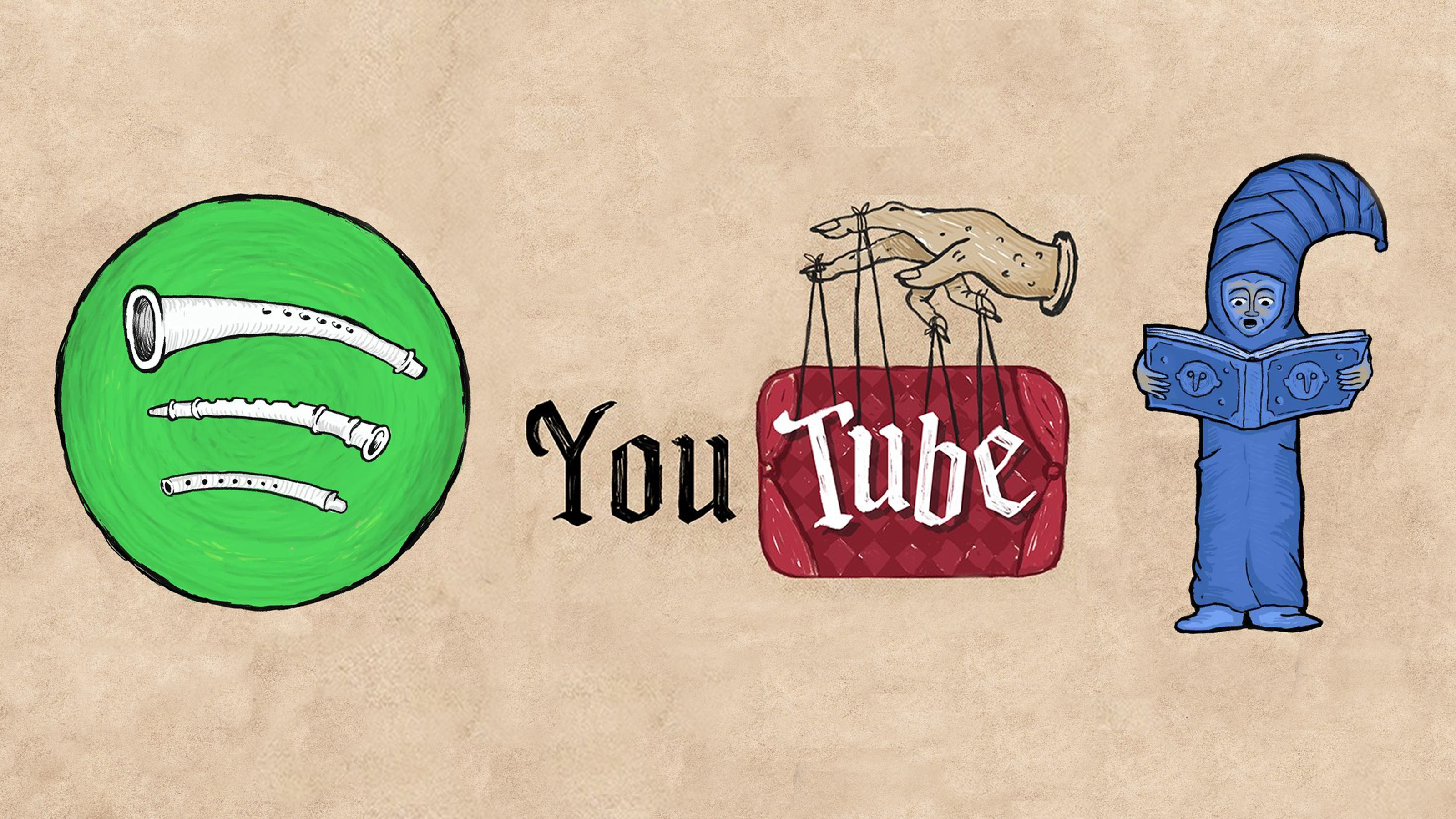
I'm a sucker for a good logo design, and I can't get enough of these entrancing art pieces that reimagine famous logos as medieval illustrations. Artist Ilya Stallone has turned some of the most iconic branding into ye olde masterpieces. If you fancy making your own unique logos, why not check out our guide on how to design a logo?
Each illustration features beautiful parchment-style texture and an iconic old-English font to really make it look like a traditional art piece. The quirky character designs are a particular highlight, and you wouldn't be a fool to assume these were real middle-aged illustrations.
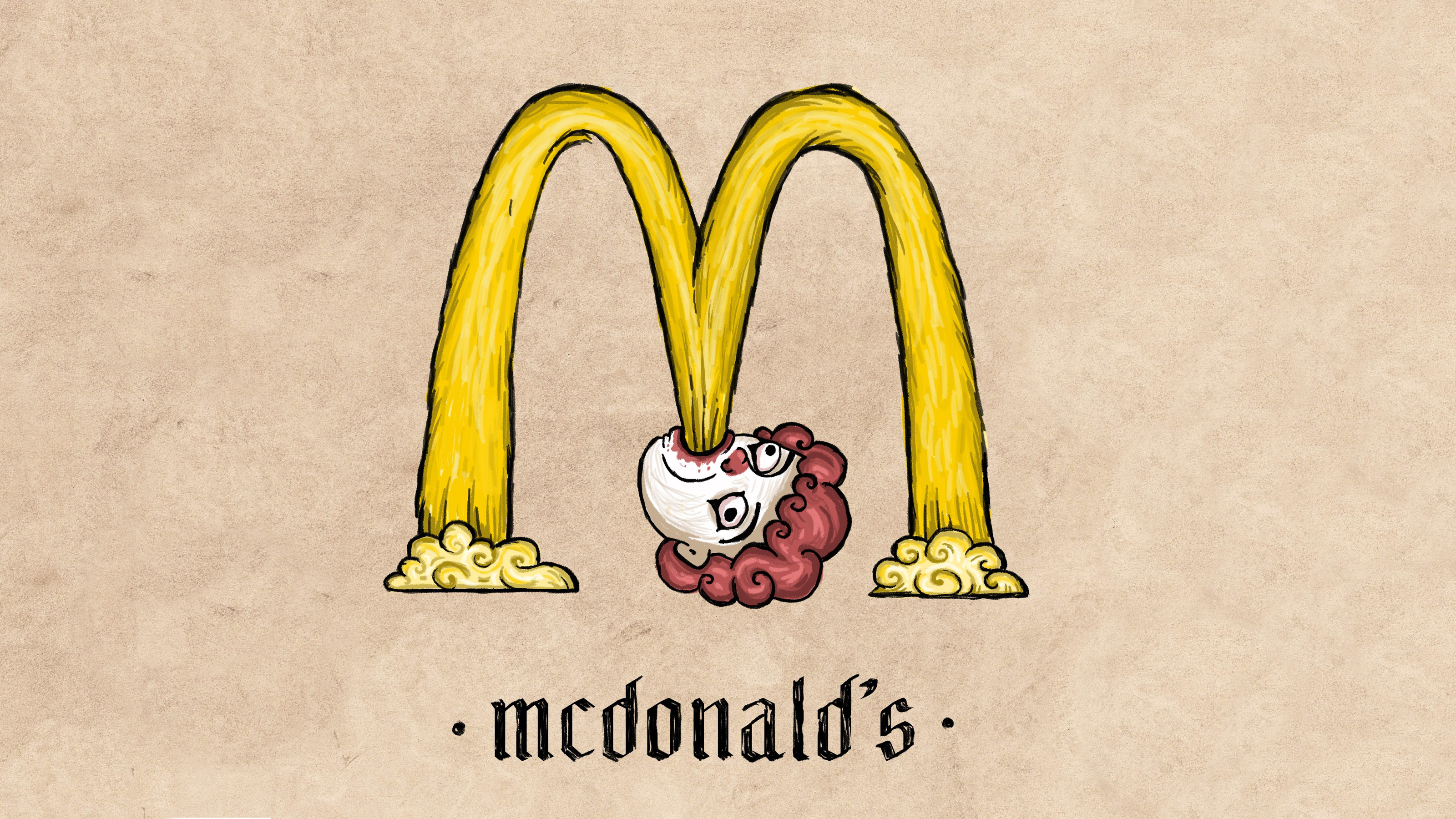
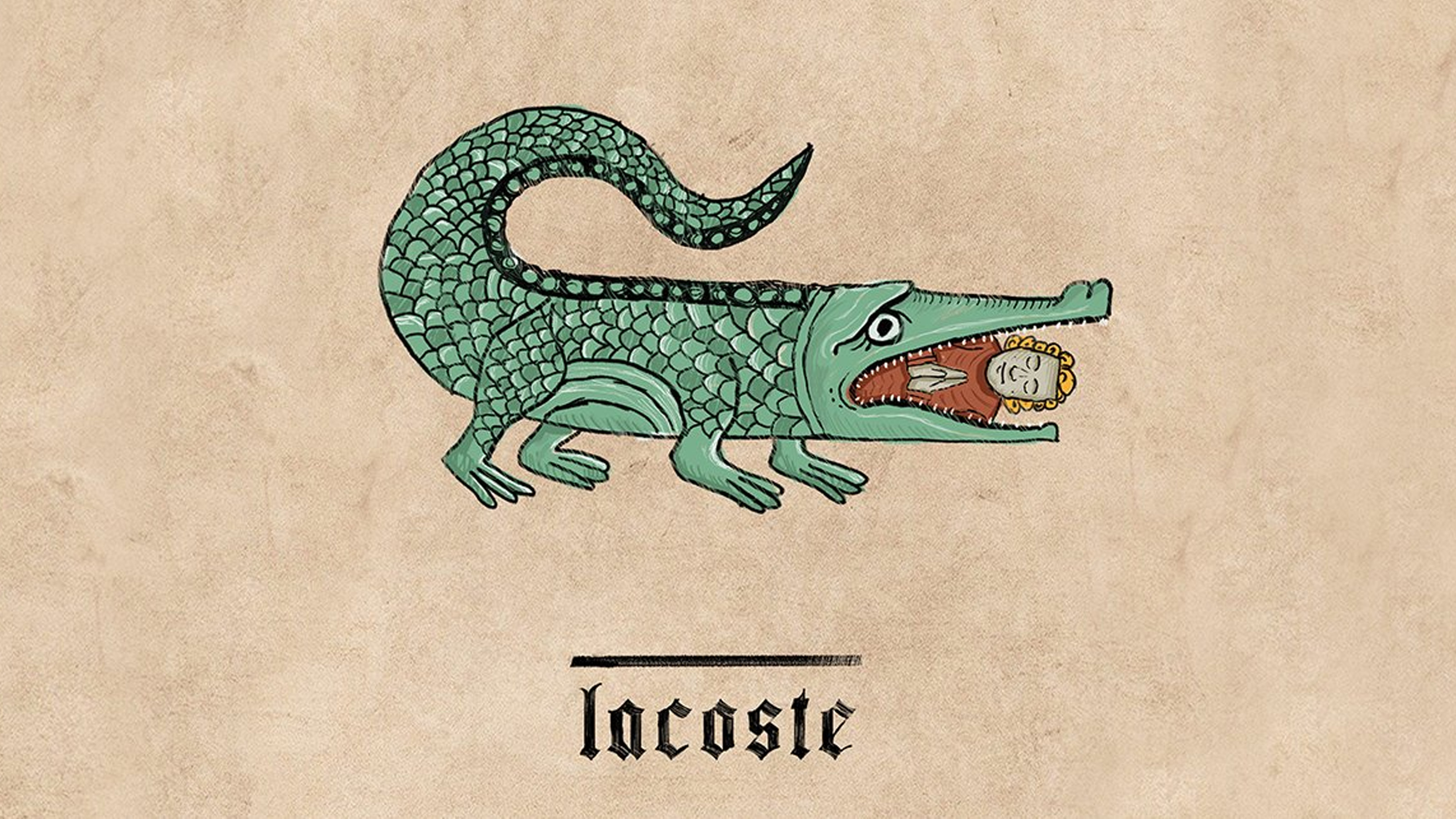

We first reported on this artist back in January 2022 when we shared our favourite of his logos, but since then Ilya Stallone has continued to transform some of the most famous logos we all know and love.
A post shared by Ilya Stallone (@ilya_stallone_artist)
A photo posted by on
This delightful fellow is a particular highlight. Although the original Rolex logo has no frog in sight, Stallone has cleverly taken the original green font as inspiration to design an accompanying froggy friend to wear the iconic crown. It's certainly a lot cuter than the original design.
A post shared by Ilya Stallone (@ilya_stallone_artist)
A photo posted by on
This reimagining of the KFC logo is another favourite. Stallone has transformed the iconic Colonel Sanders into an artistic portrait with his hair piece evolving into a chicken (as you do). I particularly love how the background resembles that of a traditional coat of arms that features the iconic shade of red that KFC uses in its branding.
We see a lot of smart branding redesigns by other artists, like these gorgeous vintage logos that take us on a nostalgia trip. In fact, sometimes the fan designs are better than the original company itself if that terrible Hersheys rebrand is anything to go by. But overall, Stallone has done an excellent job in reimagining these popular brands in his own unique way that everyone can appreciate.
Read more:
Get the Creative Bloq Newsletter
Daily design news, reviews, how-tos and more, as picked by the editors.
- The Nike logo: a history
- TikTok still can't get over that terrible Hershey's logo redesign
- The best graphic design software

Thank you for reading 5 articles this month* Join now for unlimited access
Enjoy your first month for just £1 / $1 / €1
*Read 5 free articles per month without a subscription

Join now for unlimited access
Try first month for just £1 / $1 / €1
Abi Le Guilcher previously worked as Creative Bloq’s former ecommerce writer. With a Bachelor of Arts in Creative Design for Game and Film, Abi enjoys almost anything creative and will either be found crafting or gaming in her spare time. Her previous experience as a retail assistant at CeX means she has a wide range of knowledge in both technology and media and loves to keep up to date with the latest tech. Abi is an avid cosplayer and has most recently worked with PlayStation and Santa Monica Studio on a promotional campaign for the release of God of War Ragnarök.
