McDonald's posters go viral for all the wrong reasons
McDonald's Portugal campaign is pulled after online backlash.

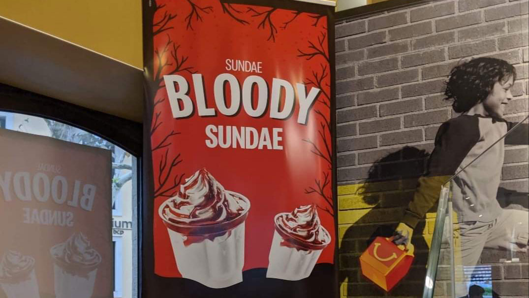
McDonald's has become one of the world's biggest brands thanks in no small part to its adverts. But while it might be behind some of the best print ads we've seen, a recent poster campaign spotted in its Portugal stores has provoked an online backlash so intense that it's been forced to remove them from display.
The posters in question promote a Halloween-themed two-for-one offer on McDonald's strawberry sundaes with the phrase 'Sundae Bloody Sundae'.
Considering that Bloody Sunday is a term used to refer to one of the worst days of the Troubles in Northern Ireland, when 13 people were shot dead by the army, it's an unfortunate choice of words to say the least.
As is the case with these sorts of mistakes, the posters were promptly distributed online for everyone to pick apart and shame. Twitter user @bigmonsterlove shared an image of the posters taken by James Timoney with the caption: "Portugal is cancelled", which soon went viral.
Portugal is cancelled. pic.twitter.com/X1egoGRq9jOctober 30, 2019
In the replies, Twitter users soon began the back-and-forth debate over whether or not the posters were an honest mistake. We think @bigmonsterlove summed things up well by saying, "I'm not pissed off, but like an ad agency clearly didn't do its homework, or did and maybe knew it would ruffle feathers."
In response to the controversy, a spokeswoman for McDonald's Portugal told the BBC: "We sincerely apologise for any offence or distress this may have caused."
She then explained that the campaign was intended as a celebration of Halloween, not as an insensitive reference to any historical event or to upset or insult anyone.
Get the Creative Bloq Newsletter
Daily design news, reviews, how-tos and more, as picked by the editors.
This isn't the first design fail to strike McDonald's recently. Back in August thirsty patrons in McDonald's Japan spotted an accidentally smutty side to its summer romance themed cups.
At least McDonald's France seems to be getting its posters right. In July it used minimalist ads inspired by French fries to guide motorists to the nearest store.
Related articles:

Thank you for reading 5 articles this month* Join now for unlimited access
Enjoy your first month for just £1 / $1 / €1
*Read 5 free articles per month without a subscription

Join now for unlimited access
Try first month for just £1 / $1 / €1

Dom Carter is a freelance writer who specialises in art and design. Formerly a staff writer for Creative Bloq, his work has also appeared on Creative Boom and in the pages of ImagineFX, Computer Arts, 3D World, and .net. He has been a D&AD New Blood judge, and has a particular interest in picture books.
