I can't stop raising my eyebrows at the new McDonald's advert
There's not a burger in sight.

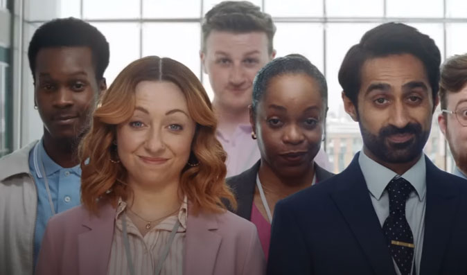
A week or so ago, McDonald's seemed to be teasing a new version of its logo on Instagram. And while at the time there were plenty of ideas around what this new logo could signify – a new adult Happy Meal, for example – it turns out we were all wrong. Because the new logo actually represents a pair of raised eyebrows, in a 60-second spot named Raise Your Arches.
The new ad, shot by Shaun of the Dead and Hot Fuzz director Edgar Wright sees a lady in the office draw an 'M' on a Post-It and raise her eyebrows at a colleague. This eyebrow raise turns out to be the logo outline that was hiding under our noses (or above them), and is now the new signal for 'Fancy a McDonald's?'. The eyebrow raising spreads around the office until all the staff are filing down the stairs, presumably on the way to McDonald's. It's a novel take on the famous golden arches, and in all honesty, it's a stroke of genius – the entries in our best logos list could take note.
The advert is notable for a few reasons. It doesn't feature any burgers, for a start. There isn't a single shot of a McDonald's restaurant. There's no sign of the 'ba da ba ba ba, I'm lovin' it' theme. In short, it rips up the rule book and spits it out again.
But does it work? On the plus side, I like the addition of a few clever details that give a nod to the brand. First of all, the first lady who appears is wearing McDonald's colours. The black 'M' on the Post-It shows how little we need to recognise those famous golden arches. The window cleaners dressed in red and yellow also provide a link to the brand, and their reflections in the window add to this.
The whiteboard in the meeting room also changes, before and after the eyebrow raise. At first it says 'bored, distracted, hungry, tired, fomo, thirsty', and then post-eyebrow it says 'idea! positive attitude, relax, awake'. Which could read like a before and after eating McDonald's (except my list would usually include 'sick' and 'full of regret'). Then there's the yellow bucket at the end and the mop – is it shaped like an 'M'? or am I reading too much into it?
On the downside, the office feels a little dated. Are there that many people actually in any office these days? And wouldn't there by a mighty queue if the whole lot of them did traipse down to their nearest branch?
What it all comes down to, ultimately, is the eyebrows. And although I'm not a fan of McDonald's food, I've got to admit that #RaiseYourArches really works, particularly as the eyebrow raises are so perfectly timed with the soundtrack of Yello’s Oh Yeah. There's also an accompanying social campaign that includes Snapchat and Instagram lenses that enable people to raise their eyebrows to invite their friends to go to McDonald's. We raise an eyebrow to whoever came up with that one.
Get the Creative Bloq Newsletter
Daily design news, reviews, how-tos and more, as picked by the editors.
Read more:
- How to design a logo: 15 pro tips
- The story behind the McDonald's logo
- These are the only blue McDonald's arches in the world

Thank you for reading 5 articles this month* Join now for unlimited access
Enjoy your first month for just £1 / $1 / €1
*Read 5 free articles per month without a subscription

Join now for unlimited access
Try first month for just £1 / $1 / €1

Rosie Hilder is Creative Bloq's Deputy Editor. After beginning her career in journalism in Argentina – where she worked as Deputy Editor of Time Out Buenos Aires – she moved back to the UK and joined Future Plc in 2016. Since then, she's worked as Operations Editor on magazines including Computer Arts, 3D World and Paint & Draw and Mac|Life. In 2018, she joined Creative Bloq, where she now assists with the daily management of the site, including growing the site's reach, getting involved in events, such as judging the Brand Impact Awards, and helping make sure our content serves the reader as best it can.
