These McDonald’s ads are brilliantly unappetising
And I’m lovin’ it.

Ah, McDonald's. The fast-food chain probably has the most iconic branding of the 21st century with those famous golden arches. And being as famous as it is, it's no surprise that it can use some of the best ad designers to create some seriously clever promotional campaigns, right?
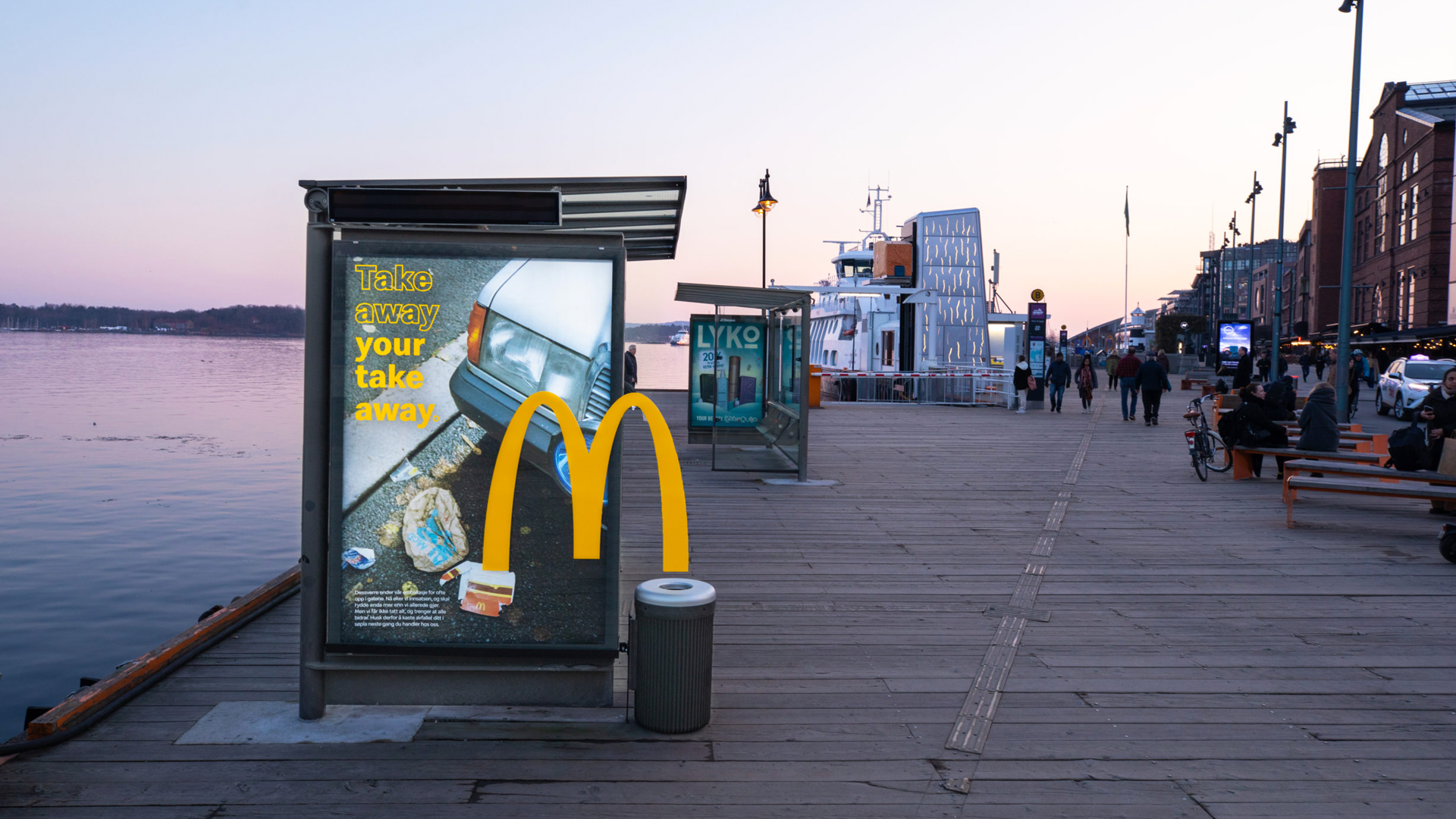
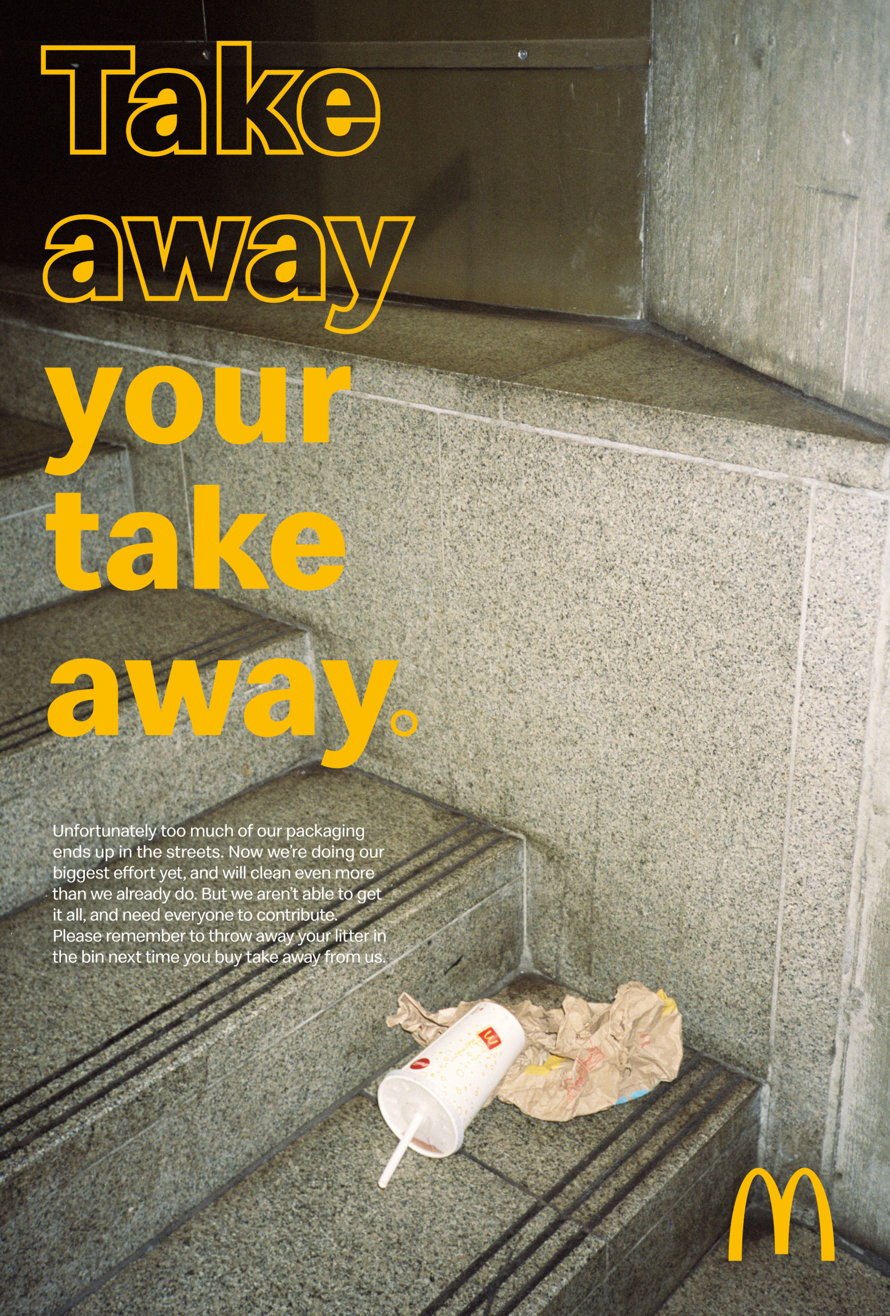
In Norway, McDonald's has released a genius print ad campaign to help prevent its customers from littering. The ads feature some pretty unconventional ways of catching your eye, but we're impressed by their originality. If you're designing your own ads and are looking for some inspiration, then make sure you check out our roundup of the best print ads of all time.

The campaign is called Take Away Your Take Away and aims to tackle the issue of littering. Some of the ads in the campaign feature some, um, rather unflattering shots of rubbish from McDonald's customers to highlight littering. And while the photos are far from aesthetically pleasing, they certainly make you stop and look.
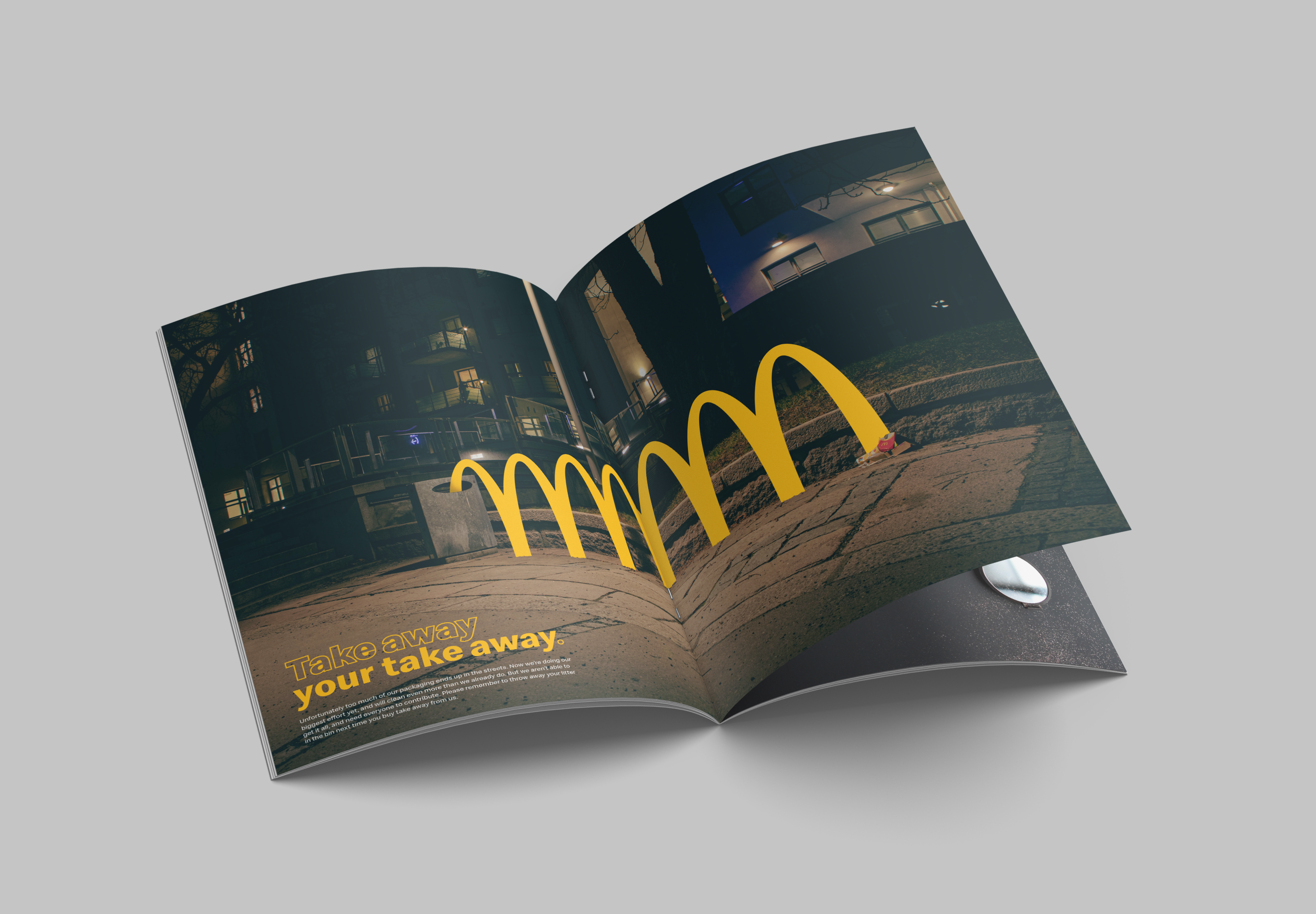
In the campaign, McDonald's has also taken to the streets of Oslo and has positioned bins next to its print ads. The golden arches in the designs cleverly lead onlookers toward the bin (see above). In the likes of magazines, the famous yellow M's are portraying a bouncing motion towards the bin (see below).

The designs were created by NORD DDB, which is responsible for some other clever McDonald's ads. The Swedish communications company has featured her on Creative Bloq before with its ingenious bee hotel ads aptly called, 'The McHive'. However, its Eyes On The Fries campaign left us feeling, erm, utterly confused.
Senior marketing manager for McDonald's Norway, Mari Husby, has said about the campaign, "We’re [McDonald's] responsible for one of the biggest and most visible parts of littering. We’re definitely not pleased when we see trash from our restaurants lying around. This is a big problem for our communities, cities and the environment. With our size and influence, we can do a lot better than we do today”.
While we love the designs, we hope that people are encouraged to bin their rubbish so McDonald's doesn't have to create such ick-inducing photos. If you loved these print designs and want to have a go at making your own, then make sure you check out our guide on how to download Photoshop and get creating.
Get the Creative Bloq Newsletter
Daily design news, reviews, how-tos and more, as picked by the editors.
Read More:

Thank you for reading 5 articles this month* Join now for unlimited access
Enjoy your first month for just £1 / $1 / €1
*Read 5 free articles per month without a subscription

Join now for unlimited access
Try first month for just £1 / $1 / €1

Amelia previously worked as Creative Bloq’s Staff Writer. After completing a degree in Popular Music and a Master’s in Song Writing, Amelia began designing posters, logos, album covers and websites for musicians. She covered a range of topics on Creative Bloq, including posters, optical illusions, logos (she's a particular fan of logo Easter eggs), gaming and illustration. In her free time, she relishes in the likes of art (especially the Pre-Raphaelites), photography and literature. Amelia prides herself on her unorthodox creative methods, her Animal Crossing island and her extensive music library.
