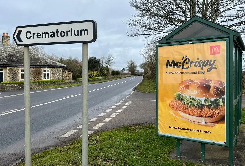
A bizarrely tasteless McDonald's poster just got taken down
(But the replacement isn't much better.)

McDonald's is known for the quality of its print advertising, with its creative campaigns often playing with our expectations of a billboard or poster. We've seen the company ditch its branding, create type-only ads and even create a fully functioning sundial. But here's an ad that proved subversive for all the wrong reasons.
A poster for McDonald's' McCrispy burger has raised eyebrows in Cornwall, thanks to its rather unfortunate placement right behind a sign for a crematorium. And now it's been removed and replaced with something just as darkly amusing. (Looking for inspiration? Check out the best print ads of all time.)

Indeed, it appears to have been the burger brand's most accidentally tasteless ad yet. "Although I can see the funny side, it is tasteless and I'm sure some grieving family members won't like to see it when visiting Penmount for the funeral and cremation of a loved one," one local told Cornwall Live.
And now, it's been removed. A McDonald's representative told Business Insider, "We were unaware of the road sign in the vicinity of this bus stop. However, in light of the concerns raised by Cornwall Live, we have asked for our advertisement to be removed."

So, what's gone up in its place? A poster for local art gallery Tate St Ives, which leads with the text, "Get your locals' pass". Yep, at a glance, it looks like the poster might just be advertising a £5 locals' pass to the crematorium. You couldn't make it up.
McDonald's has made some brilliant print ads, including its recent ingenious McDelivery ads in France. But this is by no means the first time McDonald's has come under fire for its advertising. Back in the completely quiet and uneventful year that was 2020, the brand was criticised for a tasteless logo change promoting social distancing.
Read more:
- Former Russian McDonald's rebrand – but the new logo looks ...
- McDonald's reveals surprise new look (but can it take Burger King's crown?
- Wait a minute, is McDonald's teasing a new logo?
Get the Creative Bloq Newsletter
Daily design news, reviews, how-tos and more, as picked by the editors.

Thank you for reading 5 articles this month* Join now for unlimited access
Enjoy your first month for just £1 / $1 / €1
*Read 5 free articles per month without a subscription

Join now for unlimited access
Try first month for just £1 / $1 / €1

Daniel John is Design Editor at Creative Bloq. He reports on the worlds of design, branding and lifestyle tech, and has covered several industry events including Milan Design Week, OFFF Barcelona and Adobe Max in Los Angeles.
