McDonald's reveals surprise new look (but can it take Burger King’s crown?)
Another month, another burger rebrand.
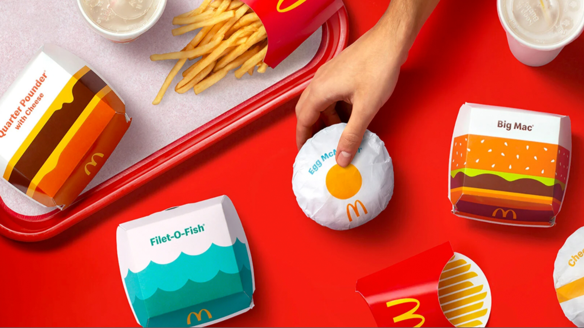
Hot off the heels of Burger King's bold, illustration-led rebrand last month, McDonald's has unveiled a redesign of its own – and it's very, well, bold and illustration-led. Favouring bright graphics and prominent typography, the new look sees its entire packaging receive a playful makeover that's fun, celebratory and retro – just like its rival's.
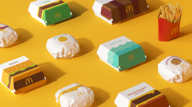
Designed to bring "a sense of joy and ease" to the brand, the redesign features delightfully simple vector-style illustrations depicting its most iconic products and ingredients. (Check out our best Illustrator tutorials if you're inspired to create your own packaging design.)

"We pulled out the most delicious and iconic aspects of each menu item to redesign their entire packaging system from top to bottom," says Pearlfisher, the agency behind the new look. "Bringing personality to life through simple illustration allows for the packaging to be functionally unique, easy to identify, aesthetically minimal and, most importantly, emotionally joyful."

While it might be yet another exercise in flat design, McDonald's new packaging design manages to stand out from the (very large) crowd. The basic, geometric shapes (below) and relatively simple yet bold colour scheme manage to juggle a functional purpose (each product is easily recognisable) with that all-important sense of fun. There's also a pleasing retro quality to the new aesthetic as a whole, emphasised by the clean, sans-serif typeface.

But how does it fare in the burger wars? Given the proximity of their unveilings, it's hard not to compare McDonald's' effort with Burger King's excellent rebrand – and the similarities haven't gone unnoticed on Twitter (below). With its juicy new logo and typeface, we'd say the King gets to keep the crown this time.
Then again, perhaps it's a little unfair to compare – McDonald's' is a rather less comprehensive rebrand, with no changes to its main logo (an iconic design arguably up there with the best logos ever).
Anyone else notice a pattern?February 14, 2021
Probably an unpopular opinion but I'm not a fan of the new McDonalds packaging. It's alright. but I feel they could have actually hired someone like Draplin to do the visuals. I neither hate it or love it. Burger King did better. pic.twitter.com/V98QZTQz00February 15, 2021
When your biggest competitor just absolutely nailed a fun packaging update you simply have to respond. I really like the simplicity of what has been done here, but BurgerKing's packaging has the edge - the retro, nostalgic feel makes this new McDonalds range look second choice. https://t.co/YgvnAyqySSFebruary 16, 2021
While some corners of the internet are clearly suffering from flat design fatigue, we're still seeing new examples of ingenious minimal graphic design. McDonald's' new look might not be quite as sizzling as Burger King's, but both prove there's still plenty of room for playfulness in the world of flat design.
Get the Creative Bloq Newsletter
Daily design news, reviews, how-tos and more, as picked by the editors.
Read more:

Thank you for reading 5 articles this month* Join now for unlimited access
Enjoy your first month for just £1 / $1 / €1
*Read 5 free articles per month without a subscription

Join now for unlimited access
Try first month for just £1 / $1 / €1

Daniel John is Design Editor at Creative Bloq. He reports on the worlds of design, branding and lifestyle tech, and has covered several industry events including Milan Design Week, OFFF Barcelona and Adobe Max in Los Angeles.
