McDonald's apologises after tasteless logo change
Opportunistic ad gets fierce backlash.
In light of this week's controversy around Burger King, who tried to mark International Women's Day in a positive way, but ended up just annoying a lot of people and having to apologise, we take a look back at a mis-step from rival burger brand, McDonald's, in March 2020...
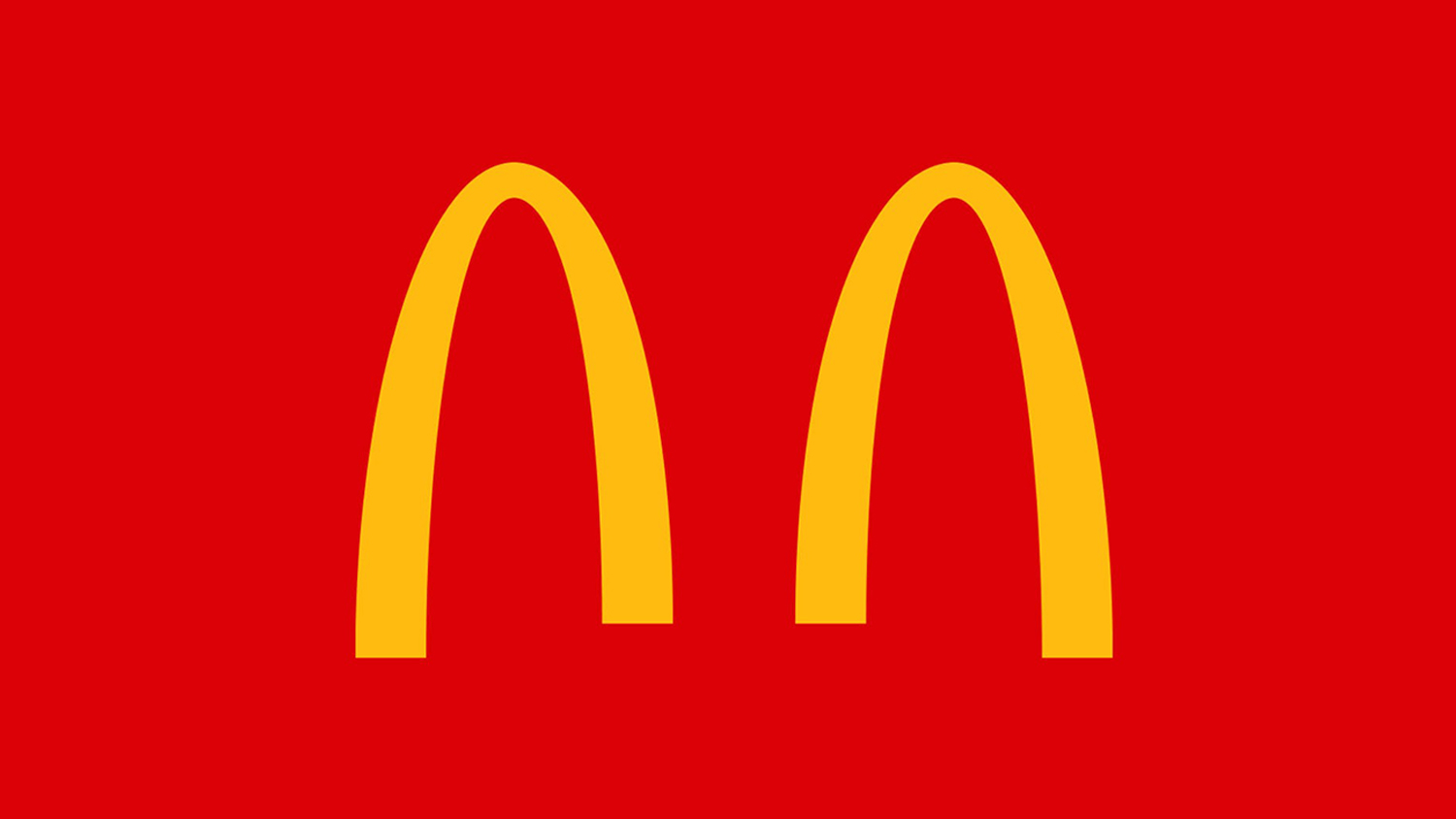
Brands are continuing to respond to the spread of coronavirus, with many using their platform to highlight the importance of social distancing. Last week, McDonald's shared a minimalist ad in which its two famous golden arches became separated – and the internet was not impressed.
The ad, created by agency DPZ&T, appeared across all of McDonald's Brazil's social media accounts to convey the idea that we are "separated for a moment so that we can always be together". However, after a fierce backlash, the altered logo and accompanying social media posts have already been deleted. It's safe to say this attempt won't be gracing our best logos list.

While speculative creative efforts (such as Jure Tovrljan's iconic logos reimagined for the age of coronavirus) have gone down well online, it seems it isn't enough for corporations to make fun, creative tweaks if they aren't backed up by actual action.
Twitter users were quick to blast McDonalds's seemingly opportunistic effort. "Shame on everyone turning this pandemic into an award brief" said @rafapcolombia, while @VanLigon simply asked, "How about pay your workers a living wage?" Perhaps @LaurelLu puts it best:
I don’t want your cute logo play McDonalds. I want you offering a million free meals to those in need. I want you turning your drive thru into safe testing sites. I want you doubling down on that happy meal box content for kiddos who are stuck inside RN. https://t.co/xgpf2mIaQeMarch 20, 2020
Not only has McDonald's Brazil removed all trace of the tasteless ad, but it has also apologised. A statement to the New York Post, said: “As a brand that operates in nearly 120 countries, we share a collective responsibility to help our communities in times of need. We apologise for any misunderstanding of the intent to remind our customers and communities on the importance of social distancing during these uncertain times.”
We hope this will be a lesson to other brands considering a quick, tokenistic response to the current situation. While McDonald's has made some successfully bold creative moves in the past (such as these minimal, type-only ads), it's safe to say this was a supersize mistake.
Get the Creative Bloq Newsletter
Daily design news, reviews, how-tos and more, as picked by the editors.
Related article:

Thank you for reading 5 articles this month* Join now for unlimited access
Enjoy your first month for just £1 / $1 / €1
*Read 5 free articles per month without a subscription

Join now for unlimited access
Try first month for just £1 / $1 / €1

Daniel John is Design Editor at Creative Bloq. He reports on the worlds of design, branding and lifestyle tech, and has covered several industry events including Milan Design Week, OFFF Barcelona and Adobe Max in Los Angeles. He has interviewed leaders and designers at brands including Apple, Microsoft and Adobe. Daniel's debut book of short stories and poems was published in 2018, and his comedy newsletter is a Substack Bestseller.
