The McDonald's logo, like you've never seen it before
But still instantly recognisable.

McDonald's arches are so iconic they have even inspired their own haircut (hello '90s), and the fast food giant is now so sure you'll recognise its logo, its latest ad campaign only displays half an arch. In a series of ads that sees a golden curve soaring over the rooftops, McDonald's uses just a portion of its arch to highlight its home delivery service – and we think the campaign is an Arch De Triumph (sorry).
Sounds bold, but McDonald's has been displaying this level of confidence for a good while now, with ads worthy of our best print ads roundup. In fact, this half-logo is the most the symbol has been seen in ages, with recent examples relying purely on the brand's recognisable typography and colour palette.

Ad creator Leo Burnett London, has relied on the specific curvature of the arch (and, of course, the signature golden yellow colour) to tell the brand's story. Cleverly, the arch lights up a single window from behind to highlight the home of someone enjoying a home delivery from the brand – glowing next to the dullness of their neighbours. The image gives the impression of a McDonald's order leaping from a store into a home like something out of a sci-fi film.

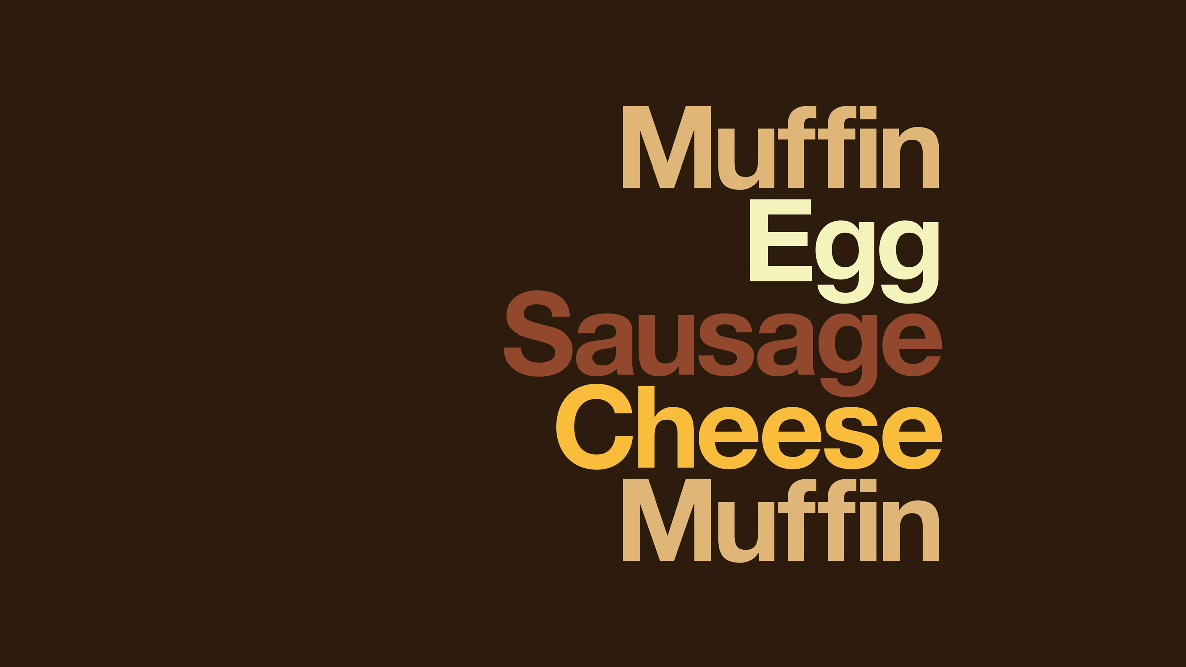
Recent McDonald's ads with minimal branding have listed a stylised version of the ingredients of well-known McDonald's menu items (above), and displayed a half-eaten burger. As you can see from above, these ads didn't include a brandname, logo or even a tagline – something only the most confident of brands could get away with.
Though there has been a trend for more well-known brands to remove the words from their logos (see our pick of the best textless logos here), there aren't many brands that would put out many series of campaigns without a full arsenal of branding. However, CocaCola recently pulled it off for a temporary campaign, showing that iconic colours and fonts are key in the success of such a mission (who doesn't recognise the colour that transformed Santa, after all?).
Read more:
- Billboard advertising: Traffic-stopping examples
- Hilarious bad logo redesigns are the laugh you need today
- Genius new Kit-Kat ad sums up lockdown perfectly
Get the Creative Bloq Newsletter
Daily design news, reviews, how-tos and more, as picked by the editors.

Thank you for reading 5 articles this month* Join now for unlimited access
Enjoy your first month for just £1 / $1 / €1
*Read 5 free articles per month without a subscription

Join now for unlimited access
Try first month for just £1 / $1 / €1

Georgia is lucky enough to be Creative Bloq's Editor. She has been working for Creative Bloq since 2018, starting out as a freelancer writing about all things branding, design, art, tech and creativity – as well as sniffing out genuinely good deals on creative technology. Since becoming Editor, she has been managing the site and its long term strategy, helping to shape the diverse content streams CB is known for and leading the team in their own creativity.
