McDonald's ditches its brand in new type-only ads

McDonald's type-based billboards
(Image credit: McDonald's/Leo Burnett London)

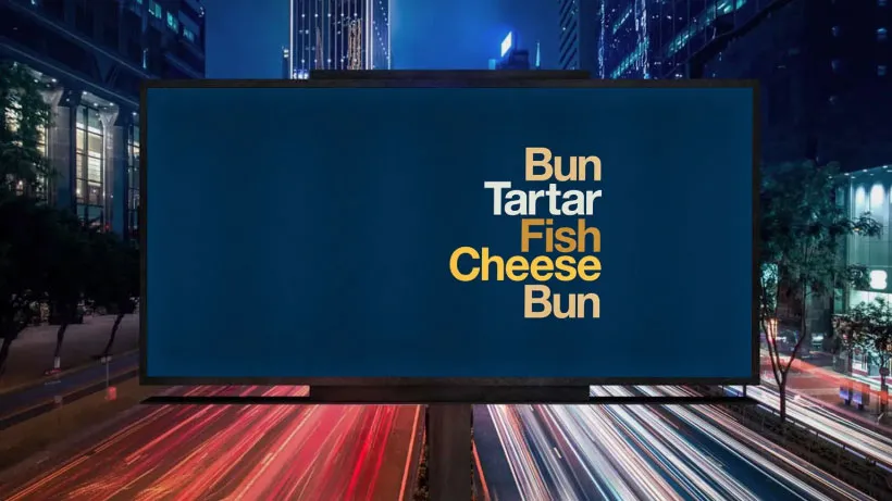
You might have thought that a brand as strong as McDonald's relies on its most famous elements – the big 'M' and bright yellow and red hues – being present, but apparently, you'd be wrong. The fast food chain's latest ads consist solely of a list of ingredients that make up its most popular offerings: "muffin, egg, sausage, cheese, muffin", for example. Or "bun, beef, gherkin, lettuce, sauce, bun, beef, cheese, lettuce, sauce, bun". The words might be in the colour of the ingredients, but there's no branding to speak of – no logo, no tagline, not even McDonald's' custom typeface. Intrigued? We thought so.

It's a risky strategy, but we bet it'll pay off; McDonald's has always been good at marketing. We've included plenty of its adverts in our best billboard ads roundup, and the chain does have form when it comes to running ads that deliberately mix up or adapt its famous golden arches. Remember those blurry ads it ran last year?

Thank you for reading 5 articles this month* Join now for unlimited access

Enjoy your first month for just £1 / $1 / €1

*Read 5 free articles per month without a subscription

Join now for unlimited access

Try first month for just £1 / $1 / €1

Rosie Hilder

Rosie Hilder is Creative Bloq's Deputy Editor. After beginning her career in journalism in Argentina – where she worked as Deputy Editor of Time Out Buenos Aires – she moved back to the UK and joined Future Plc in 2016. Since then, she's worked as Operations Editor on magazines including Computer Arts, 3D World and Paint & Draw and Mac|Life. In 2018, she joined Creative Bloq, where she now assists with the daily management of the site, including growing the site's reach, getting involved in events, such as judging the Brand Impact Awards, and helping make sure our content serves the reader as best it can. 

Latest in Branding
Monotype quiz
What's your type? Take this font quiz to find your soulmate
Microsoft To Do
People have some Very Strong Opinions on the Microsoft To Do icons
Between the Lines
"It's not enough to be a good writer”: Zosia Swidlicka on the importance of brand language in copywriting
Clippers logos old vs new
New LA Clippers logo is an instant classic
Reddit rebrand
'Help us clean up... that was the assignment': How we made Reddit's new identity
Rockstar energy drink
"Lively, buzzy and spirited": Rockstar rebrand ditches traditional energy drink aesthetics
Latest in News
Render showing design for new Manchester United stadium
Manchester United's new stadium design is getting some unfortunate comparisons
Shot of AI augmented A Different World
Netflix's AI 'fix' turned an 80s sitcom into a horror movie
Screenshots from KFC Original Fake Games
KFC takes a bite out of annoying fake game ads and turns them into real games
Tesla Cybertruck
Why some Tesla owners are covering up the logo
Magnum billboards on a roadside
Magnum abducts our radio waves with ingenious sonic branding ad
Korean Air new logo in use
Korean Air has rebranded for first time since the '80s