Marvel's leaked Agatha logo looks oddly familiar
Fans are in a frenzy over what it all means.

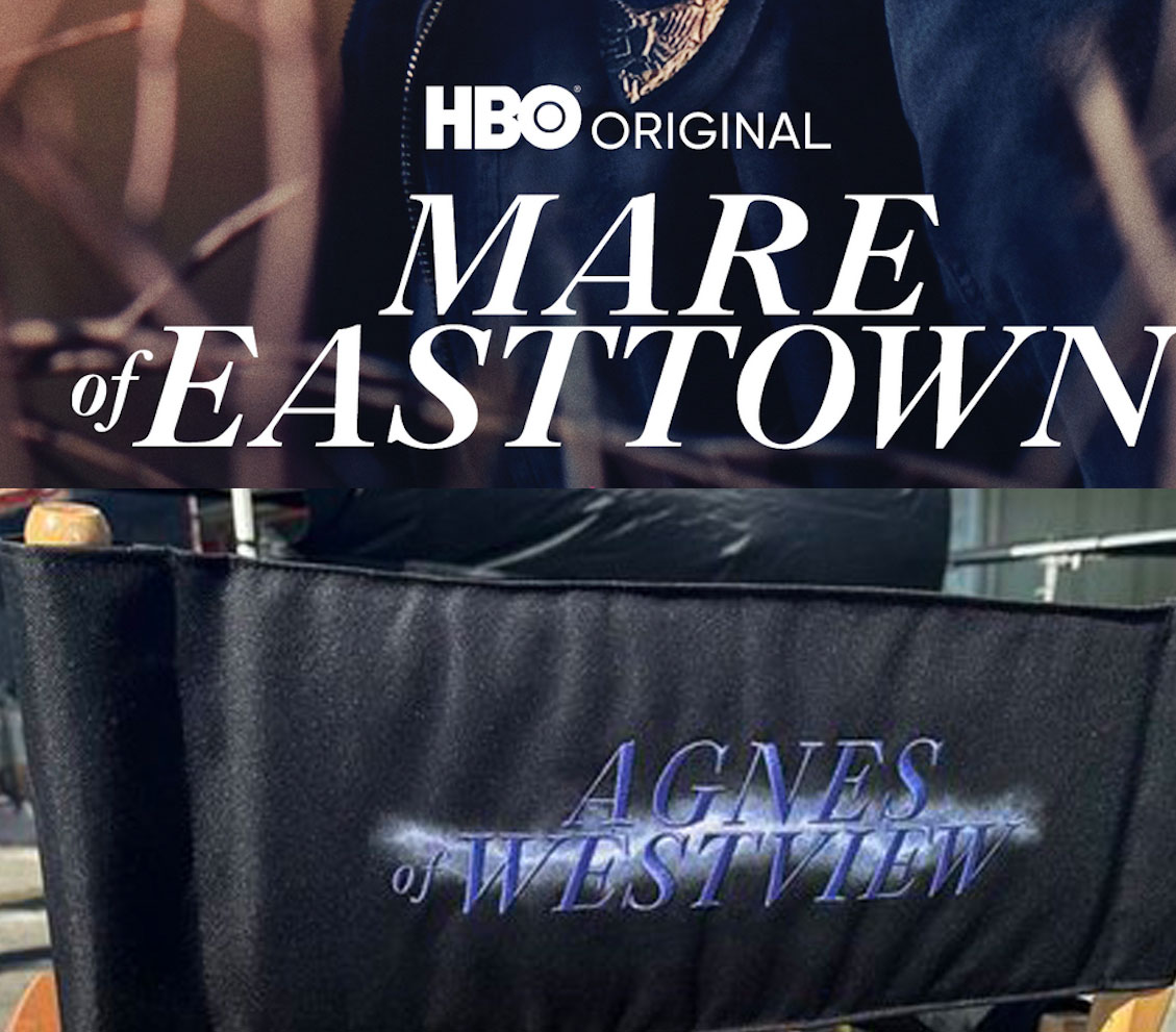
Any hint of a new logo sends Marvel fans into a frenzy of anticipation and speculation. But the recent uncovering of a logo for upcoming show Agatha: Coven of Chaos has created more murmuring than most because the graphic seems to be an exact replica of the logo belonging to a recent HBO smash hit – Mare of Easttown. And even more strangely, the title of the Marvel show seems to have changed.
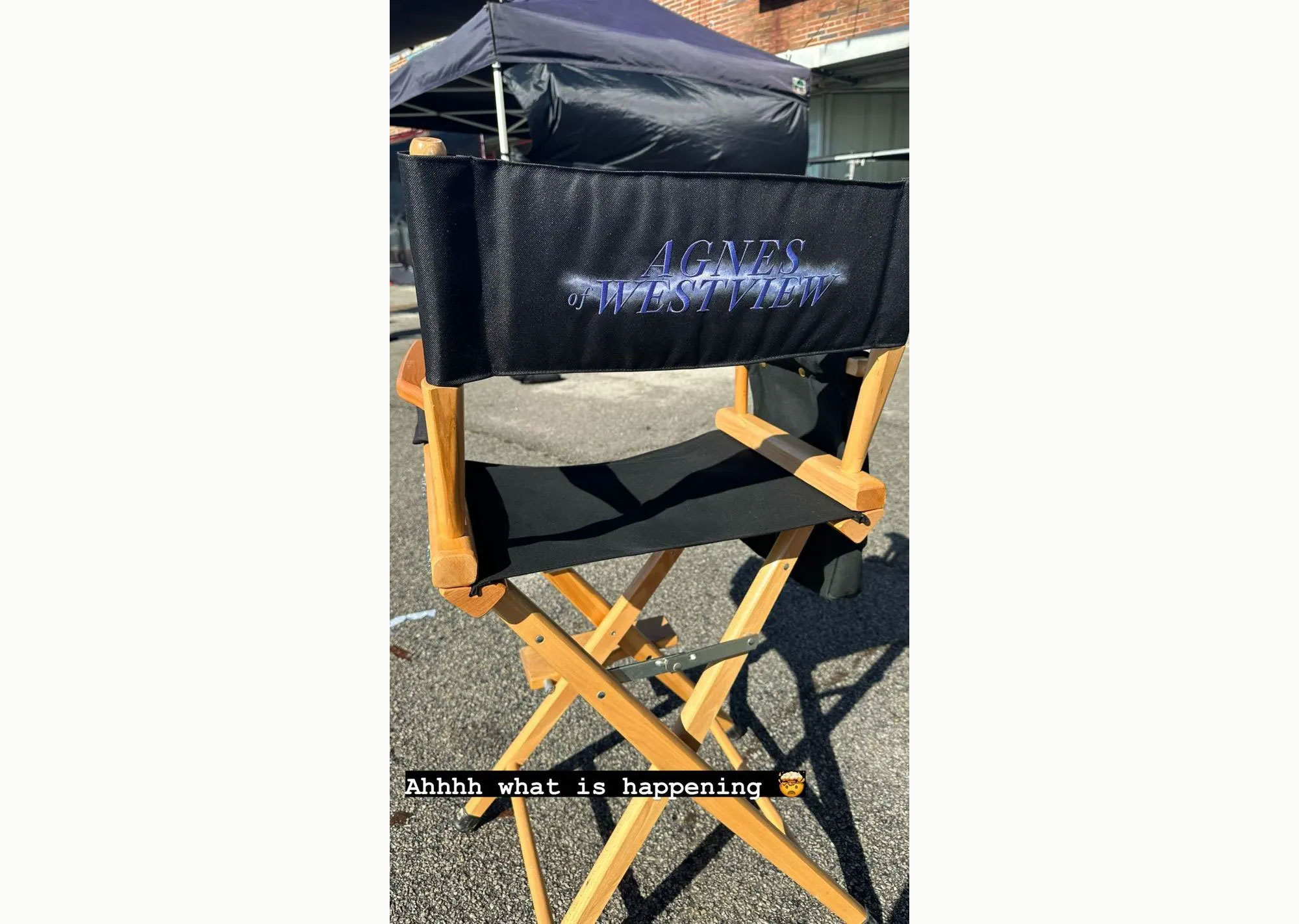
Shared by Agatha star Joe Locke on his Instagram stories (now deleted), the logo is exactly the same in almost every element, from its italicised font to the way the title is laid out. See it below. We're not sure this one has the chops to make our best Marvel logos list.

The logo bears the title "Agnes of Westview" and was posted along with the caption "ahhh what is happening" by Locke – a statement that perfectly encapsulates the feelings of fans online. While the similarity could be unintentional (designers know only too well the dangers of unconsciously imitating a logo you've seen many times), fans are convinced that there's some sort of hidden meaning to be interpreted here – after all they are almost identical in title format, layout and typography.

Some fan theories discount the Mare reference altogether, ranging from another series title name change (Agatha: Coven of Chaos started out as Agatha: House of Harkness), to the simple premise that the series will be set in Westview (an MCU town). Others ponder over the deleted aspect of the Instagram story, claiming it's because the photo gave away too much – but if the post was a Story, it would have deleted automatically anyway so we're not sure that's much of a mystery.
We've popped some of the most flabbergasted responses below:
I feel the reason he deleted the story is because Agnes of Westview is probably an episode title and a dead giveaway to who he’s playing https://t.co/4i8ZVCmd0bJanuary 20, 2023
They better have not changed the title to Agnes of Westview 🤮Coven of Chaos is WAY BETTER pic.twitter.com/YP1rctGEoLJanuary 19, 2023
This is not a reference to Mare of Easttown. Agnes of Westview is just a title given to Agatha by the residents after they begin to worship her as their hero and saviour. She sheds the Agnes name over the course of the series once she’s no longer narrow sighted on power. https://t.co/5cVEPKgh6lJanuary 19, 2023
None of those theories address the elephant in the room – the fact the design is a copy of Mare of Easttown. Other ideas circulating online imagine that the episode has elements of Mare of Easttown reflected in its plot, with a murder mystery to be solved that sees Agnes (Agatha's fake identity) playing detective, or maybe it just reflects the darkness found in a fictional town in the MCU as well as in Easttown. But others think all that is just a red herring.
All in all, we think the logo could be the name of an episode, rather than a series name change – or a joke on set. We can't imagine that logo would get the sign off if it was anything more.
Get the Creative Bloq Newsletter
Daily design news, reviews, how-tos and more, as picked by the editors.
Either way, it's been a brilliant way to get fans talking, in a very different way to the new Ant-Man 3 posters, which have got tongues wagging for their hilarious Photoshop fails.
Read more:

Thank you for reading 5 articles this month* Join now for unlimited access
Enjoy your first month for just £1 / $1 / €1
*Read 5 free articles per month without a subscription

Join now for unlimited access
Try first month for just £1 / $1 / €1

Georgia has worked on Creative Bloq since 2018, and has been the site's Editor since 2023. With a specialism in branding and design, Georgia is also Programme Director of CB's award scheme – the Brand Impact Awards. As well as immersing herself with the industry through attending events like Adobe Max and the D&AD Awards and steering the site's content streams, Georgia has an eye on new commercial opportunities and ensuring they reflect the needs and interests of creatives.
