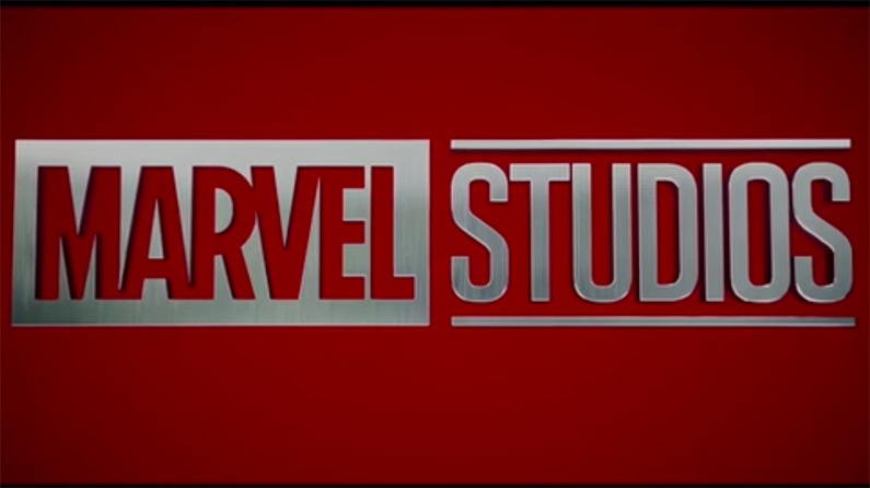
Marvel Studios unveils new logo
Iconic characters from the big screen appear in the new Marvel Studios logo.

Generating the same kind of cinematic excitement as the thunderous 20th Century Fox intro or the twinkly Lucasfilm wordmark, the Marvel Studios logo design has been a staple of the publisher's comic book films since 2002.
Rushing by in a flurry of comic panels and speech bubbles, the format of the logo design has remained largely unchanged over the years. But the newest iteration, revealed at last weekend's Comic-Con, breaks from tradition by incorporating some of Marvel's iconic superheroes that have graced the big screen.
Accompanied by a fanfare composed by Up's Michael Giacchino, the new intro also runs at twice the length of some previous efforts.
Considering that the creative structure of Marvel Studios has recently changed, a new logo design makes sense. It also feels about time that Marvel recognises their significant impact on the film industry, with several of their outings ranking amongst the highest grossing movies of all time.
Fan reaction appears to be more positive than the recently unveiled new DC Comics logo, so it seems that the updated Marvel Studios design will be a welcome addition to the next wave of films.
Here's the previous logo, for reference. Which do you prefer?
Get the Creative Bloq Newsletter
Daily design news, reviews, how-tos and more, as picked by the editors.

Thank you for reading 5 articles this month* Join now for unlimited access
Enjoy your first month for just £1 / $1 / €1
*Read 5 free articles per month without a subscription

Join now for unlimited access
Try first month for just £1 / $1 / €1

Dom Carter is a freelance writer who specialises in art and design. Formerly a staff writer for Creative Bloq, his work has also appeared on Creative Boom and in the pages of ImagineFX, Computer Arts, 3D World, and .net. He has been a D&AD New Blood judge, and has a particular interest in picture books.
