Marvel reveals new X-Men logo
The new 'x' marks the start of a new chapter for the comic series.
![New X-Men logo [Image: Tom Muller]](https://cdn.mos.cms.futurecdn.net/ZmMkFCTgBNMoxEohbzBXJm.jpg)
Marvel's team of mutant superheroes, the X-Men, have been going strong since their debut way back in 1963. In that time the franchise has spawned some of the comic book publisher's most famous characters, not to mention tons of blockbuster films.
Change is at the heart the X-Men's longevity, and with a new chapter for the comics just around the corner, it was decided that the time was right for them to get a new logo. (To learn more about logo craft, see our post on logo design.)
Here’s my new X design for @JHickman’s epic new @Marvel #HouseOfX and #PowersofX series announced at #C2E2—https://t.co/4rHEoLvo4ZYou’re welcome. pic.twitter.com/YIWPMYSfFQMarch 23, 2019
Created by graphic designer and creative director Tom Muller, the recently unveiled logo design will appear on the pages of House of X and Power of X when they hit shelves this summer.
This pair of comics form a mini-series that set up a complete reboot of the franchise spearheaded by acclaimed writer Jonathan Hickman, and artists Pepe Larraz, R.B. Silva and Marte Gracia.
Unlike the new logo for Justice League, which was revealed last week, Muller's design doesn't fall back on specific reference points from the series' past. He does however rely on the tried and tested piece of X-Men iconography: the letter 'X'. This symbol has been at the heart of X-Men logos for decades, so it's good to see the letter is retained and refined for a new age.
Muller worked closely with Hickman and Marvel to develop several iterations of the logo (in the gallery below) before settling on the final design, which sees the letter X split in the middle by a vertical line. This is then displayed on a pair of yellow and red backgrounds.
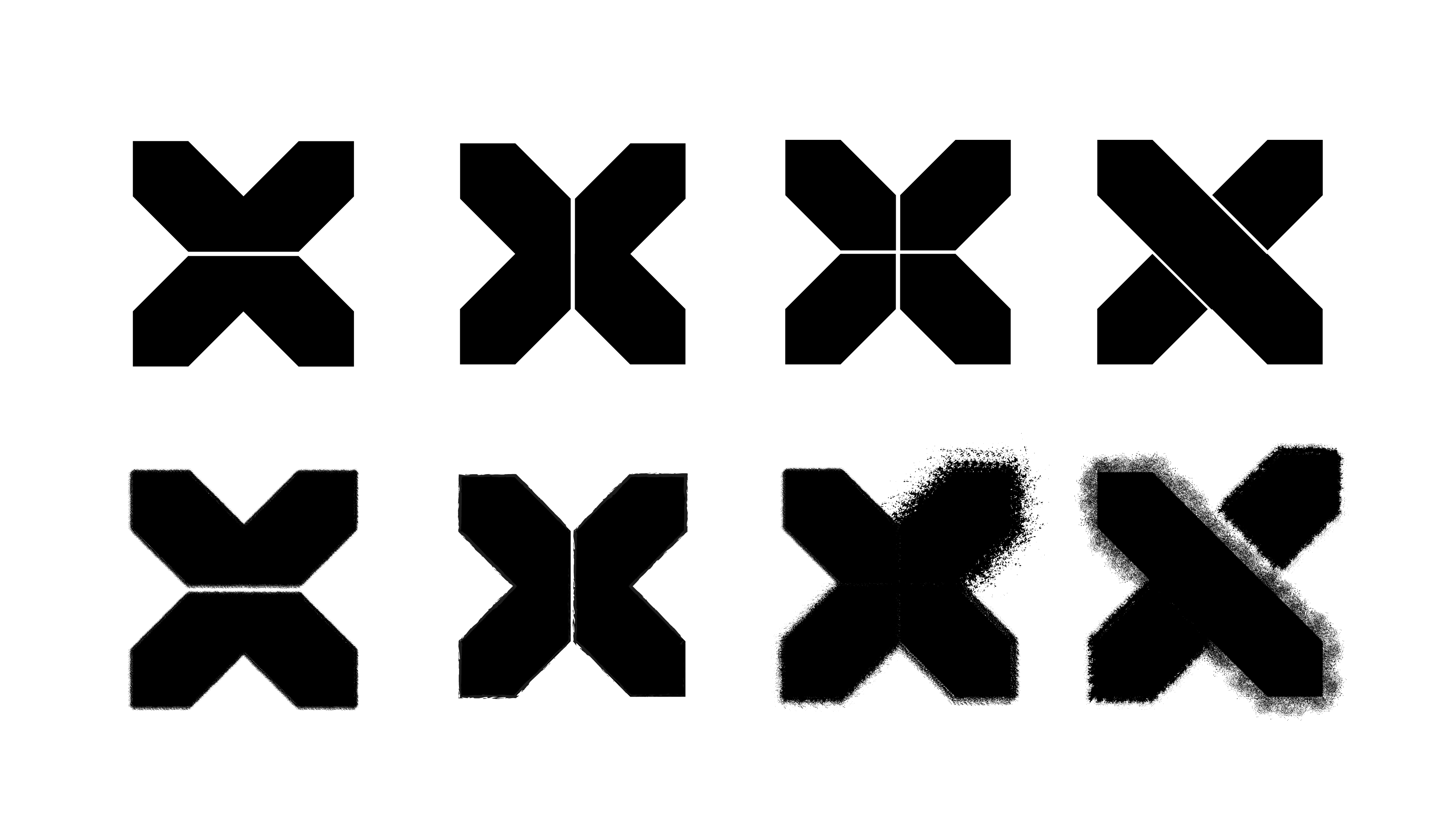
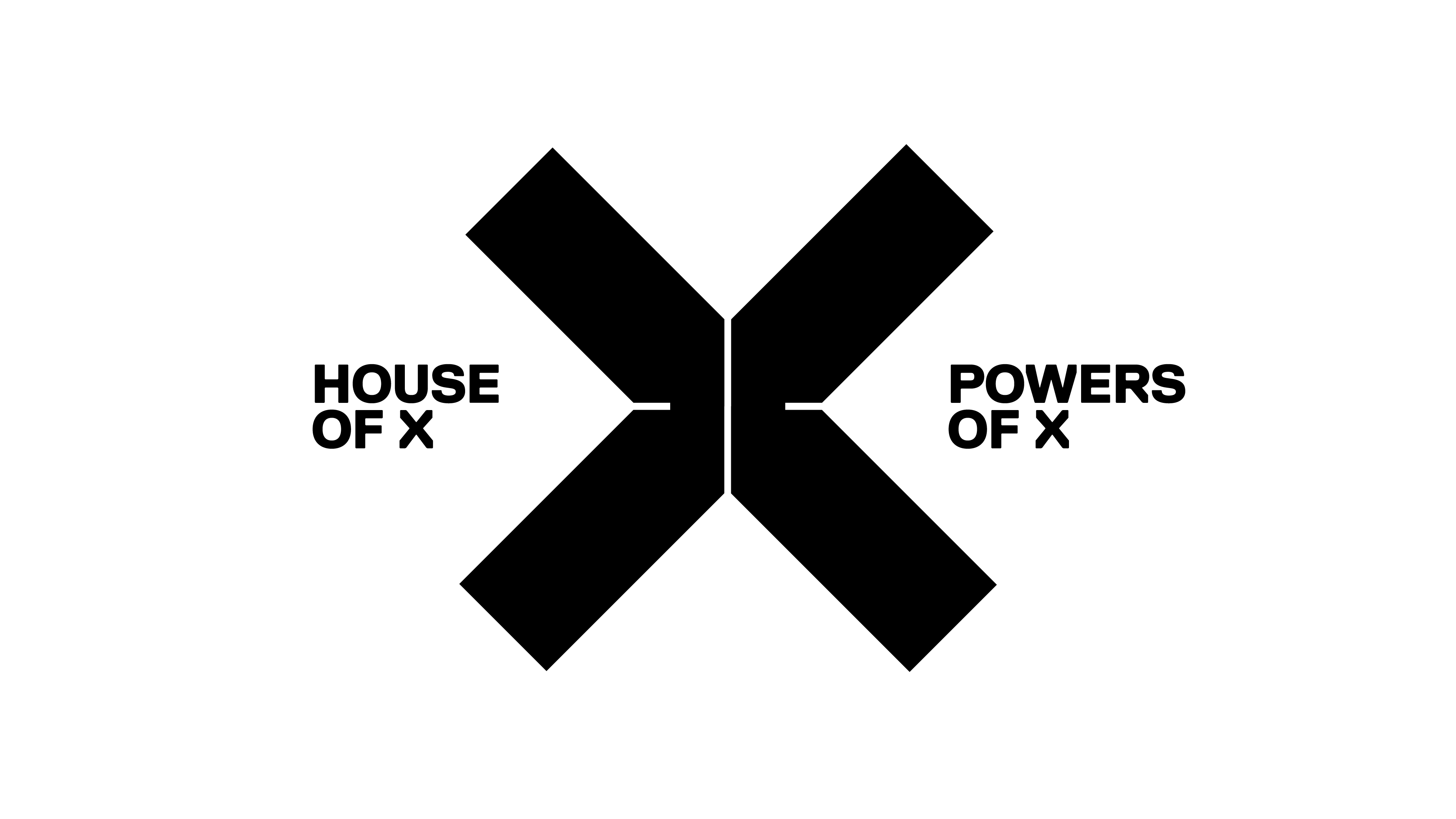
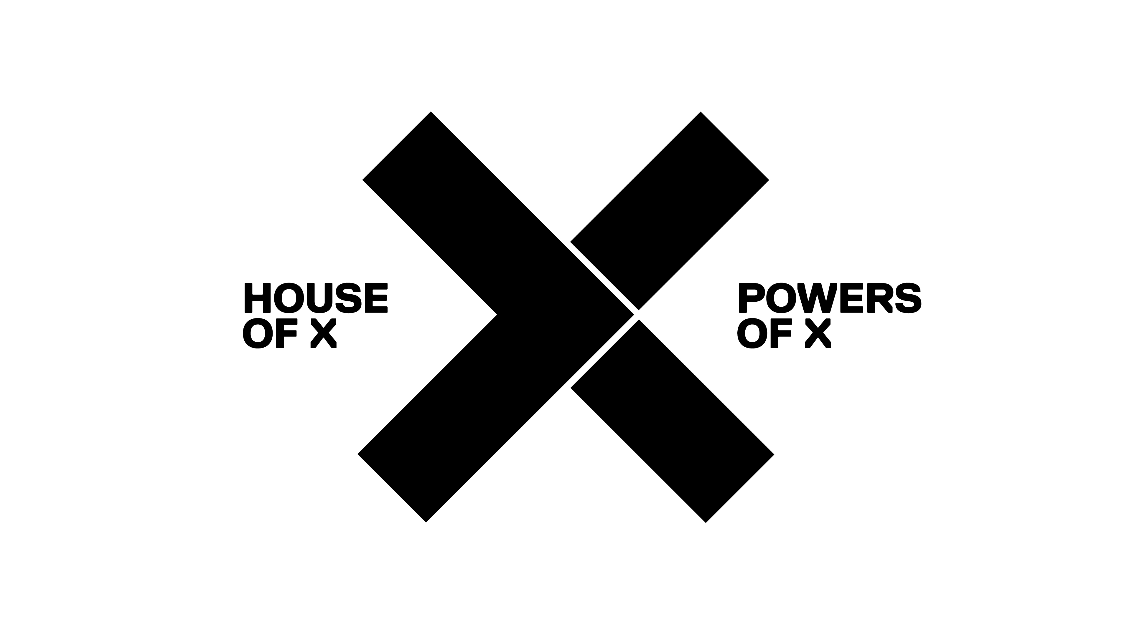


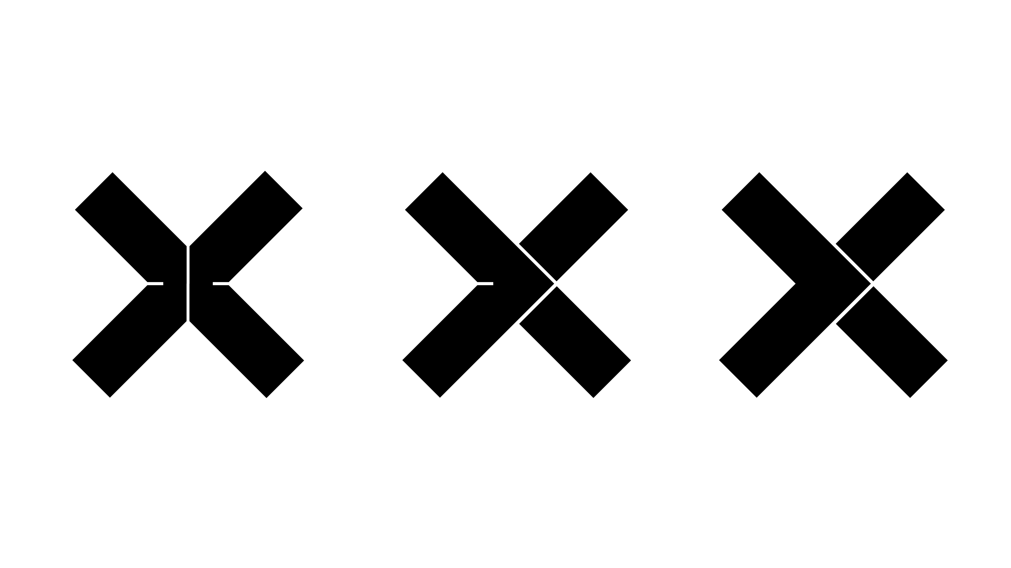
"Part of the design references one of the initial teasers Marvel released that said 'When two aggressive species share the same environment, evolution demands adaptation or dominance'" Muller tells Creative Bloq.
Get the Creative Bloq Newsletter
Daily design news, reviews, how-tos and more, as picked by the editors.
"In part the new logo design reflects ideas on the evolution of species and the duality of social groups that has always permeated the X-Men stories. The halves of the X can also be read as > and < signs or even arrows.
"The final logo is a clear evolution and refinement of those initial concepts. It was important for everyone that we struck the right balance between being new and future-facing whilst keeping that clear X-Men ‘X’ recognisable and build on the foundations of the X brand."
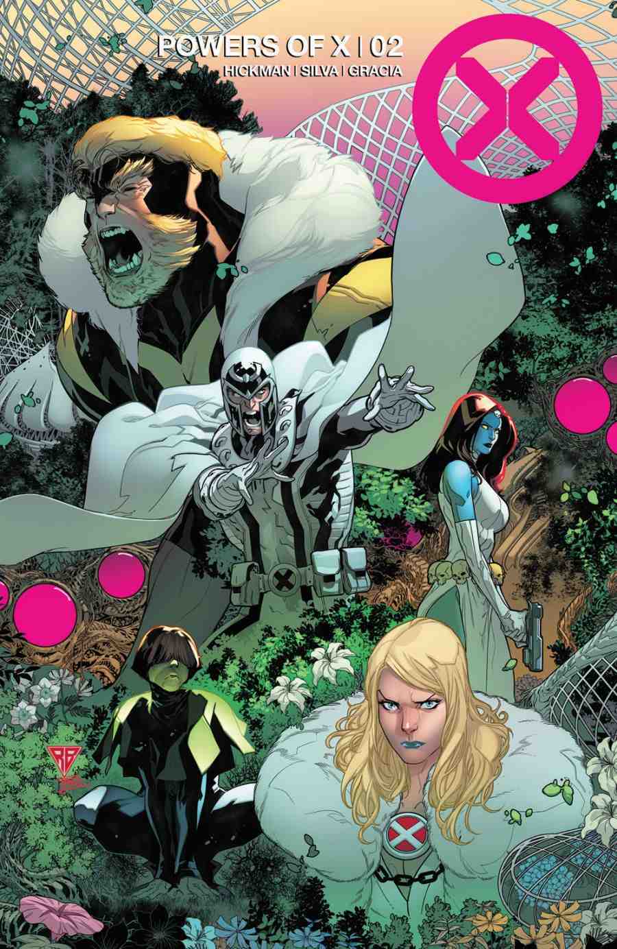
The first issues of House of X and Power of X go on sale this July. For more information and to stay up to date with releases, head over to Marvel.
Related articles:

Thank you for reading 5 articles this month* Join now for unlimited access
Enjoy your first month for just £1 / $1 / €1
*Read 5 free articles per month without a subscription

Join now for unlimited access
Try first month for just £1 / $1 / €1

Dom Carter is a freelance writer who specialises in art and design. Formerly a staff writer for Creative Bloq, his work has also appeared on Creative Boom and in the pages of ImagineFX, Computer Arts, 3D World, and .net. He has been a D&AD New Blood judge, and has a particular interest in picture books.
