New Nintendo Switch design has Super Mario fans fuming
It's-a not what they were expecting.
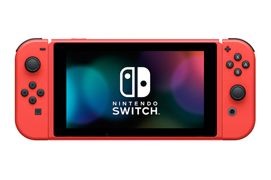
When Nintendo announced a brand new Nintendo Switch this week, it was notable for two reasons. Not only does it mark the very first time the classic Switch has appeared in a new colour, but said colour has been selected in honour of everyone's favourite moustachioed Italian plumber. (We're talking about Super Mario, just in case you have another favourite.)
It might sound like the holy grail of Nintendo Switch consoles, but the more fans saw of the new design, the more disappointed they became. It seems the Mario-themed Switch could just as well be a Spider-man-themed Switch. Or a ketchup-themed Switch. Or, basically, an anything red-themed Switch. (Check out these unbeatable Nintendo Switch deals if you're happy to settle for classic grey.)
The #NintendoSwitch – Mario Red & Blue Edition system has a distinct red-and-blue color scheme in honor of Mario’s iconic outfit. Available beginning 2/12, it comes with a red & blue carrying case to help protect your system as you travel through those Warp Pipes! #SuperMario35 pic.twitter.com/Ke2bCBtPCfJanuary 12, 2021
According to Nintendo (above), the 'Mario Red & Blue Edition' Switch features a "distinct red-and-blue colour scheme" in honour of the character's famous outfit. It even features a Mario-themed carrying case. Available from 12 February, the console will cost the same $299/£279 as a regular Switch.
But while you'd think Nintendo fans would be chomping at the bit to get hold of a Switch designed in tribute to the company's most famous character, many feel that the the Mario Switch could be a lot more, well, Mario. Indeed, only the Joy-Con grips have been rendered in blue, with everything else red. This means that in handheld configuration (below), the whole console is, like our favourite 1980s British pop band, simply red.

And judging by the response on Twitter (below), Nintendo hasn't quite got that red/blue balance right. (Perhaps the company ought to have checked out our guide to colour theory first?)
the "red and blue" mario switch being red with blue joycon accessories seems like a missed opportunity to make it interesting-esp when...in handheld mode it's just. all red ,, doesn't rly warrant the "and blue"January 12, 2021
Nintendo: Let's release a special Mario-Themed Switch and call it "Mario Red & Blue", due to its special colours! :)Also Nintendo: Acctually let's make the console completely red and only add some blue accents to the accessories lmao https://t.co/bukFVEobELJanuary 13, 2021
one hundred percentlike I have no problem with completely red mario things, my ds lite was the red mario one, but come on if you're gonna make EVERYTHING ELSE blue at least splash some blue on the switch itself so it looks like a mario one in handheld and not just a painted oneJanuary 12, 2021
This isn't really a Mario switch it's just red and blue. The actual console is just solid colors, no cool designs, nothing. To me, it isn't a true Mario Nintendo Switch. https://t.co/YhhkL2t4PLJanuary 13, 2021
They say it's a Mario themed switch, but it's literally just a red and blue colored switch. It would've been better with actual Mario designs on it https://t.co/Or1xFOkVytJanuary 12, 2021
Such a shame. I got really excited for it. But take away the blue grips, or controller grip. And its just a red switch. The promo image really draws you in with the whole "Mario aesthetic" They could've done so much more with the base unit. pic.twitter.com/a3kmVmirauJanuary 12, 2021
Ironically, we think the new Switch looks pretty neat – as long as we forget it's supposed to resemble Super Mario. Until now, only the Switch Lite was available in anything other than grey, and it's refreshing to see the standard Switch in a brand new hue. Like Apple's Product Red iPhones, the new Switch seems like a stylish piece of kit. But does it make us think of Mario? Nope.
If recent months in the world of gaming have taught us anything, it's that colour matters. The PS5 was mercilessly mocked when initially revealed with its 'reverse Oreo' white-and-black colour scheme. No wonder fans recently went wild for an unofficial black edition – which has already been pulled thanks to impossible demand.
Get the Creative Bloq Newsletter
Daily design news, reviews, how-tos and more, as picked by the editors.
Already got a Switch? Don't miss our round up of the best Nintendo Switch games and Nintendo Switch headsets money can buy. Or if you've yet to get your hands on one of the popular consoles, here are the best prices on the web:
Read more:

Thank you for reading 5 articles this month* Join now for unlimited access
Enjoy your first month for just £1 / $1 / €1
*Read 5 free articles per month without a subscription

Join now for unlimited access
Try first month for just £1 / $1 / €1

Daniel John is Design Editor at Creative Bloq. He reports on the worlds of design, branding and lifestyle tech, and has covered several industry events including Milan Design Week, OFFF Barcelona and Adobe Max in Los Angeles.
