Fan ‘fixes’ video game logo – but is it better than the original?
We’re so confused.

We've seen lots of designers tackle existing logos, from complete redesigns to subtle fixes. This latest effort falls into the latter category – but proves that even the tiniest tweak can make a major difference.
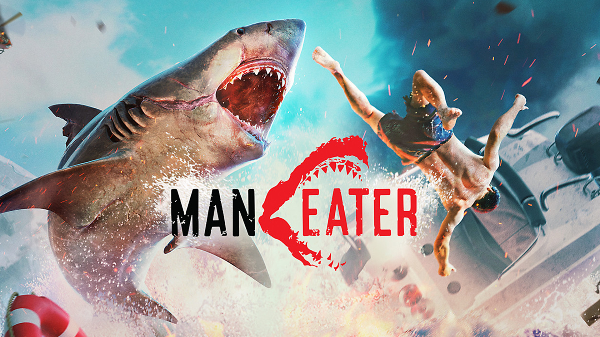
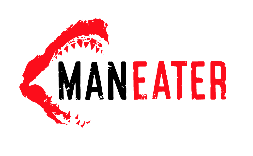
One Reddit user wasn't completely happy with the logo for Tripwire Interactive's Maneater, a brand new open-world video game in which the player assumes the role of, you guessed it, a shark. With a tiny bit of Photoshop magic, the shark's mouth has been reversed so that is now about to chomp on the 'MAN' section of the title, making it a much more logical logo for the game (check out our logo design inspiration guide for more innovative examples).
The Man Eater logo was bothering me, so I altered it. Makes more sense this way imo. from r/gaming
It just goes to show that you don't always need a bunch of complex Photoshop actions to make a difference – sometimes a simple 'Flip' will suffice. Many Reddit users prefer the updated version, with several commenting that it makes more sense. Some, however, feel that the original version is more balanced with the jaws pointing the right – since we read from left to right. One user proposed yet another version (below), which several Redditors called "the best option by far".

For us, shockwave414's attempt (above) could be the ultimate version of the logo. Not only is the appropriate section of the title being 'eaten', but the correct sense balance and movement is created by the jaws pointing to the right. Removing the jaws from the middle also clears up any confusion over the title – this is clearly a logo for Maneater, not Man Eater.
Whichever option you prefer, there's no doubt that when it comes to a successful logo, details matter – especially when there's an internet full of designers ready to pounce on any mistakes. One designer recently performed a public service by redesigning some of the most hilariously bad logos in existence. Indeed, if even the tiniest aspect of a logo would benefit from a redesign, it probably isn't going to make our list of the best logos of all time.
Read more:
- New Adobe Creative Cloud logo is much more... creative
- iPhone 12 design finally revealed (and it’s not what we expected)
- New Black Mirror Series 6 Netflix poster is terrifying yet genius
Get the Creative Bloq Newsletter
Daily design news, reviews, how-tos and more, as picked by the editors.

Thank you for reading 5 articles this month* Join now for unlimited access
Enjoy your first month for just £1 / $1 / €1
*Read 5 free articles per month without a subscription

Join now for unlimited access
Try first month for just £1 / $1 / €1

Daniel John is Design Editor at Creative Bloq. He reports on the worlds of design, branding and lifestyle tech, and has covered several industry events including Milan Design Week, OFFF Barcelona and Adobe Max in Los Angeles.
