I adore the use of negative space in this minimalist wine label
Malika Favre’s collaboration with Oé is the perfect pairing.

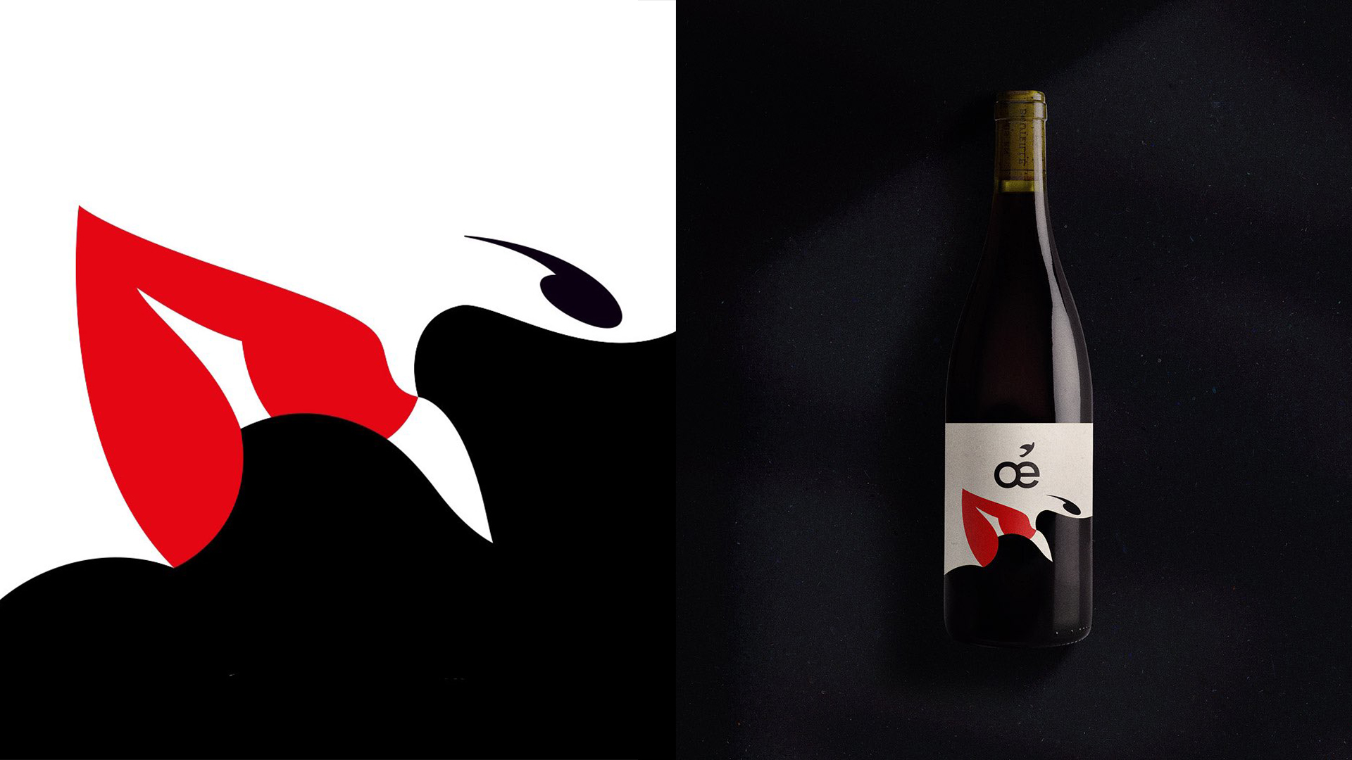
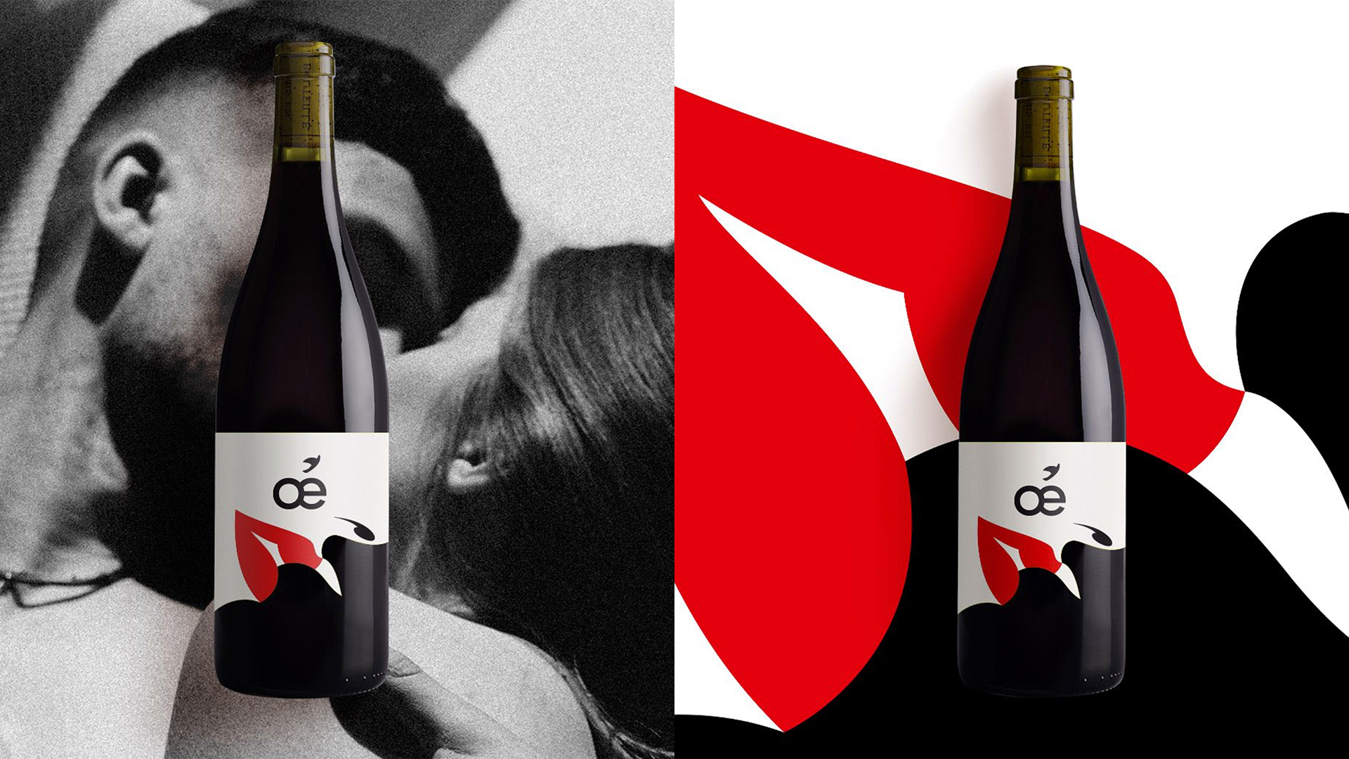
French artist Malika Favre has partnered with organic wine manufacturer Oé to create a label design for the brand's new limited-edition wine. The minimalist label expertly blends Favre's signature pop art style with Oé's classy, stripped-back aesthetic, resulting in a thoroughly modern and stylish design.
The collaboration is a perfect pairing, encapsulating Oé's new product with a seductive and contemporary elegance, effortlessly embellishing the product with Favre’s bold style. (If you're after more ingenious design, check out our collection of the best design books, to spark some inspiration).

The sleek design of Oé's latest product features a monochromatic colourway, with a splash of red to draw the eye to the label's central theme. Pictured in the artwork is a white face with vivid red lips leaning over for a kiss. In combination with the bottle's dark colour and the label's clever use of negative space, a second face can be spotted in the design.
“To hint at the idea of pleasure, I created a minimal cut-out label that plays with the negative space of the bottle,” Favre claims in an Instagram post. "When trying to find the most minimal way to express something I really get in the zone. Every line and every colour becomes filled with intention and meaning. I just love the challenge of it all and more than anything, I love that feeling I get when it feels just right. Nothing more, nothing less," she adds.
A post shared by Malika Favre (@malikafavre)
A photo posted by on
Favre's work, “often described as Pop Art meets OpArt” according to her website, has been featured in numerous famous publications such as The New Yorker and Vogue. It seems that fans of her work are equally as impressed with her smaller-scale project with Oé, taking to social media to share their praise.
“I hope the wine lives up to the label!” one Instagram user commented, while another said: “Your design are so cool. Love the composition and how you used the colors.” We can’t help but agree as Favre’s clever illusion illustration is a masterclass in visually stunning minimalist design – the perfect fit for the elevated elegance displayed in Oé’s products.
A post shared by Malika Favre (@malikafavre)
A photo posted by on
If you’re after more stunning design check out the minimalist dollhouse that’s a masterclass in minimalist interior design, or check out the Pringles x Caviar collab that transforms the unassuming snack into a surprisingly opulent treat.
Get the Creative Bloq Newsletter
Daily design news, reviews, how-tos and more, as picked by the editors.

Thank you for reading 5 articles this month* Join now for unlimited access
Enjoy your first month for just £1 / $1 / €1
*Read 5 free articles per month without a subscription

Join now for unlimited access
Try first month for just £1 / $1 / €1

Natalie Fear is Creative Bloq's staff writer. With an eye for trending topics and a passion for internet culture, she brings you the latest in art and design news. Natalie also runs Creative Bloq’s Day in the Life series, spotlighting diverse talent across the creative industries. Outside of work, she loves all things literature and music (although she’s partial to a spot of TikTok brain rot).
