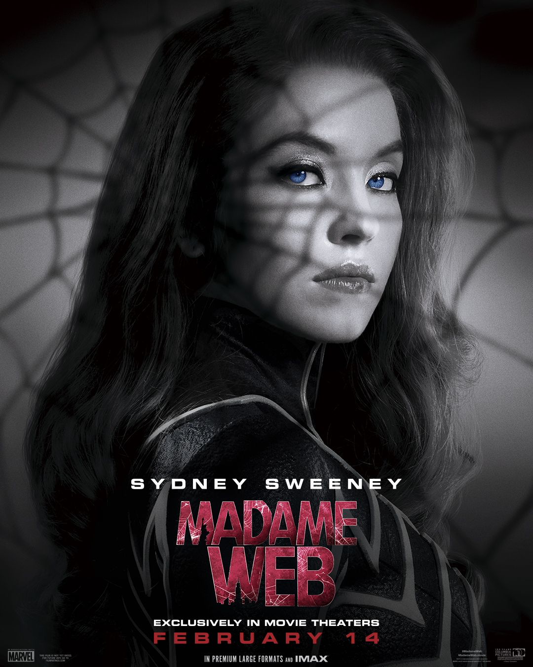
The new Madame Web posters to support the latest Sony Spider-Verse spin-off give the cast a noir sense of dread, maybe. This new set is an evolution of the previous posters which were vibrant and colourful, while then new releases are black and white, hinting at a noir tale and character's new Spider-powered alter egos. It's a nice idea, but it's just so lacklustre.
The film, starring Dakota Johnson, Sydney Sweeney, Celeste O'Connor, Isabela Merced, and Tahar Rahim, sets up the arrival of Cassandra Webb and a new cast of Spider-heroes into Sony's offshoot Marvel universe. But after the so-bad-it's-good Mobius movie, fans just aren't sure what to expect, and these standard profile posters aren't really that exciting.
It's the lack of real imagination behind these new posters that really has fans scratching their heads. While there are subtle colour keys in the new posters I like, it's the over-use of Photoshop that feels so lacklustre. After we've had artistic John Wick 4 posters and the creative Poor Things' movie posters, these Madame Web designs just feel incredibly bland.
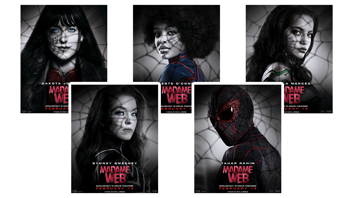
Thankfully these aren't the standard hierarchy of heroes style posters we've seen overused by Marvel (remember the painful Ant Man 3 poster?), and I do love a bit of noir foreshadowing, but for a movie that has fans already questioning why it exists, Sony could have had fun with this one.
Some reach to the new Madame Web posters was quite critical. Artist CΛTΞS wrote on X: "They can’t keep getting away with this. Should I just make a poster for them?" While another X user joked about Dakota Johnson overly colourful eyes, "Save Me Blue Eyed Women," quipped 𝙸𝚝𝚜𝚁𝚊𝚗𝚍𝚘𝚖𝚆𝚘𝚛𝚍𝚜. Another X user, brian, wrote, "These character posters have been so funny".
Are they being too harsh? See for yourself below.
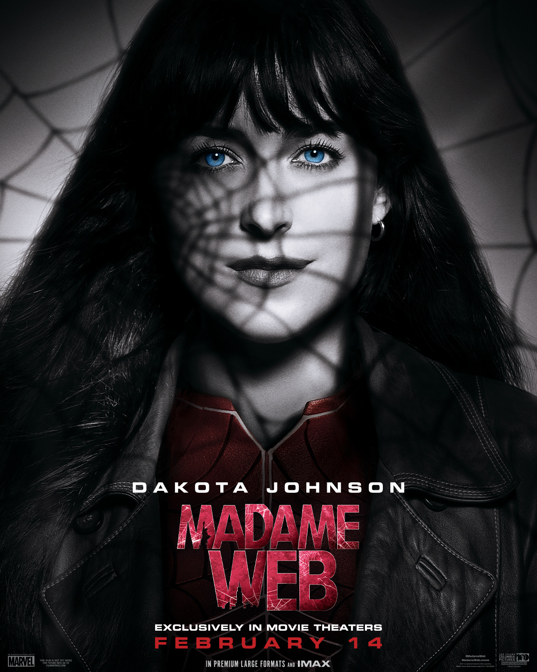
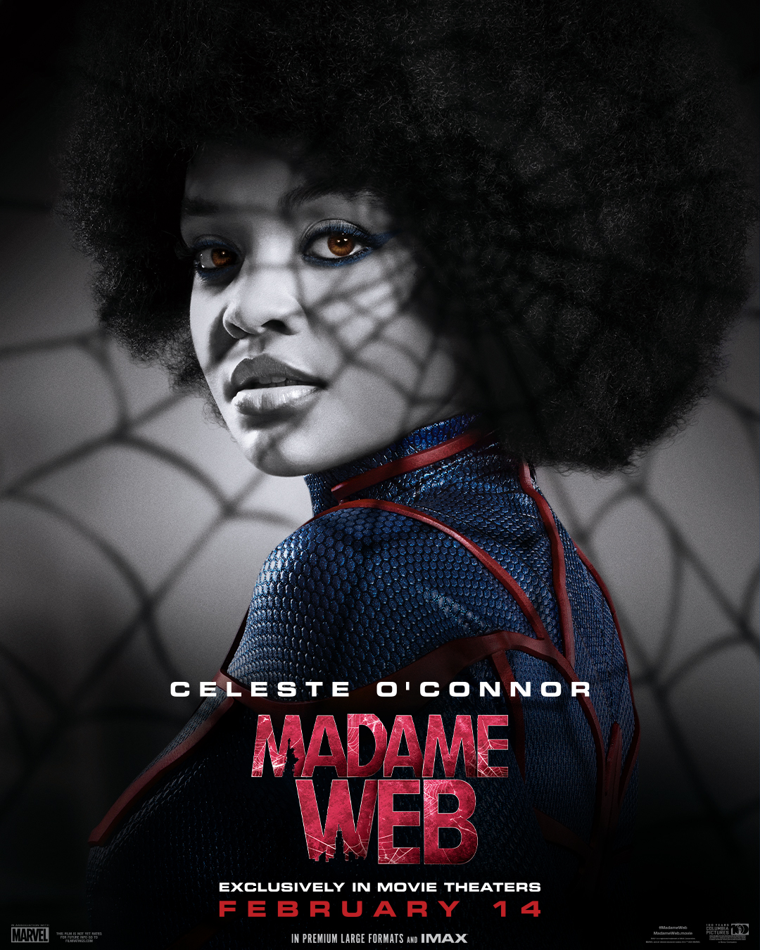
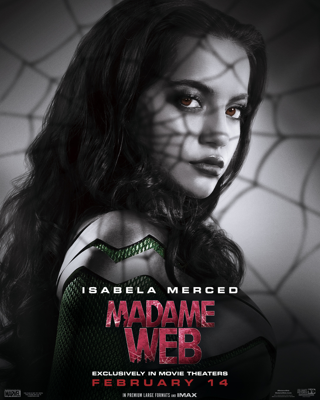
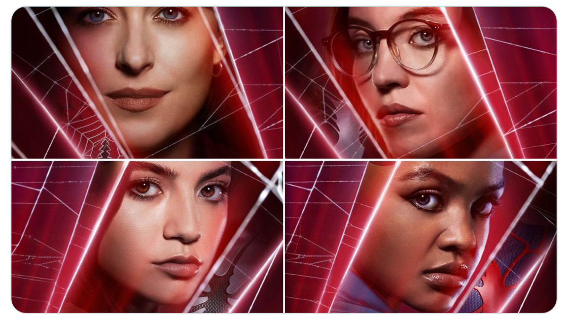
As mentioned, this wasn't the first set of posters released to promote Madame Web. Previously Sony released four vibrant, colourful posters showing the four Spider-powered protagonists. The pitch seems to be a before and after set, the older posters (below) showing the characters before their darker, Spider-personalities take over. Nice idea. Yet, it could have been so much more creative.
Get the Creative Bloq Newsletter
Daily design news, reviews, how-tos and more, as picked by the editors.
The two poster drops also leave Sony open to some casual social media jibes. One X user, TheStebe, for example, cynically wrote, "There are going to be more posters than actual minutes of the film at this rate". *zing*
If you want to see how movie posters can work, take a look at our list of the best movie posters of 2023 and the top 25 movie posters of all time. You can also read up on how to create a B-movie poster in our tutorial.

Thank you for reading 5 articles this month* Join now for unlimited access
Enjoy your first month for just £1 / $1 / €1
*Read 5 free articles per month without a subscription

Join now for unlimited access
Try first month for just £1 / $1 / €1

Ian Dean is Editor, Digital Arts & 3D at Creative Bloq, and the former editor of many leading magazines. These titles included ImagineFX, 3D World and video game titles Play and Official PlayStation Magazine. Ian launched Xbox magazine X360 and edited PlayStation World. For Creative Bloq, Ian combines his experiences to bring the latest news on digital art, VFX and video games and tech, and in his spare time he doodles in Procreate, ArtRage, and Rebelle while finding time to play Xbox and PS5.
