So Apple's most controversial new macOS feature is... System Settings
macOS Ventura users aren't loving the new look.
After what's felt like years in the wings, macOS Ventura has finally made its way into the world. Mac users have been downloading the new software update in their droves – and while it's features like Continuity Camera and Stage Manager that have hogged the headlines since WWDC this summer, its a smaller update that's getting fans talking now.
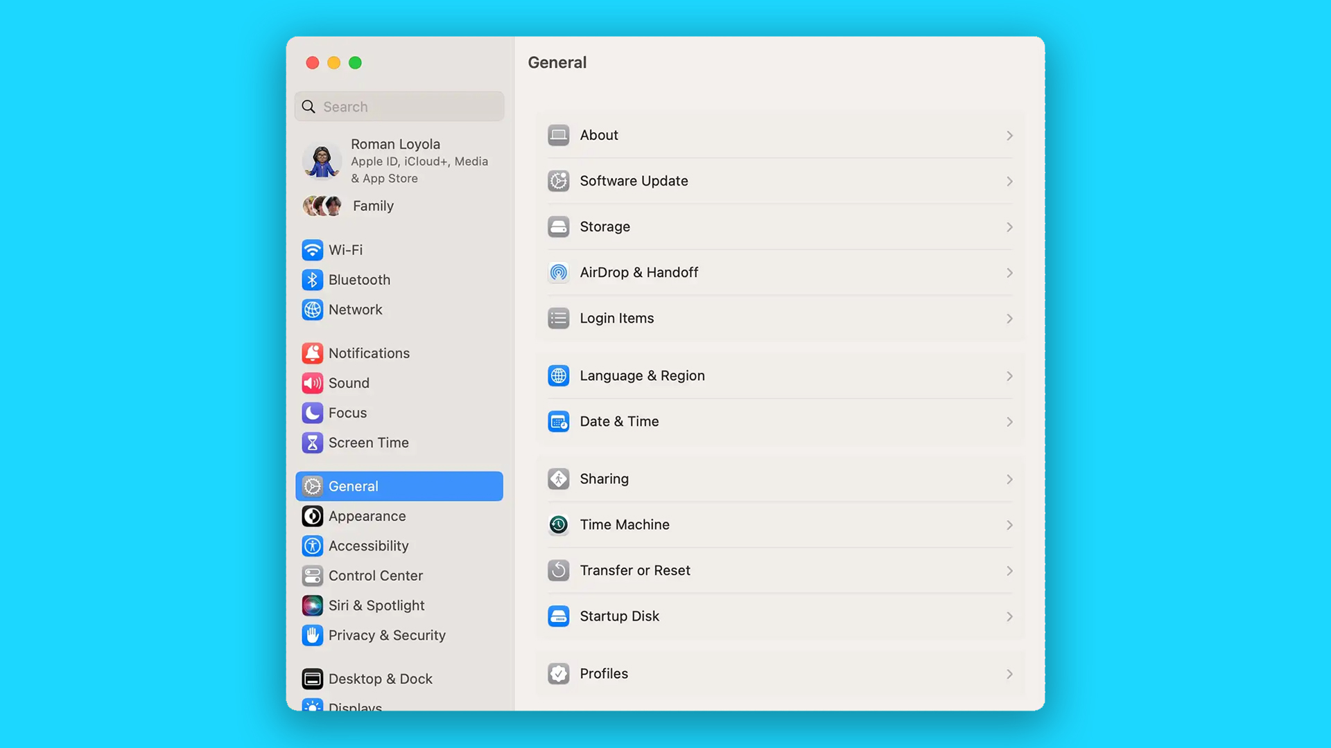
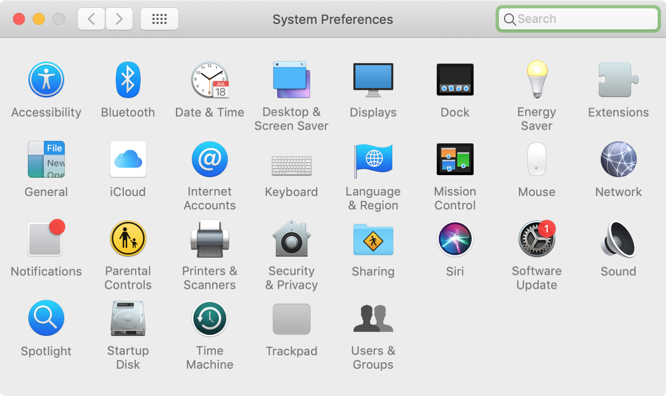
System Preferences has not only been renamed System Settings, but the menu also features a new design. Apple says this is "optimised for efficient navigation on Mac and delivers a more consistent experience across iPhone and iPad," but users aren't convinced. (Want the best macOS experience around? Check out the best MacBook Pro deals available now).


The redesigned System Settings menu certainly looks more reminiscent of iOS and iPadOS, based on large, scrolling lists. But it seems users aren't happy with the idea of a mobile design being reappropriated for desktop. For one thing, there's a lot of negative space out there, when the list of options isn't large enough to fill the window.
Upgraded to Ventura this morning. Finally I can try the most-talked about new feature: the system settings app 🙃October 25, 2022
I hate macOS Ventura's iOS style settings app. Absolutely terrible on a desktop deviceOctober 24, 2022
The new System Settings app in Ventura is an abomination. It's like they took a mobile app design and stretched it out for the desktop (without re-thinking it) and said: it's done!Do they have anybody at Apple these days who understands the concept of Responsive Design?October 25, 2022
But even worse is the fact that so many settings have completely moved. For longtime macOS users, that means throwing a whole load of muscle memory out the window.
for starters, look at it pic.twitter.com/v8qAwz1mcZOctober 24, 2022
The new Settings App on macOS Ventura is a disaster. It is so much harder to find things now.October 27, 2022
Still, Apple users are famously averse to change – and it's quite possible that, like macOS Big Sur's once-hated icons, they'll eventually get used to the new Settings app (and maybe even, whisper it, start to like it). And besides, users will have much more to talk about if any of those new iPhone 15 rumours eventually come to fruition.
Read more:
- These radical iPhone 15 concepts are both weird and wonderful
- MacBook Air (M2,) review
- MacBook Pro 13-inch (M2,) review
Get the Creative Bloq Newsletter
Daily design news, reviews, how-tos and more, as picked by the editors.

Thank you for reading 5 articles this month* Join now for unlimited access
Enjoy your first month for just £1 / $1 / €1
*Read 5 free articles per month without a subscription

Join now for unlimited access
Try first month for just £1 / $1 / €1

Daniel John is Design Editor at Creative Bloq. He reports on the worlds of design, branding and lifestyle tech, and has covered several industry events including Milan Design Week, OFFF Barcelona and Adobe Max in Los Angeles.
