Ingenious McDonald's Halloween ad is an internet hit
Reddit's still lovin' it.
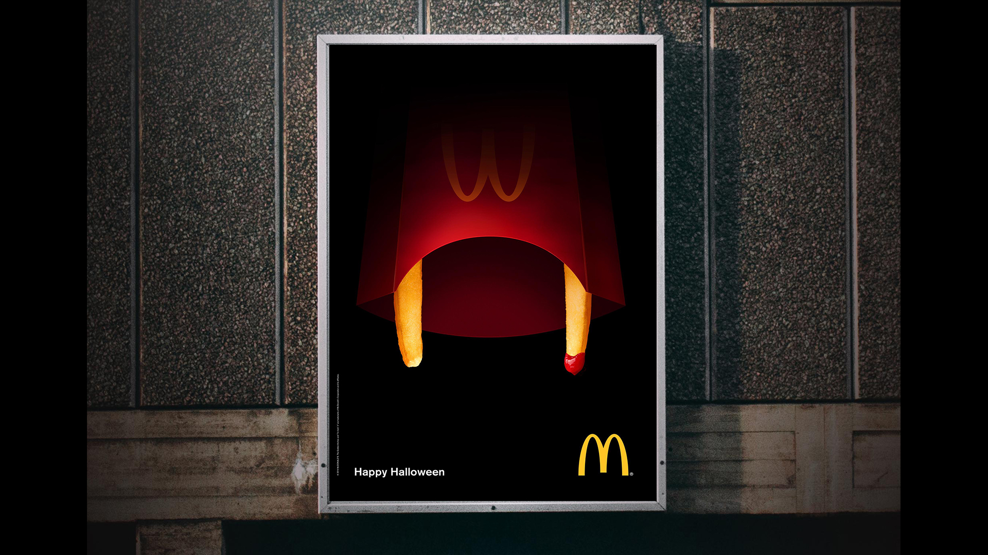
Halloween is the time of year when the big companies pull out all the stops (and puns) to get in on all the spooky festivities even though they don't always set the right tone. But these brilliantly designed McDonald's ads are both fun and festive.
McDonald's frequently has strong ad campaigns, whether it's print or digital, but this collection of Halloween-themed posters are getting us in the spirit (see what we did there?). The internet has just rediscovered this chip fang poster design, and are totally loving it. Shame McDonald's weren't taking note when it came to designing its road safety print ad.
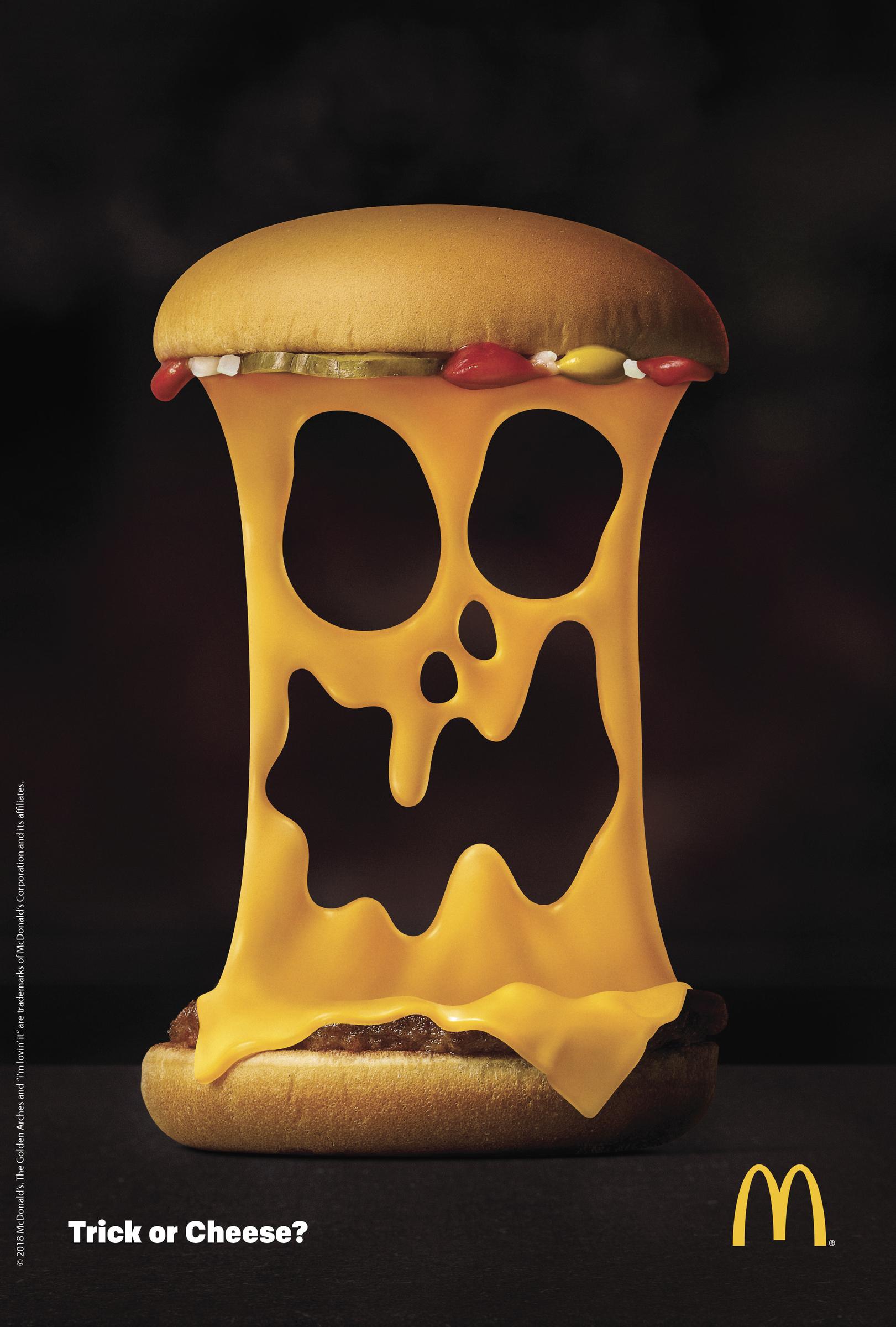
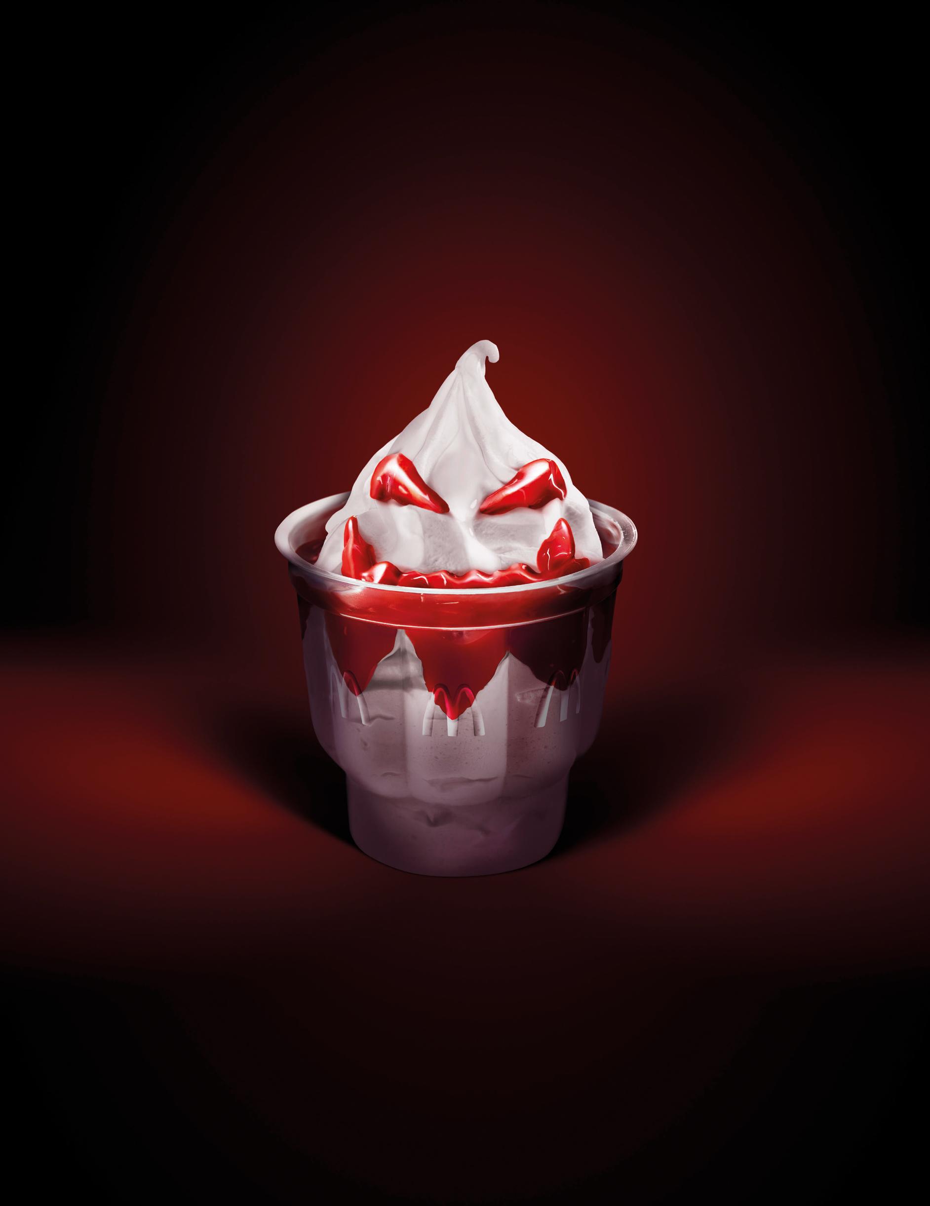
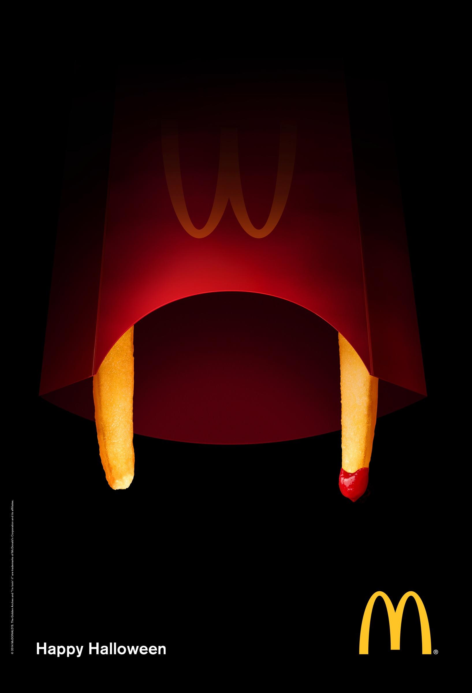
These print ads were designed by the advertising company DDB. At first glance, it just looks like just an average McDonald's advert, but the closer you look the more you can see a spooky face staring back at you.
We love the subtlety of these ads and the way DDB have incorporated the McDonald's colours make sure the posters are on brand whilst also conveying a certain eeriness to fit the Halloween theme. Saying that, we definitely prefer the ingenious designs for the McDelivery posters or the abstract McDonald's ads designed by TBWA.
While plenty of Redditors are loving these posters, others are less convinced. With the chip fang poster hitting the top of the Design Porn reddit page with 7.1k upvotes, it has also been greeted with some mixed reviews. Some thought that the poster looked less like fangs and more like the bonnets from The Handmaid's Tale.
mcdonalds_halloween_ad from r/DesignPorn
mcdonalds_halloween_ad from r/DesignPorn
mcdonalds_halloween_ad from r/DesignPorn
Whether you like the ads or not, we're sure everyone's feeling pretty hungry by now. If you think you can design a better print ad, then check out our round up of the best online poster makers. And if you're seeking some print ad inspiration, then have a look at our list of the best print ads of all time.
Read More:
Get the Creative Bloq Newsletter
Daily design news, reviews, how-tos and more, as picked by the editors.
- Brands change their logos to terrible new designs
- We NEED these posters for The French Dispatch
- New Hawkeye poster revealed and the internet are MARVELing at it

Thank you for reading 5 articles this month* Join now for unlimited access
Enjoy your first month for just £1 / $1 / €1
*Read 5 free articles per month without a subscription

Join now for unlimited access
Try first month for just £1 / $1 / €1

Amelia previously worked as Creative Bloq’s Staff Writer. After completing a degree in Popular Music and a Master’s in Song Writing, Amelia began designing posters, logos, album covers and websites for musicians. She covered a range of topics on Creative Bloq, including posters, optical illusions, logos (she's a particular fan of logo Easter eggs), gaming and illustration. In her free time, she relishes in the likes of art (especially the Pre-Raphaelites), photography and literature. Amelia prides herself on her unorthodox creative methods, her Animal Crossing island and her extensive music library.
