M3 MacBook Air hands-on: 3 striking things about Apple's new laptop
It might be a more significant update than it first seems.
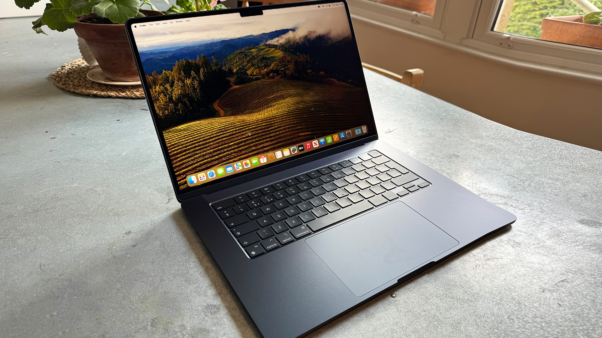
Apple made its first hardware announcement of 2024 this week, unveiling the brand new M3 MacBook Air, available in 13 and 15-inch versions. On the face of it, this appears to be a fairly iterative update. For one thing, the design remains unchanged (except for one particular detail related to the Midnight colour – more on that below). But after using the device for a couple of days, and combing through Apple's own marketing materials, the M3 MacBook Air might mark a more significant change in direction for the Mac – and even Apple in general – than first appears. (It's certainly a shoo-in for our roundup of the best laptops for graphic design.)
Refreshing 2022's model (read our M2 MacBook Air review), the M3 MacBook Air is said to be up to 60% faster than the M1 model, with new features including the ability to connect to two external monitor (providing the laptop lid is closed). We'll share our detailed review complete with performance benchmarks soon, but in the meantime, here are the 3 most striking details we've noticed about the M3 MacBook Air after a few days with the 15-inch version of the device.
01. Apple is going all-in on AI
Until the announcement of the M3 MacBook Air, Apple had hardly even used the term 'AI', preferring to stick to good old 'machine learning'. But it seems the company has finally decided to meet people where they are, declaring the M3 MacBook Air the "world's best consumer laptop for AI".
We've had chance to try out a few AI-based processes, and the results are impressively speedy. Enhancing an image with AI using Photomator’s Super Resolution feature is, unbelievably, almost instantaneous, upscaling photos while preserving and even recreating visually important details.
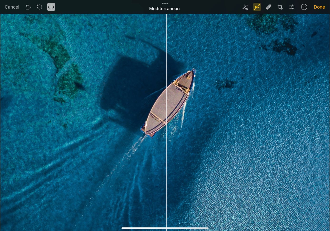
"With the transition to Apple silicon, every Mac is a great platform for AI," Apple says. "M3 includes a faster and more efficient 16-core Neural Engine, along with accelerators in the CPU and GPU to boost on-device machine learning, making MacBook Air the world’s best consumer laptop for AI. Leveraging this incredible AI performance, macOS delivers intelligent features that enhance productivity and creativity, so users can enable powerful camera features, real-time speech to text, translation, text predictions, visual understanding, accessibility features, and much more."
02. Midnight is finally fingerprint free
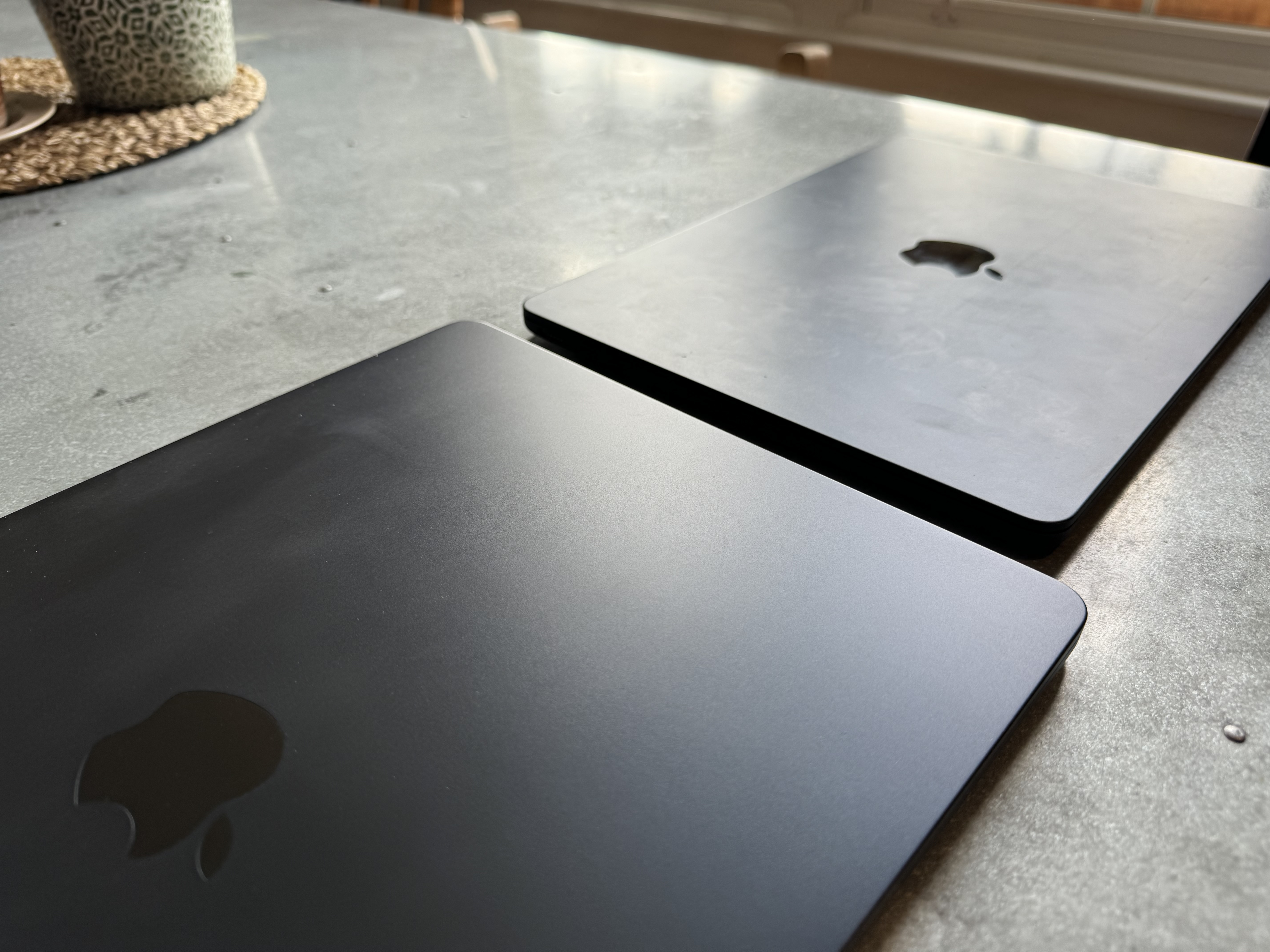
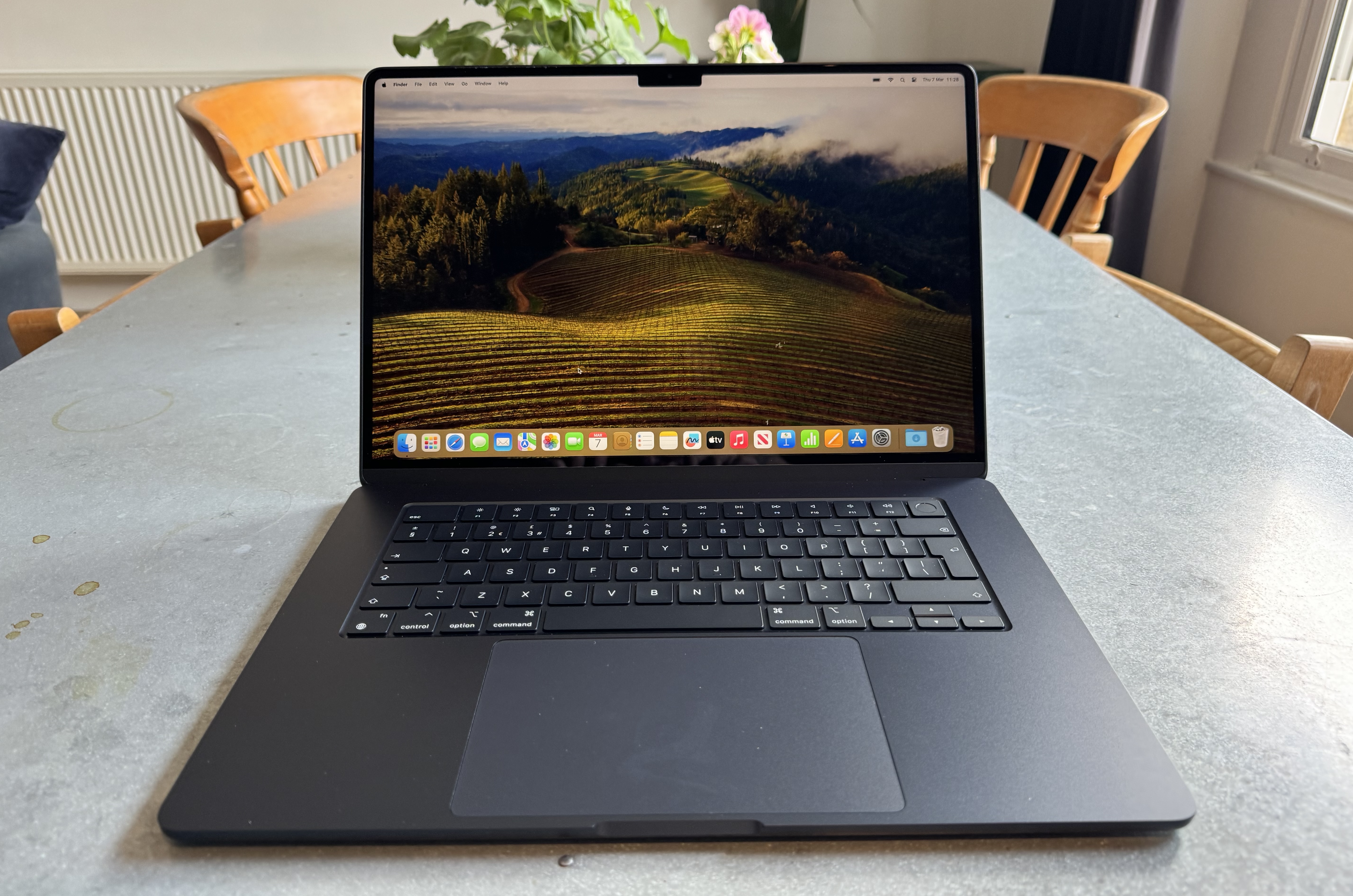
While the M2 MacBook Air's new midnight shade looked beautiful, there was no getting around the fact that it was a fingerprint magnet. My own model, in the wrong lighting conditions, looks like an international fingerprint database. But this time around, the Midnight version is finally easy to recommend.
Midnight now features a "breakthrough anodisation seal to reduce fingerprints". When placed side-by-side, the new version looks a little darker, but the most obvious difference is that it isn't covered in smudges.
Get the Creative Bloq Newsletter
Daily design news, reviews, how-tos and more, as picked by the editors.
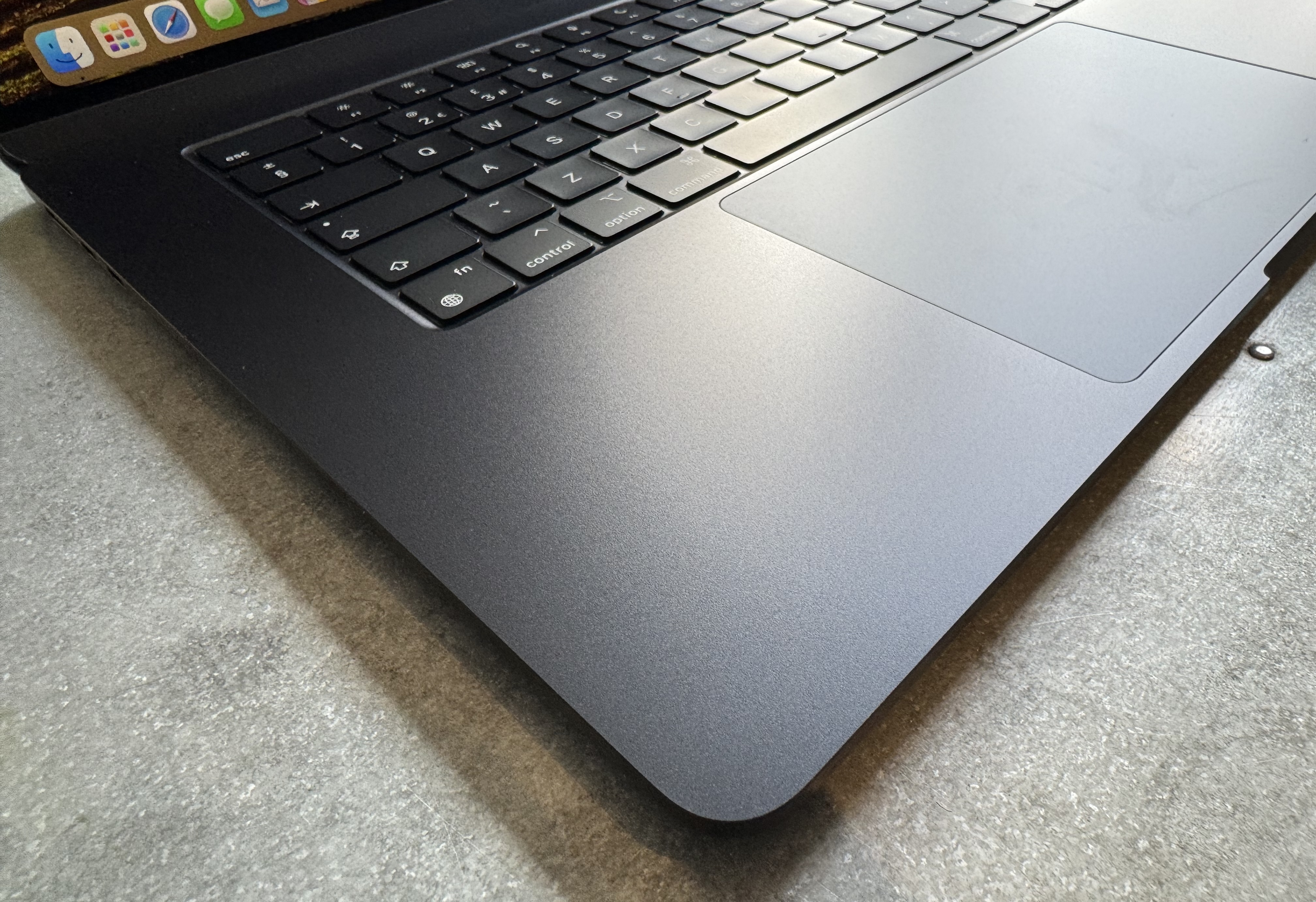
Apple first debuted this design tech with last year's M3 MacBook Pro, with the Space Black edition of that model also far less prone to fingerprints. Of course, it doesn't prevent all marks, and we'll have to wait until we've carried out some long term testing to see how it stacks up against the M2 model over time.
03. The 'wedge' is dead
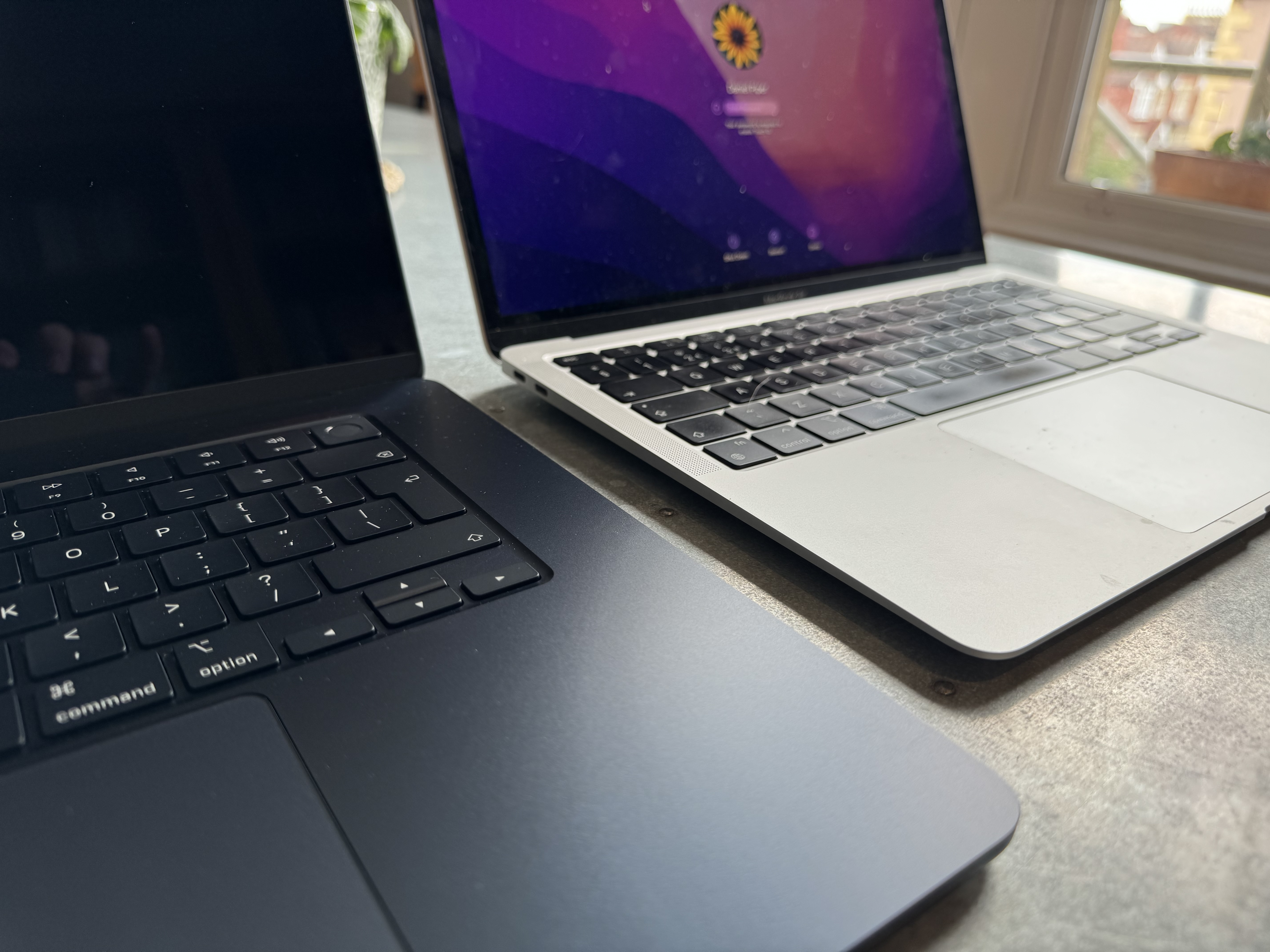
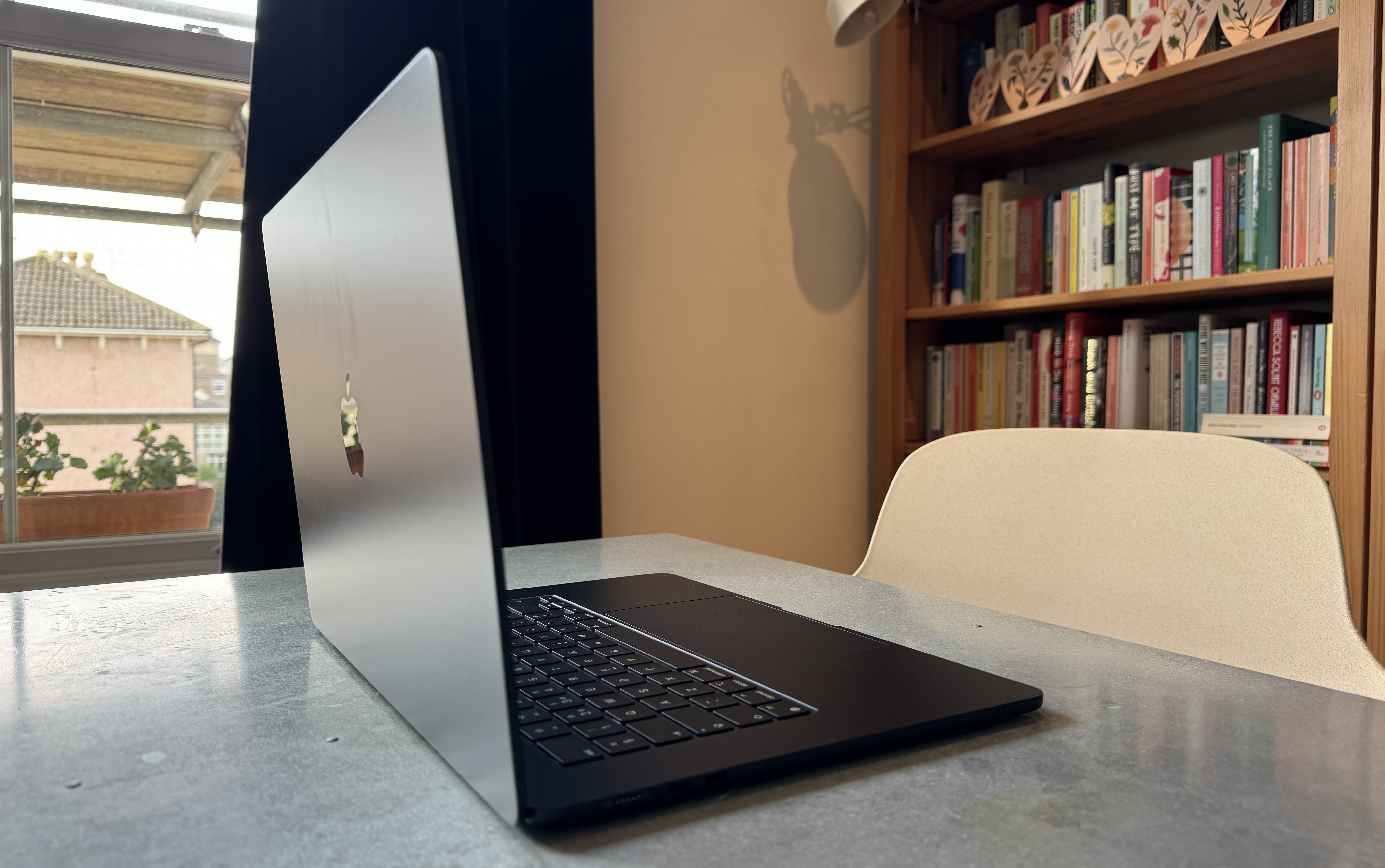
With the launch of the M3 MacBook Air, Apple also quietly retired the M1 MacBook Air. Which means the 'wedge', a design that's stuck around (albeit with a few tweaks) for 14 years, is finally no more.
Like the M2 Air, the M3 features a completely flat design. Sure, it's thicker than the thinnest end of the M1 Air, but the overall effect is that of a much thinner profile. Apple has adopted the somewhat controversial 'notch' above the display, sticking the 1080p FaceTime camera into a protrusion that slightly interrupts the menu bar. But while the notch is a trade-off, the updated design includes tiny bezels around the display, which manage to look even smaller on the 15-inch model.
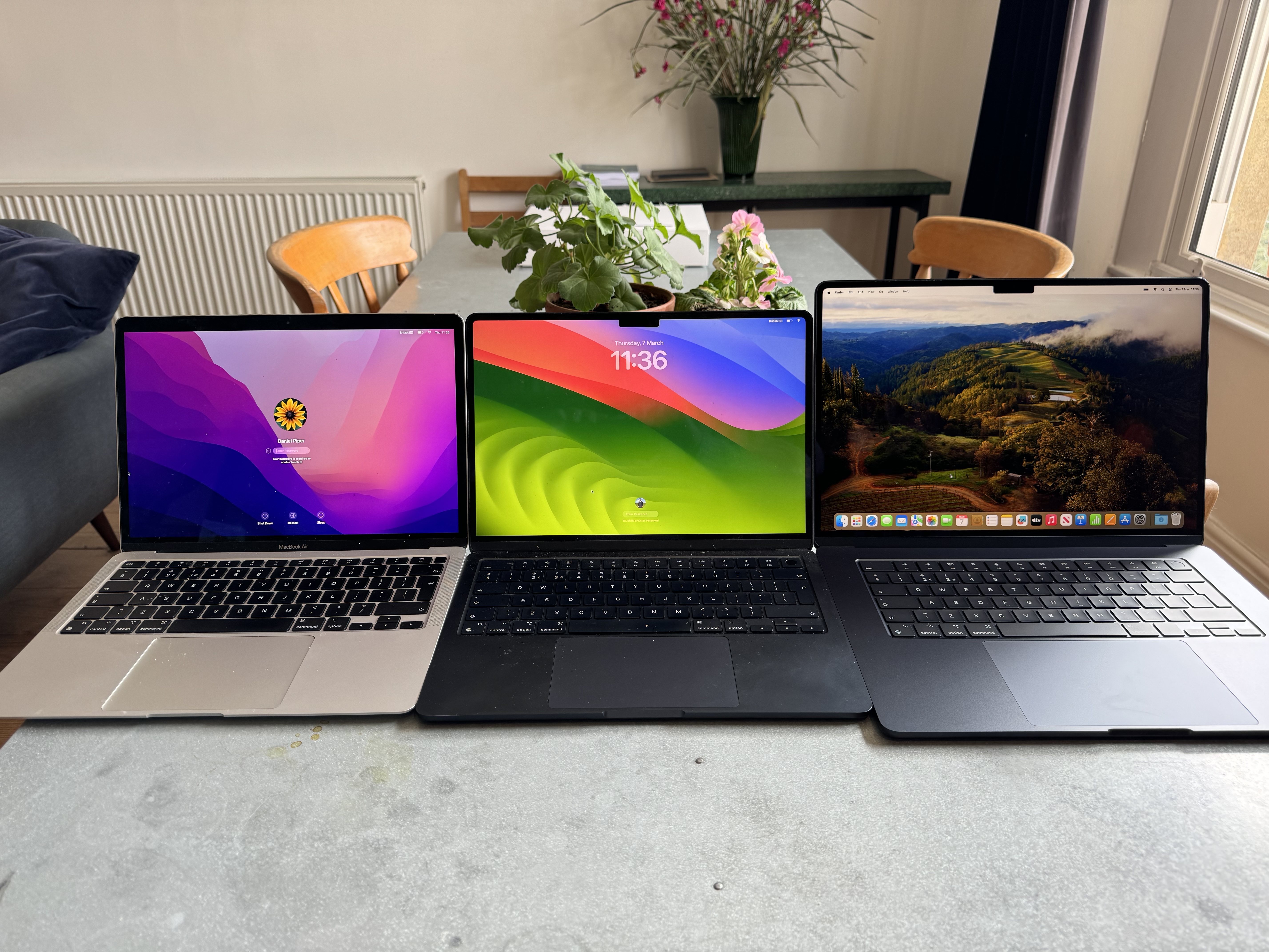
But while we'll take the new design over the old one, it's hard not to feel a little wistful as the 'doorstop' shape, which Steve Jobs famously pulled from an envelope on stage in 2008, has finally been discontinued. To illustrate quite how far ahead of everything else it was, Steve Jobs compared it to the Sony TZ series of “thin” laptops that were popular at the time. They were 0.8 inches at their slimmest point; the MacBook Air was 0.16 inches at its thinnest edge.

Thank you for reading 5 articles this month* Join now for unlimited access
Enjoy your first month for just £1 / $1 / €1
*Read 5 free articles per month without a subscription

Join now for unlimited access
Try first month for just £1 / $1 / €1

Daniel John is Design Editor at Creative Bloq. He reports on the worlds of design, branding and lifestyle tech, and has covered several industry events including Milan Design Week, OFFF Barcelona and Adobe Max in Los Angeles.
