MacOS Big Sur is here – but users aren't loving its icons
Skeuomorphism could be coming back.
MacOS Big Sur has been a long time coming, with the new operating system announced way back in June at Apple's WWDC event. It's finally here, and users are now getting to grips with new features as well as brand new look. But one aspect of the updated design is already drawing heat from users online.
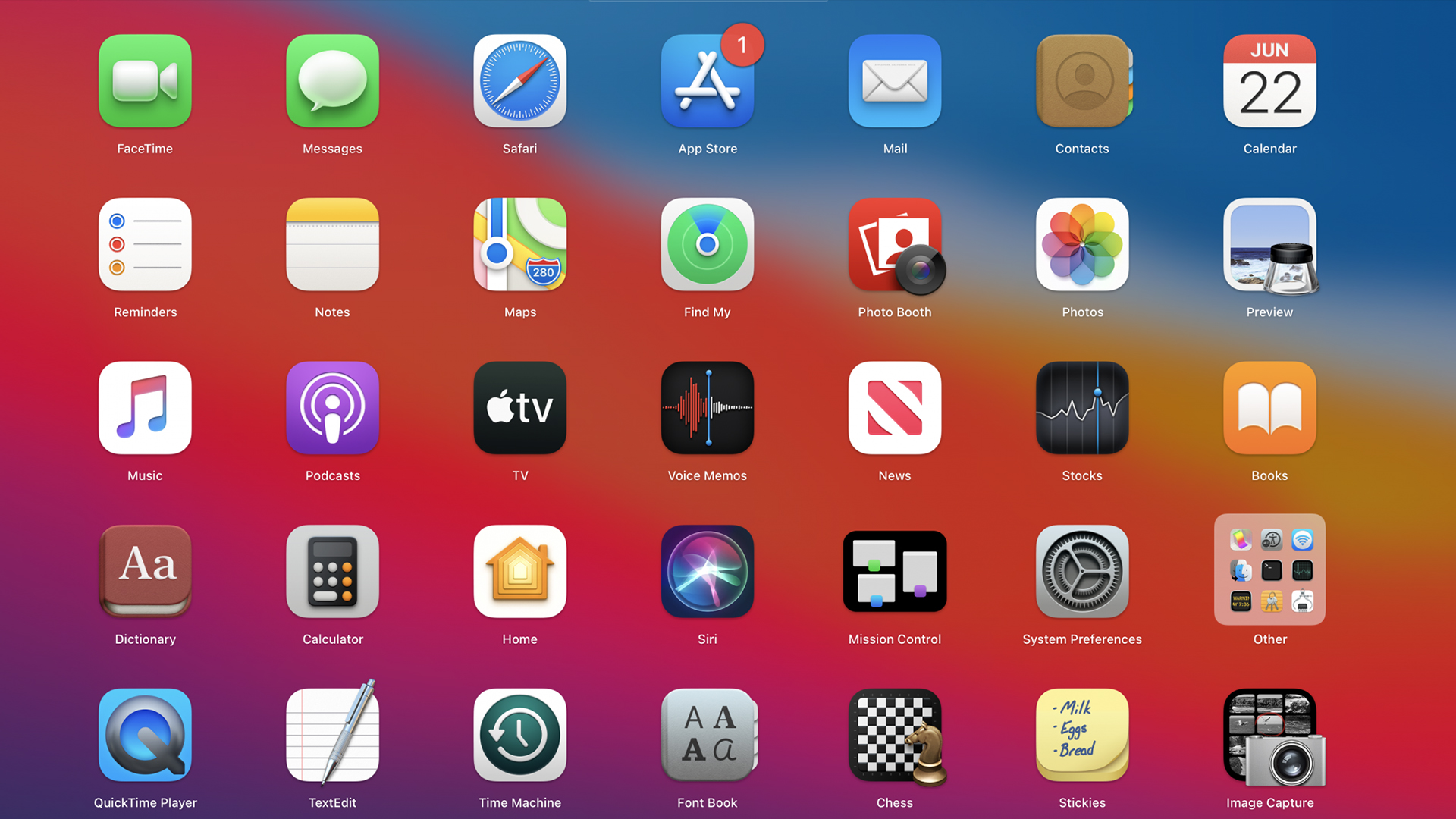
MacOS Big Sur's icons appear to mark a return to skeuomorphism, which is more realistic than flat design. With increased shadows adding texture and depth, these new icons are certainly more 3D. But after downloading the new software, many users have taken to Twitter to make their feelings known about the changes. (If you're in the market for a Mac, check out our best MacBook Black Friday deals.)

When the software was first announced back in June, many beta users were less than complimentary about the new icons. In a MacRumors thread dedicated to the offending designs, users described the icons as "horrific and poorly designed," with one suggesting "it's like Apple has just discovered the shadow effect". And now that the software is finally available to the public, many more users are sharing their thoughts.
Googling “how to replace Big Sur icons”November 13, 2020
The new Big Sur icons are too colourful and 'fun' 😢 bring back my Catalina simplicityNovember 13, 2020
Damn system preferences icons in Big Sur are a complete mess. pic.twitter.com/rE44bqKYlhNovember 13, 2020
just updated my macbook to macos big sur and I just want to say that whoever designed these icons needs to BE FIRED BECAUSE THIS IS THE UGLIEST MAC SOFTWARE I HAVE EVER SEENNovember 13, 2020
I'm sorry but what on earth is this... #BigSur pic.twitter.com/Kp0259NtqBNovember 13, 2020
As the world of icon and logo design marches on towards flat design, a return to 3D, skeuomorphic design might seem like a backwards step for Apple. Perhaps the problem here is a lack of consistency – while the Stickies icon (with its handwritten shopping list) is positively skeuomorphic with its realistic design, others (such as Messages and Facetime) look like modern, flat designs with a drop shadow slapped on. It's almost as though Apple can't make up its mind which way it wants to go.
However, not everybody is hating the new designs. Indeed, some (below) are enjoying the extra detail of the new style, and appreciating the more fun, colourful look.
Beautiful Big Sur icons pic.twitter.com/mPhmmsnv40November 13, 2020
In LOVE with these new Big Sur icons pic.twitter.com/1eGhyFgWNyNovember 13, 2020
I don't get why people don't like Big Sur's icons, they look fine to me. pic.twitter.com/ZvJq6u2zkkNovember 13, 2020
While Apple may well continue to tweak the icons and eventually find a sweet spot between the two design styles, we'd like to see a little more consistency across MacOS Big Sur.
There's been plenty for Mac fans to get their teeth into over the past few days, with the launch of Big Sur as well as the announcement of not one but three new Macs featuring Apple's own custom M1 chips. Check out the best MacBook deals below, and if you're looking for all the best Apple offers in one place, head over to our Apple Black Friday page.
Get the Creative Bloq Newsletter
Daily design news, reviews, how-tos and more, as picked by the editors.
Read more:
- Apple Black Friday 2020: What you need to know
- Twitter roasts Apple's new iOS 14 home screen
- Cheap Apple Pencil deals: The lowest prices

Thank you for reading 5 articles this month* Join now for unlimited access
Enjoy your first month for just £1 / $1 / €1
*Read 5 free articles per month without a subscription

Join now for unlimited access
Try first month for just £1 / $1 / €1

Daniel John is Design Editor at Creative Bloq. He reports on the worlds of design, branding and lifestyle tech, and has covered several industry events including Milan Design Week, OFFF Barcelona and Adobe Max in Los Angeles.
