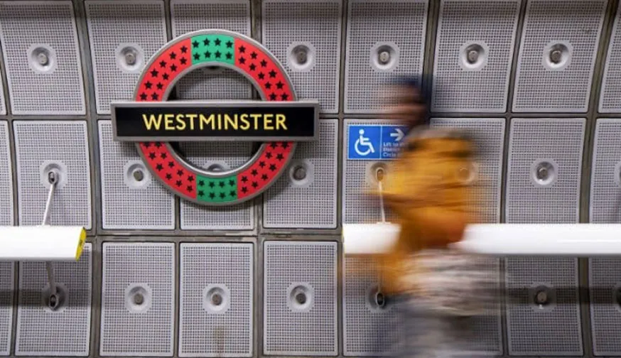
The London Underground symbol is an iconic piece of logo design. The red and blue bar and circle roundel has been around since 1908. But visitors to London's Westminster Underground station can now see a reimagined version of the transit symbol courtesy of British-Ghanaian artist Larry Achiampong.
The eight new designs – under the banner Pan African Flag for the Relic Travellers’ Alliance 2019 – were commissioned by Art on the Underground, a visual arts showcase funded by Transport for London. The designs are part of the '2019 – On Edge' series and if you want to get a closer look at the artwork you have until the end of February 2020, when the project comes to an end (if you happen to be heading to the UK capital yourself, see our guide to the best hotels in London).
Achiampong chose to focus on Pan African colours – green, black, and red – that speak symbolically to various African identities. The colours represent the land, the people and the struggles that the African continent has endured, while gold was chosen to represent a new day and prosperity.
Latest Videos From Creative Bloq
Beyond the colour palette, the redesign builds on the artist’s concept of Sanko-time. For those who don't know, Sanko-time is based in the Ashanti word 'sankofa'. This alludes to using the past to prepare for the future. And, the project takes a closer look at African mythologies and their relationship to science fiction.
It's an interesting concept, but what do people think of Achiampong's redesigns? Instagram account londonist_com asked, "Artist Larry Achiampong has given the roundels at Westminster a pan-African makeover. What do you make of them?"
A photo posted by @londonist_com on Nov 28, 2019 at 9:37am PST
Some people made positive comments, others thought the designs had a Christmassy feel, while others weren't impressed at all.
We think that a few may be missing the point. The redesign is a temporary piece of art. It's not a permanent move to a new look for the iconic design, it's just an interpretation of what it could be.
Get the Creative Bloq Newsletter
Daily design news, reviews, how-tos and more, as picked by the editors.
Steven Jenkins is a freelance content creator who has worked in the creative industries for over 20 years. The web and design are in his blood. He started out as a web designer before becoming the editor of Web Designer magazine and later net magazine. Loud guitars, AFC Bournemouth, Photoshop, CSS, and trying to save the world take up the rest of this time.