New names and colours make the system easier to use.
London's famous Tube map design is to get a major update. Transport for London (TfL) has announced new names and colours for the city's six Overland lines.
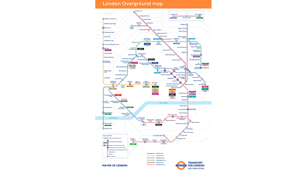
The Overland lines will be named the Lioness line, the Mildmay line, the Windrush line, the Weaver line, the Suffragette line and the Liberty line, and each will have its own colour. But it's more than just a superficial rebranding. This is an example of how design can aid usability (see our guide to UX theory)
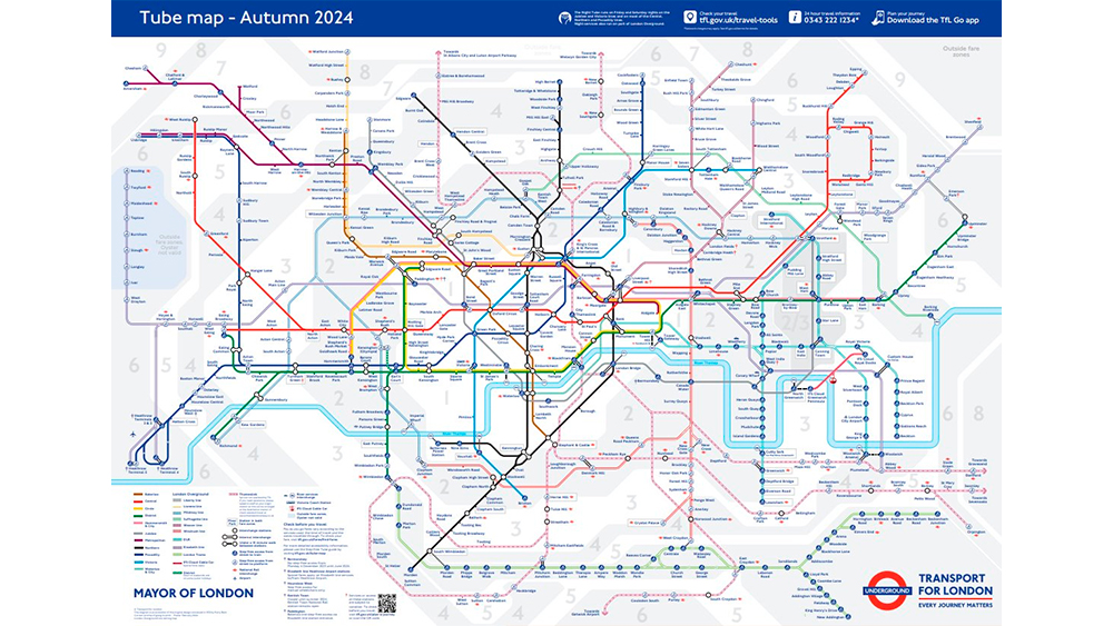
The new Tube map for 2024 after the application of the new colours (Image credit: Transport for London)
The six lines on the Overground are currently all identified on the Tube map with the same colour: orange-bordered lines that have earned the 113-station network the nickname of the Ginger Line. For anyone not familiar with the service, that's hardly an ideal user experience since the different lines are hard to distinguish and recall.
Latest Videos From Creative Bloq
The new names and individual colours will simplify the map, making the network less confusing and easier to understand. It also brings the network in line with the London Underground, which is famous for its map with colours used to easily identify the different lines – an approach adopted by many underground and metro services around the world.
(Image credit: Transport for London)
Certain sections of the press have voiced the obligatory indignation at the fact that the lines aren't all named after monarchs, but the new names are memorable and meaningful.
Lee Rolston, chief growth officer at branding experts JKR, said: "It’s only caused a reaction in the echo-chamber of certain British press titles. I think the regular users of the tube will feel the naming of the lines after Windrush or Suffragette movements just as valid as naming it after a monarch.
"I think it's great. The tube has always been a part of the rich cultural fabric of London - from being a refuge during wartime, to being referenced in song titles, and even playing a vital role in the pandemic. This new effort really demonstrates their dedication to weaving cultural and societal influences into the core of the brand."
Get the Creative Bloq Newsletter
Daily design news, reviews, how-tos and more, as picked by the editors.
The interior of Overground trains is not expected to change to match the line colour like Tube trains often too, and the orange roundel will still be used as the Overground logo.
Joe is a regular freelance journalist and editor at Creative Bloq. He writes news, features and buying guides and keeps track of the best equipment and software for creatives, from video editing programs to monitors and accessories. A veteran news writer and photographer, he now works as a project manager at the London and Buenos Aires-based design, production and branding agency Hermana Creatives. There he manages a team of designers, photographers and video editors who specialise in producing visual content and design assets for the hospitality sector. He also dances Argentine tango.