A writer has asked the question on Twitter, and it's opened a whole can of worms.
(Image credit: Velvetshark.com)
Think logos are all starting to look the same? You're not the only one. While ideally a logo design should aim to be timeless, they do, like anything else, do follow trends. The trend in recent years has been towards minimalist simplification. Both fashion and the practical requirements of small mobile screens have led to simpler, flatter designs.
But some people aren't convinced by the arguments for why the trend exists. One writer has proposed his own theories on Twitter, and the thread has gone viral, eliciting thousands of responses. From companies playing it safe or cutting costs to the death of aesthetic diversity, it appears everyone has a theory about why it's happening. But is it really anything new? For some more examples, see our selection of logos that look ridiculously similar. And for the best logo inspiration, see our pick of the best logos of all time.
While the debate's not new, the developer Radek Sienkiewicz opened it up again with a post on his site VelvetShark. He examines the "sans serif invasion", which he argues is creating a "sea of sameness" in tech and fashion logos. He thinks that since around 2017, brands have started to see "being unique as a handicap" and have decided it was better to be like everyone else.
Latest Videos From Creative Bloq
He doesn't buy the usual reasons given for the trend. He argues that readibility on mobile devices isn't the issue it's made out to be, especially with 4K and retina displays, and that claims in favour of simplication and utility don't hold up.
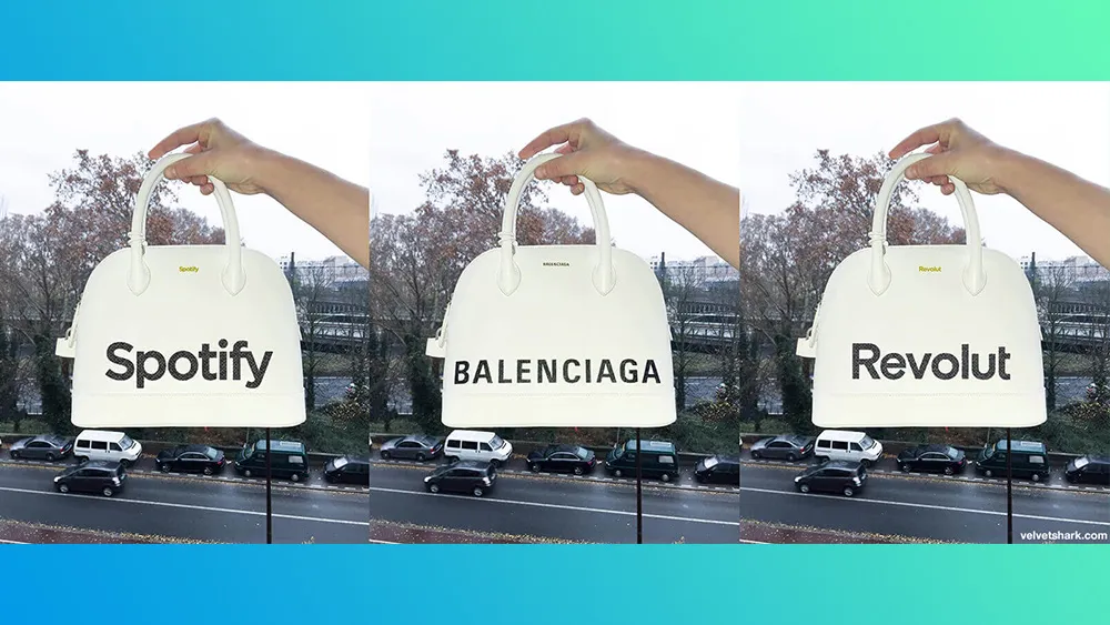
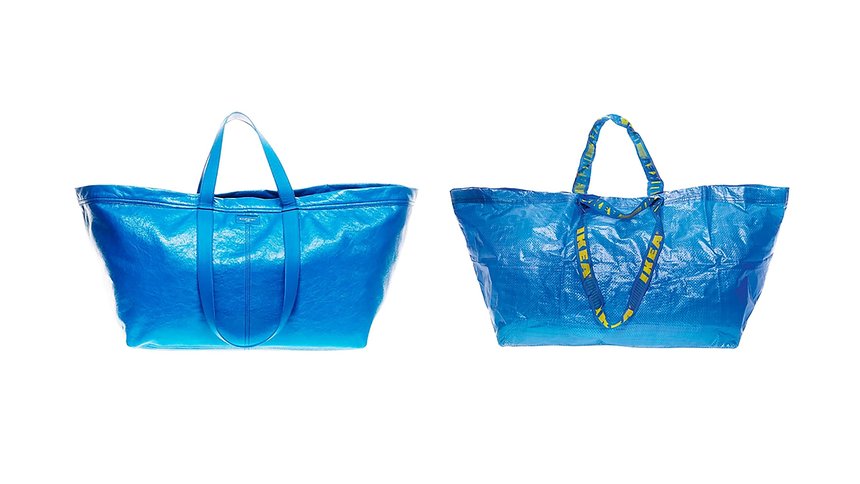
"Don’t throw away what the brand has been working on for decades," he says. "Otherwise, you may end up in a situation where you could slap any logo on any product and hardly anyone would notice a difference." He illustrates the point with an image of three bags (above) and the legend 'one of these bags is real'. We'll leave you to work out which one.
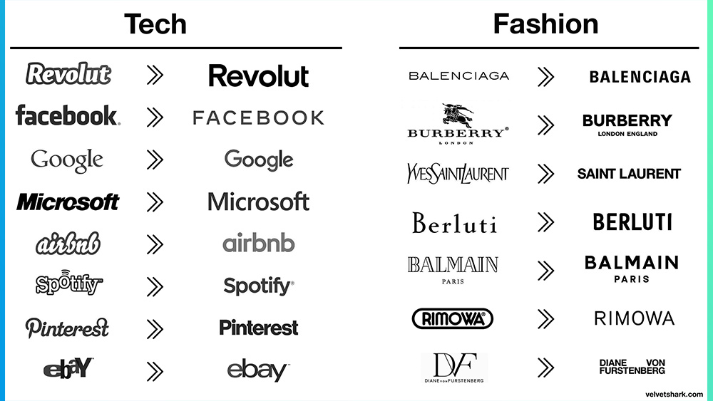
Sienkiewicz also shared examples of a series of tech and fashion logos that have changed in recent years. The tech brands he highlights have almost universally gravitated to simple lowercase wordmarks – gone is the jaunty typography of earlier logos from Spotify and ebay. The fashion brands all went uppercase. In both cases, there's not a serif to be seen.
For the tech brands, they at least have colour to tell them apart – and many have a logomark as well as their wordmark, but seeing the logos in greyscale shows just how much they rely on that for their brand identity. However, in the case of the fashion logos, they're almost always used in black and white, making them even more similiar in their real applications.
Get the Creative Bloq Newsletter
Daily design news, reviews, how-tos and more, as picked by the editors.
"It looked like two huge industries decided to use the services of one designer, and not a particularly inventive one at that," Sienkiewicz alleges. This makes it very easy to create a similar logo – as Gucci has discovered.
(Image credit: Velvetshark.com)
Sienkiewicz's observations were picked up by the writer and podcaster David Perell, who posted his own theories on a Twitter thread headed with the question, "What's causing all these logos to look the same?" It's since picked up 250K likes, 50K shares and more than 4,500 comments. Perell has two theories to explain the aesthetic homogenisation: 1) that designers are all using the same software and 2) that globalisation is killing aesthetic diversity.
My best guess comes down to two factors: software and the Internet.1) Software: Designers are using the same tools, which exert the same unconscious forces on their creative process.2) The Internet: Aesthetic diversity is bound to fall in such a hyper-connected world.July 9, 2022
See more
He goes further and suggests it's not just logos that are becoming more similar, but all design, from 'Corporate Memphis' illustration to doorbells, bookshelves and street furniture. As a society, it’s as if we’ve read too many blog posts about the 80/20 rule," he says. "When you strip away too much of the non-essential, you lose the kind of craftsmanship that endows an object with soul and makes life feel meaningful."
Plenty of people agreed. One person responded: "This is what happens when the creative dept is overrun by the marketing dept. Being data driven is the death of art." Another person replied, "Brands are scared to stand out and they don’t want to pay for the time and skill it takes to create a unique logo. Blending in is easier."
Something to factor into your answer: The homogenization doesn't end with logos. It's happening to phone booths, doorbells, street poles, and bookshelves too.(h/t @culturaltutor) pic.twitter.com/5cqBiA2GEbJuly 9, 2022
See more
But not everyone sees it that way. Many people took issue with the suggestion that the software is to blame, noting that you can create any logo design you like in the best graphic design software. UI engineer, Lucas Castro had a different take on the reason. "It's not simply accidental homogeneity: there's a fundamental difference between the objectives of graphic design VS UX design." He notes that in UX, "sticking to convention is a feature, not a bug." See our guide to the things to consider when designing a UI for more on that.
Another person suggested a different theory: "My bet is it’s the clients. You have no idea the # of options these brands were presented. It was a lot! Having been in this business for some time, very few clients have the courage to be different." But some question whether it's really something new at all. After all, if you look at lot of logos from as far back as the 19th century, you'll see a lot of similarities between them, with ornate script fonts and lines, detailed illustrations, filigree and other fussy adornments.
What is causing this terrible homogenization of logo design and why is it the demise of western civilization? Thread 🧵 pic.twitter.com/TtGELokBafJuly 10, 2022
See more
We can certainly see Perell and Sienkiewicz's point though. The tendency to simplification is very clear, and in some cases it can start to feel a lot of the same thing. It's not only happening with wordmarks – we've seen logomarks also get flattened and simplified – sometimes very successfully. One of the latest big examples was the new Aston Martin logo.
But the requirements of small mobile screens, the need to reach a global audience, and, yes, fashion, mean that it most cases the change makes sense. We dread to imagine the original Apple logo rendered as a favicon. However, the new Rolling Stone logo is a successful example of how logos can be simplified while retaining a lot of their original character.
In most cases, a brand will want a logomark as well as a logotype that more readily differentiates them. Perhaps the simplification of logos might even require brands to ensure their branding is more than just their logo.
For some pointers for your won work, see our guide to how to design a logo. And to see what to avoid, don't miss our pick of the worst logos of 2022 so far. If you need to upgrade your software, see the best current prices on Adobe's Creative Cloud below.
Joe is a regular freelance journalist and editor at Creative Bloq. He writes news, features and buying guides and keeps track of the best equipment and software for creatives, from video editing programs to monitors and accessories. A veteran news writer and photographer, he now works as a project manager at the London and Buenos Aires-based design, production and branding agency Hermana Creatives. There he manages a team of designers, photographers and video editors who specialise in producing visual content and design assets for the hospitality sector. He also dances Argentine tango.