Can famous logos still work in a totally different colour?
The results might surprise you.
We see iconic logos every day, and the most famous examples are etched onto our memory. From the yellow McDonald's arches to the red Netflix wordmark, many brands are synonymous with a particular colour. But if that colour were to change, would our perception of the brand change with it?
A new study has revealed just how important colour is to some of the UK’s leading brand logos, and the results are surprising. Indeed, it seems even a simple change of hue could be enough to yank a design from our best logos roundup.

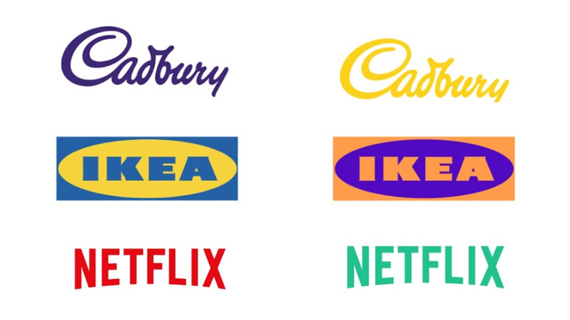
Icon Printing teamed up with Karen Haller, the leading international authority in the field of Applied Colour Psychology, to switch nine iconic UK logos to the opposite colours on the colour wheel. (Not sure what we're talking about? Take a look at our guide to colour theory.)

Change Netflix from red to green, and we move from "serial excitement to natural zen". "There’s a reason why red is used in cinemas and theatres. When we sit on red seats, it encourages us to get excited, full of anticipation for the show to begin. This is because, in colour psychology terms, red stimulates the physical," Haller says. "If Netflix changed its brand colour to green, we would straight away lose that sense of anticipation, that excitement."

Meanwhile, if Samsung's logo was to change from dark blue to gold, we'd lose a sense of "trustworthy communications", which would be replaced by "premium exclusivity" – in other words, a brand that isn't for everyone.

Perhaps the most interesting change is Ikea. While it's already a bold and striking logo, flipping the colours to orange and purple nudge it over into childishness. Fine for the brand's range of children's products perhaps – but it doesn't scream 'solid and reliable bookcase' to us.
The full study includes many more brands such as Boots, Royal Mail and, er, Cathedral City Cheese. It's a fascinating look at how a simple nudge of the 'hue' slider on Photoshop can completely change the aura of a brand. Speaking of which, want to have a go at changing some logos of your own? Then check out our guide on how to download Photoshop.
Get the Creative Bloq Newsletter
Daily design news, reviews, how-tos and more, as picked by the editors.
Read more:

Thank you for reading 5 articles this month* Join now for unlimited access
Enjoy your first month for just £1 / $1 / €1
*Read 5 free articles per month without a subscription

Join now for unlimited access
Try first month for just £1 / $1 / €1

Daniel John is Design Editor at Creative Bloq. He reports on the worlds of design, branding and lifestyle tech, and has covered several industry events including Milan Design Week, OFFF Barcelona and Adobe Max in Los Angeles.
