These logo design mashups will mess with your head
But that's definitely the point.
Some brands make us feel as if they've been around since the dawn of time. The likes of Nestle and Heinz sport packaging and logo designs that are instantly recognisable, and people pick up their products without even thinking about it. It's a level of consumer trust that brands all over the world aspire to.
Artist Ahmed Morshedi recently shone a light on the concept of brand trust with a series of brilliant but brain muddling packaging redesigns. The Experiment is comprised of brand design mashups that aim to make you stop and think. And it certainly made our heads hurt.
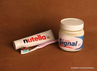
The above Nutella/Signal mashup is a good example of how Morshedi has managed to confuse us. It's like we've gone through the looking glass to an upside-down world where, though nothing makes sense, everything still works. And let's be honest, who doesn't love the idea of brushing their teeth with Nutella?
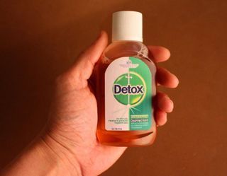
Morshedi explains his work: “I redesigned the logos, printed them out and repackaged well-known brands in a way that will mess with your head … in a good way,” he says. But Morshedi hasn't just created this art to turn us all topsy-turvy, he also thinks there's an important message here for designers.
"It's simply a different way of looking at the brands, which most of the time their teams are afraid of tackling it in such a way," Morshedi told Bored Panda. This approach makes us consider whether some brands are too ingrained in our consciousness. Do we still see them, or are some in danger of becoming background noise? Morshesdi's work certainly emphasises the impact of a brand refresh, and the importance of thinking outside of the limitations of a brand image.
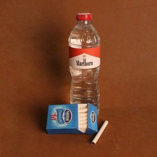
Branding couldn't be more important for this cigarette/water switcheroo. After the transition cigarette branding has gone through over the last decades – from bright and alluring to plain with unsightly pictures and impactful messaging – it's jarring to see how the brand message of a pack of cigs can be altered. This pack looks like it could be straight out of the mind of an early Don Draper (before all the important legislation came in), bringing cigarettes to the masses with misleading and harmful imagery.
Also the idea of water, the essence of life, being covered with cigarette branding is, frankly, disturbing. And not one we ever want to see come to fruition.
Get the Creative Bloq Newsletter
Daily design news, reviews, how-tos and more, as picked by the editors.
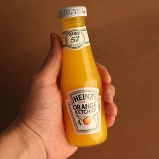
We especially like this 'Orange Ketchup', not only for the smart redesign but for the opportunity to add ketchup to a different type of meal. It also reminds us of the time purple ketchup was a thing, and we wonder why Heinz didn't continue the shake-up. Though it did have it's own wacky branding, and we kinda like the classic twist Morshedi has put on things.
This isn't the first time we've seen brands go though unofficial logo mashups, but every time it happens it makes us consider whether everything we know is true, and it seems it doesn't ever get less confusing.
Read more:

Thank you for reading 5 articles this month* Join now for unlimited access
Enjoy your first month for just £1 / $1 / €1
*Read 5 free articles per month without a subscription

Join now for unlimited access
Try first month for just £1 / $1 / €1
Georgia is lucky enough to be Creative Bloq's Editor. She has been working for Creative Bloq since 2018, starting out as a freelancer writing about all things branding, design, art, tech and creativity – as well as sniffing out genuinely good deals on creative technology. Since becoming Editor, she has been managing the site and its long term strategy, helping to shape the diverse content streams CB is known for and leading the team in their own creativity.

