Are these the 10 commandments of logo design?

A graphic of a logo being designed
(Image credit: Sprout Social)

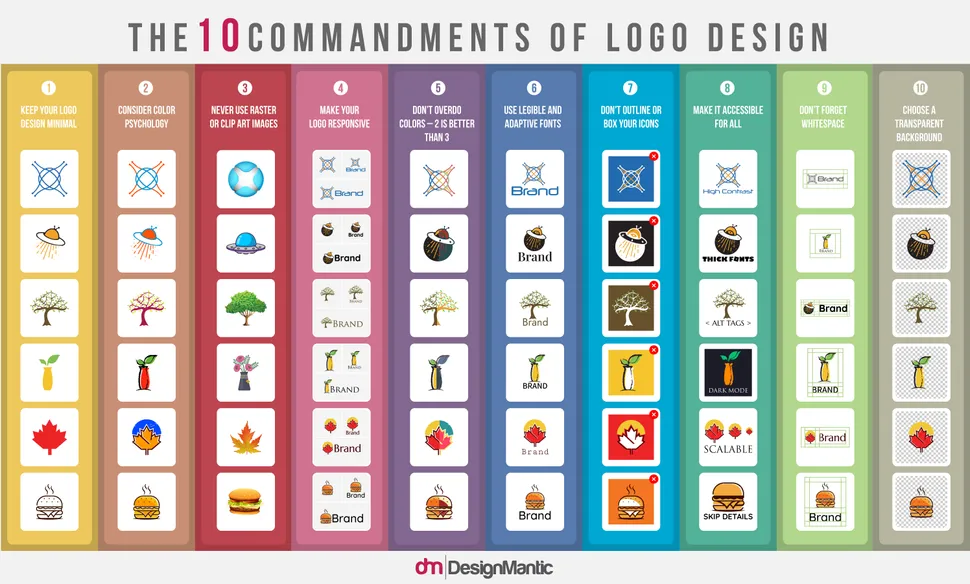
We love a good infographic here at Creative Bloq, especially when they're full of nifty tips and tricks to perfect our creative process. And this vibrant graphic is no exception. Created by DesignMantic, this infographic has 10 fool-proof steps to designing a great logo. 

While this design is simple, it's still jam-packed with information. We love the engaging colours and the diagrams that show you exactly what you should and shouldn't do when designing logos – it's almost like the infographic version of our 15 golden rules of logo design

Thank you for reading 5 articles this month* Join now for unlimited access

Enjoy your first month for just £1 / $1 / €1

*Read 5 free articles per month without a subscription

Join now for unlimited access

Try first month for just £1 / $1 / €1

Amelia Bamsey
Staff Writer

Amelia is Creative Bloq’s Staff Writer. After completing a degree in Popular Music and a Master’s in Song Writing, Amelia began designing posters, logos, album covers and websites for musicians. She now enjoys covering a range of topics on Creative Bloq, including posters, optical illusions, logos (she's a particular fan of logo Easter eggs), gaming and illustration. In her free time, she relishes in the likes of art (especially the Pre-Raphaelites), photography and literature. Amelia prides herself on her unorthodox creative methods, her Animal Crossing island and her extensive music library.

Read more
Apple logo
The 10 best logos of all time
five different logos on a pink to yellow gradient background
The best logos of the 2020s (so far)
Hip-Hop infographic by Dorothy
29 inspiring infographics
Five of the best logos of the 2010s
The best logos of the 2010s
Jaguar logo
The year in logos: 2024 was both pivotal and controversial
woman showing a younger woman something on a drawing tablet
What do you wish you'd known as a beginner graphic designer? - We asked the experts
Latest in Logos & Icons
Microsoft To Do
People have some Very Strong Opinions on the Microsoft To Do icons
Clippers logos old vs new
New LA Clippers logo is an instant classic
WLCO logo design
This hip neighbourhood's logo is totally loopy, but I love it
The superman logo as based on a potential design from Superman: Legacy
Possible new Superman logo divides fans
Lyle's Golden Syrup and Lyles Black Treacle tins showing the lion logo
Lyle's apologises for its Golden Syrup logo redesign as even the church expresses dismay
Steve Jobs and the Google logo
Apparently Steve Jobs hated the Google logo on his iPhone
Latest in News
Absolut vodka
Why Absolut's 'bottle' print ad is the greatest of all time
Democratic Party donkey logo
People are bashing the Democrat's new logo, but a rebrand was necessary
Mark looks at a crystal cube from Lumon in Severance
5 perfect Severance prop designs that shaped Apple TV's best series
Audi EV billboard adverts
Ingenious Audi billboards soar above the chaos in EV branding
Chupa Chups logo
The Chupa Chups logo was created by an art legend in just one hour
DC Sonic the Hedgehog comic collaboration
Sega reveals first glimpse of the Sonic DC collaboration we never knew we needed