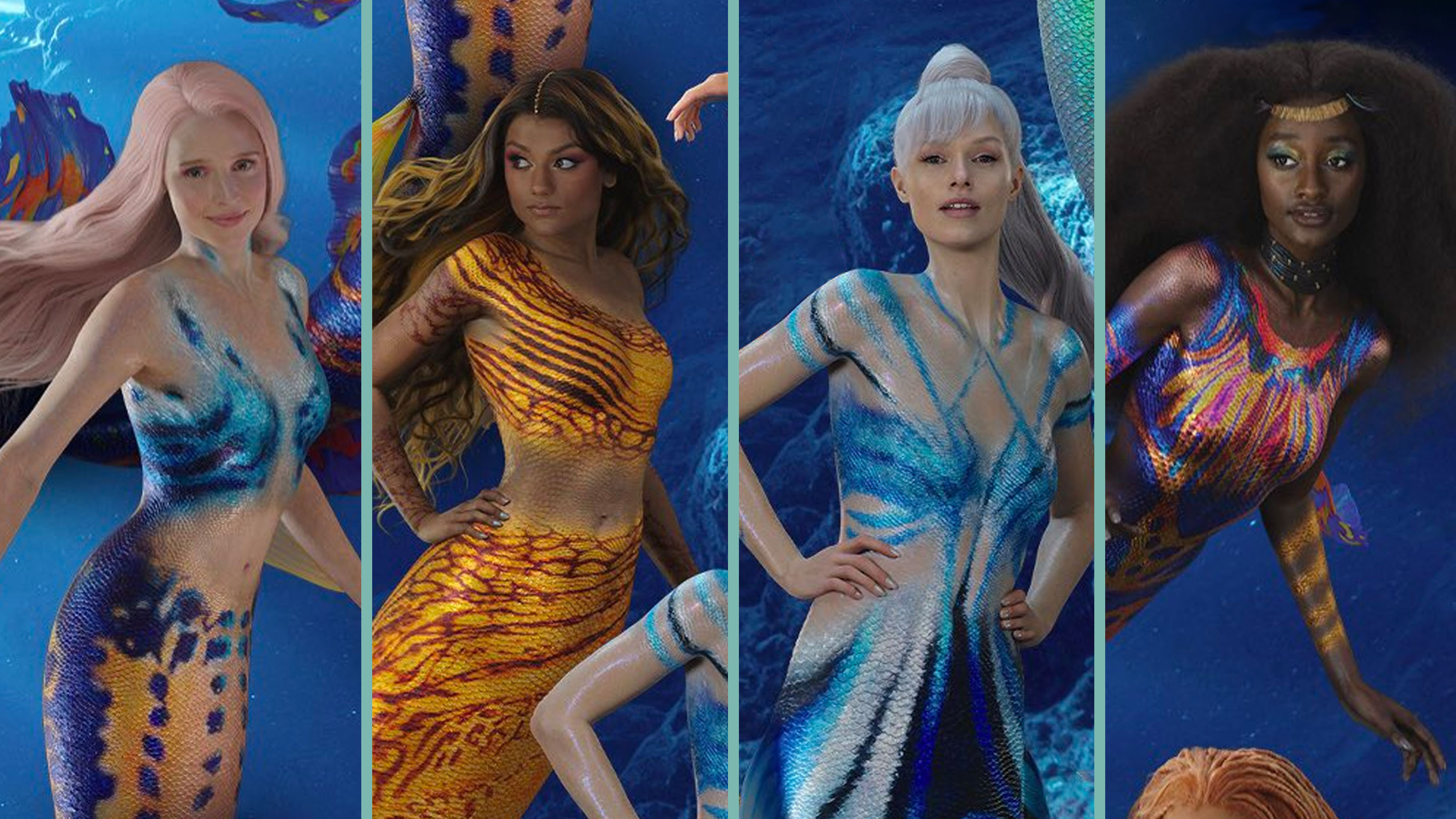
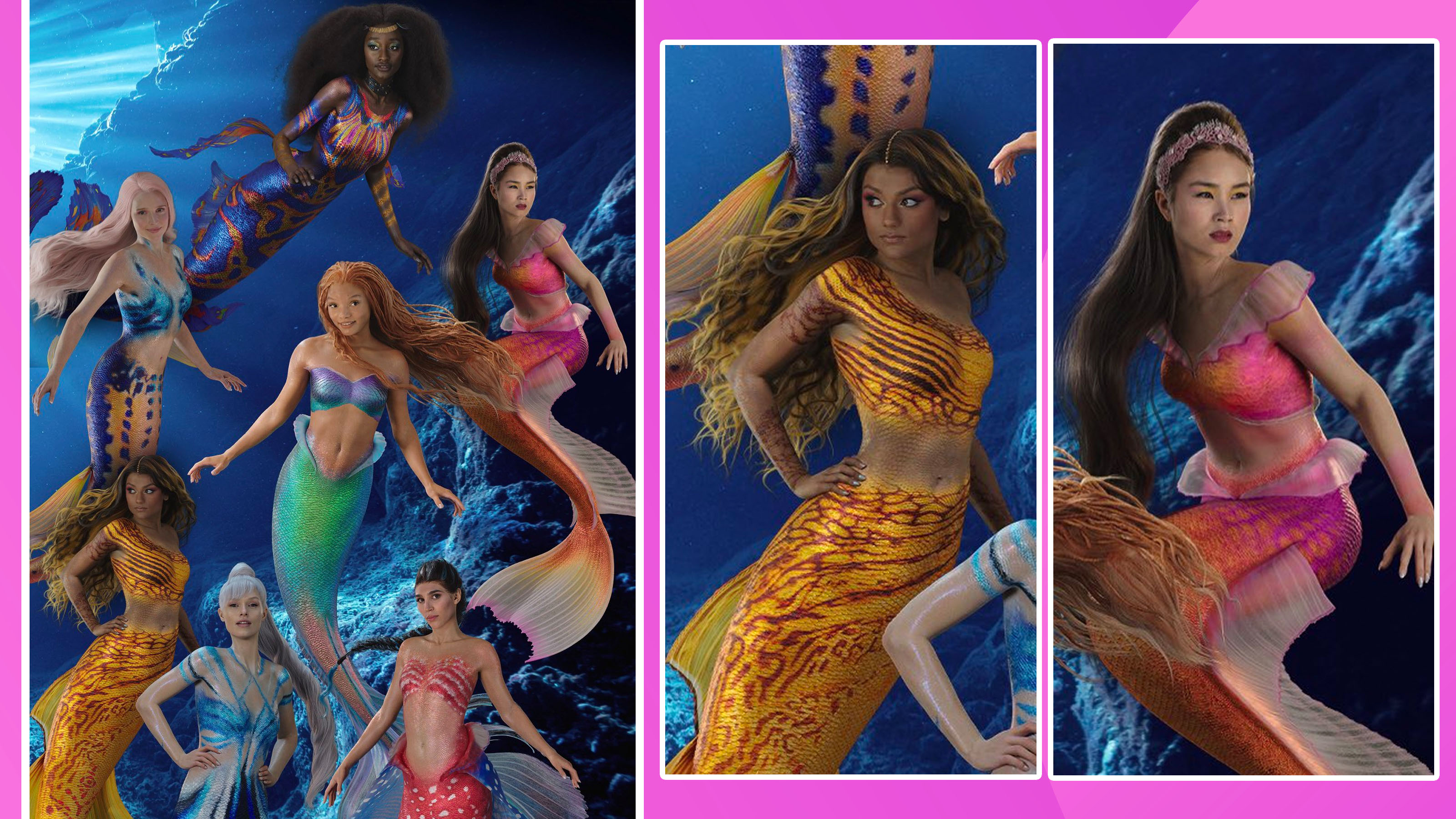
What on earth is going on with this Little Mermaid poster?
Some things are better left under the sea.

It's fair to say that Disney is no stranger to live-action remakes at this point, with its list of rehashed titles growing ever larger year by year. The classic tale of the Little Mermaid is one of the latest in production – but newer doesn't always mean better, and many Disney fans are baffled by this latest poster, which features some rather questionable Photoshop.
The leak is certainly kicking up a stir on social media. The poster (originally found on Target's website) has been shared to Twitter and fans are rightfully pointing out the odd visuals. The poster shows Ariel with her sisters, and whilst the wide array of representation is something to be admired, the same can't be said for the graphic design on show. We certainly won't be adding it to our list of the best print ads of all time.

Many commenters are trying to work out exactly what feels off about the poster. Most agree that it's the lighting – the lack of a direct and consistent light source makes each character feel like they belong in a completely different scene. Each character design is so different that it barely feels like they should be in the same film. Most notably, Ariel's design feels almost bland compared to her siblings' unique patterning, and the lack of a cohesive colour scheme throughout the sea-dwelling sisters throws us off entirely. Personally, I feel like a lack of water reflections and bubbles also makes it feel really flat, which seems to be a common issue if the latest trailer is anything to go by.
The conversation about remakes and live-action adaptions is one that keeps popping up, and not for the right reasons. I recently wrote about the classic remasters that scrub the older films of grain so much that is actually destroys a lot of the original line work. As the saying goes – if it ain't broke, don't fix it. Maybe the same should be said for live-action adaptions.
Ariel and her sisters in the live-action remake of ‘THE LITTLE MERMAID.’(via @mmdisney200) pic.twitter.com/ZQuCsPayPJApril 24, 2023
When it comes to marketing, Disney has come under fire a few times for its questionable design choices recently. From claims of ripping off fan art to dodgy Photoshop on the Ant-Man 3 poster, we're not quite sure what's going on in the drawing room.
Of course, the nature of leaks is that public eyes see things before they're fully complete and approved, so maybe we're just seeing an early draft. But considering this has already been spotted online, I'm not hopeful.
Read more:
- Understand Disney's 12 principles of animation
- I'm not buzzing about Disney's Toy Story 5 announcement
- These old Disney posters are design heaven
Get the Creative Bloq Newsletter
Daily design news, reviews, how-tos and more, as picked by the editors.

Thank you for reading 5 articles this month* Join now for unlimited access
Enjoy your first month for just £1 / $1 / €1
*Read 5 free articles per month without a subscription

Join now for unlimited access
Try first month for just £1 / $1 / €1

Abi Le Guilcher previously worked as Creative Bloq’s former ecommerce writer. With a Bachelor of Arts in Creative Design for Game and Film, Abi enjoys almost anything creative and will either be found crafting or gaming in her spare time. Her previous experience as a retail assistant at CeX means she has a wide range of knowledge in both technology and media and loves to keep up to date with the latest tech. Abi is an avid cosplayer and has most recently worked with PlayStation and Santa Monica Studio on a promotional campaign for the release of God of War Ragnarök.
