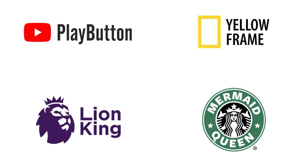
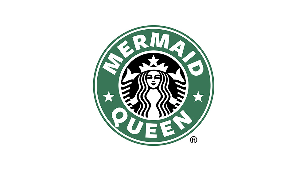
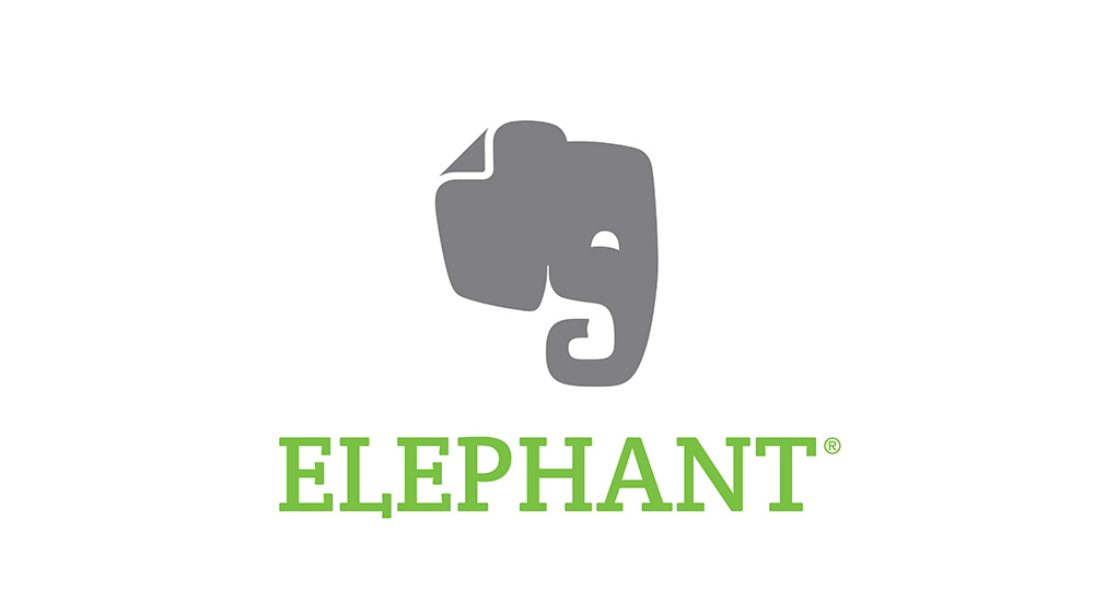
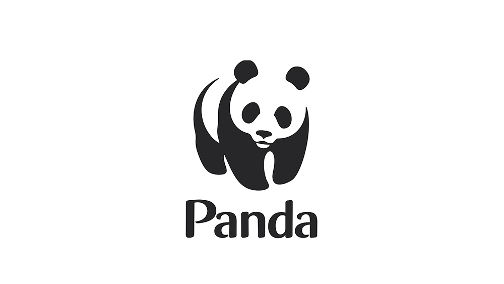
When designing a logo, you have a whole bunch of creative decisions to make. Do you use a strong image to represent exactly what the brand does, or do you go more conceptual with a carefully curated squiggle (not that you'd ever admit that's what it is)? It all depends on what you want the consumer to see, and the brief, of course, which will inform your decisions.
One graphic designer has played with those decisions with a recent project, where they've replaced brand names with the literal meaning of their logo images. Seeing some of the biggest brand logos this way isn't only good fun, it offers a new perspective on the image and message they've chosen to project with their branding – and is surprisingly thought provoking. You can see them below. Want to have a go? Download Illustrator and get designing.
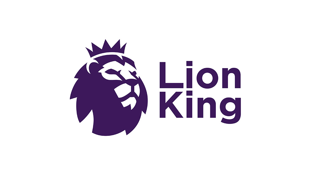
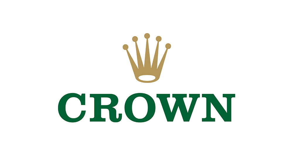
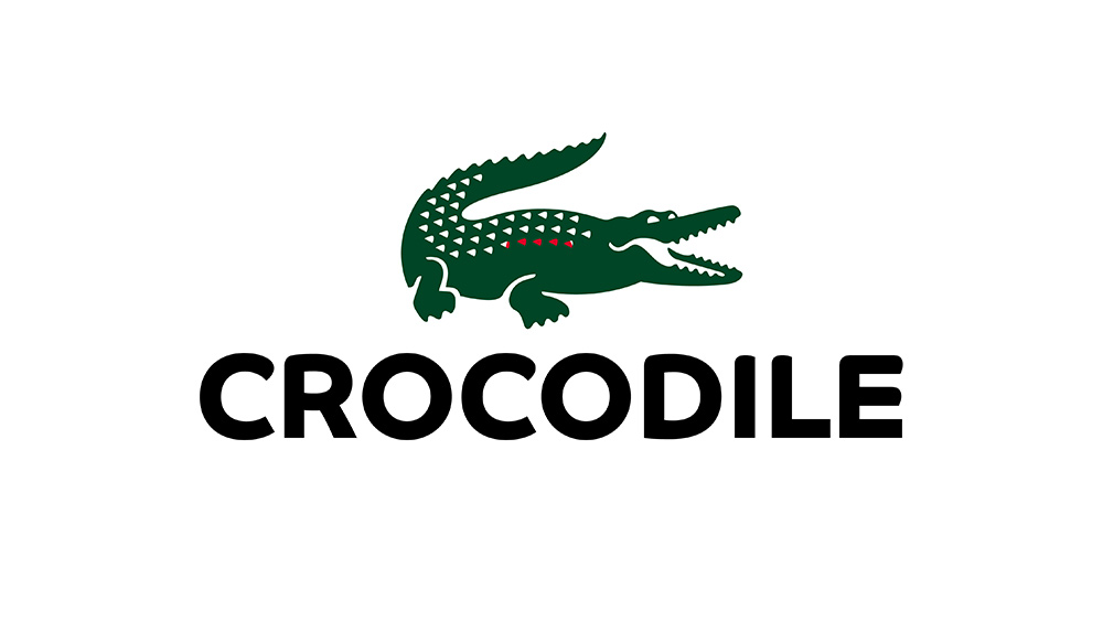
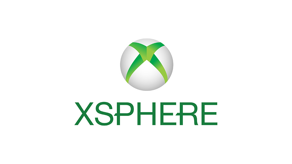
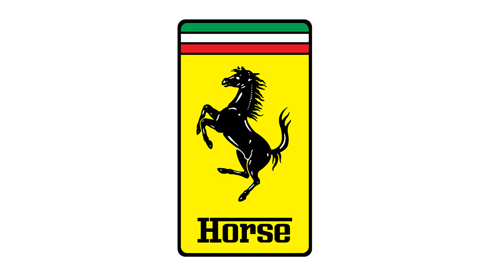
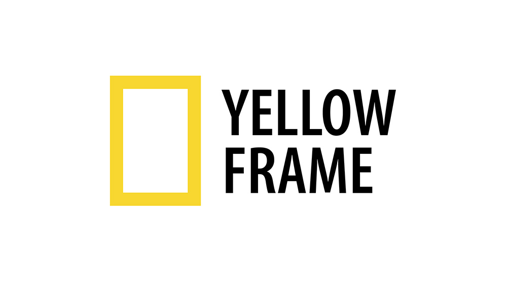
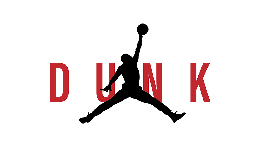
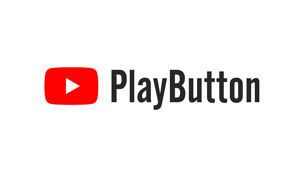
Apple, Puma, Ram, Dominos ...Some brands names are the literal meaning of the Symbol/Icon on their logo, so I got the idea to redesign other brands, so their name is the literal meaning of the brand's symbol/icon 1/3 pic.twitter.com/Zgk3K4L8cOJune 21, 2022
See more
"The idea came when I was browsing and analysing some international brand's identities, and I noticed that some brands have their symbol be the literal description of the brand name, like (Puma, Ram, Apple, Dominos, Shell...)," Samir Chajia told Creative Bloq. "I wondered how other brands will look if they took the same approach."
Latest Videos From Creative Bloq
Chajia then searched for famous brands and selected the ones that could be easily described in a word or two. See them all in the slideshow below (scroll to see more), and you might want to consider the brand's real-life creative intention as you go.
Image 1 of 11
(Image credit: Samir Chajia)
(Image credit: Samir Chajia)
(Image credit: Samir Chajia)
(Image credit: Samir Chajia)
(Image credit: Samir Chajia)
(Image credit: Samir Chajia)
(Image credit: Samir Chajia)
(Image credit: Samir Chajia)
(Image credit: Samir Chajia)
(Image credit: Samir Chajia)
(Image credit: Samir Chajia)
"I love these kinds of small projects," says Chajia. "It gives me the liberty to play with wonderful brands and their colours, and typography while appreciating the creativity and simplicity that goes with it."
We love seeing designers use their skills to shine a light on a fascinating element of branding design. This project (see the whole thing on Twitter) reminds us of another designer's joyful retro logos, which made over well-known logos with a retro twist.
If you have a logo project you think we need to hear about, send it to us via Twitter or Instagram.
Get the Creative Bloq Newsletter
Daily design news, reviews, how-tos and more, as picked by the editors.
Georgia has worked on Creative Bloq since 2018, and has been the site's Editor since 2022. With a specialism in branding and design, Georgia is also Programme Director of CB's award scheme – the Brand Impact Awards. As well as immersing herself with the industry through attending events like Adobe Max and the D&AD Awards and steering the site's content streams, Georgia has an eye on new commercial opportunities and ensuring they reflect the needs and interests of creatives.