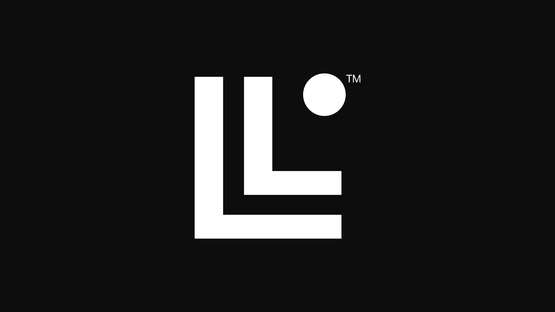
People already think the new Linksys logo is the worst of the year
TikTok isn't loving the new look.

We're just 10 days into the year, but TikTok already thinks it's found the worst logo of 2023. The first big rebrand of the year has arrived courtesy of networking and WiFi hardware brand Linksys, and it seems to be causing some, er, confusion.
The new design replaces the previously simple wordmark with a design featuring two nested 'L's with a dot above them (representing the letter 'i'). It's certainly a clean and contemporary new look – but good luck deciphering the actual name of the brand. (Need some inspiration? Check out the best logos of all time.)

"Today, we welcome you to meet the new Linksys," the company announced in an email to users (shared on Reddit). "Our new logo is an all-encompassing expression of our mission to connect the world and the people within it. This change is more than a new logo or identity. It's a reflection of our commitment to you, our customer, to build the world’s most reliable, innovative, and future-ready wireless technologies."
But while the new monogram looks cool, and offers a clever play on the famous WiFi symbol, it's proving somewhat illegible. The dot is simply proving too subtle for many, with the design appearing to read 'LLnksys'. And one of TikTok's most eminent logo critics has already gone so far as to call it the worst of the year:
@zacharywinterton ♬ original sound - Zachary Winterton
Time will tell whether the new logo cause any lasting issues when it comes to brand recognition – as we saw with the Airbnb logo way back in 2014, an initially hated design can end up staying the course. And at least Linksys can take some comfort from the fact that its logo isn't the most infamously illegible of the last 12 months – that dubious honour still very much goes to Kia.
Read more:
- Audi drivers get road rage over new logo
- The latest Aston Martin logo makes perfect sense
- TikTok still can't get over that terrible Hershey's logo redesign
Get the Creative Bloq Newsletter
Daily design news, reviews, how-tos and more, as picked by the editors.

Thank you for reading 5 articles this month* Join now for unlimited access
Enjoy your first month for just £1 / $1 / €1
*Read 5 free articles per month without a subscription

Join now for unlimited access
Try first month for just £1 / $1 / €1

Daniel John is Design Editor at Creative Bloq. He reports on the worlds of design, branding and lifestyle tech, and has covered several industry events including Milan Design Week, OFFF Barcelona and Adobe Max in Los Angeles.
